Meiji Ramen Soy Sauce Blue Yellow Japanese Characters
Topics
Details
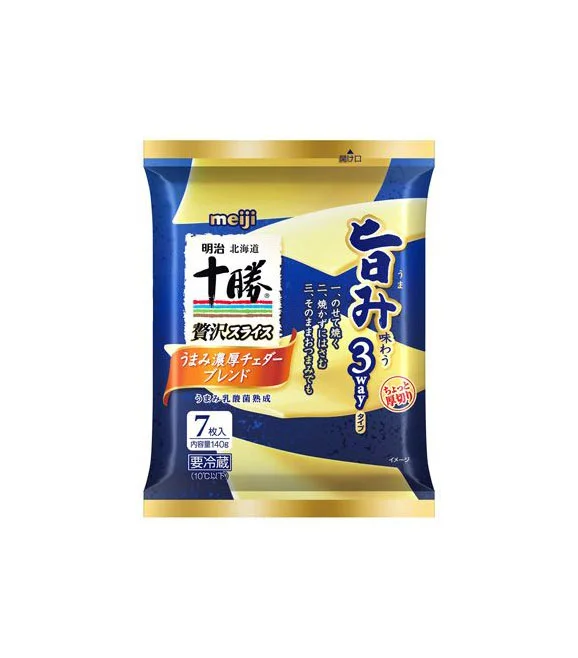
A flexible pouch of Meiji instant ramen stands upright, featuring a bold color scheme of deep navy blue and metallic gold. The packaging displays the brand name 'meiji' in lowercase white letters at the top left, while large Japanese characters for 'Jukkoku' (十勝) and '3 Way' (3WAY) dominate the central and right portions of the bag. A white rectangular label contains smaller text identifying the product as Hokkaido soy sauce flavor, with an orange ribbon banner below advertising the inclusion of a special cheddar cheese sauce.
Visual interest arises from the dynamic diagonal gold stripes that slice across the dark blue background, creating a sense of premium quality and movement. The typography mixes traditional calligraphic styles for the main product name with clean, modern sans-serif fonts for nutritional information and quantity details. This specific version distinguishes itself through its unique three-way eating concept, highlighted by a circular red stamp graphic that suggests an interactive culinary experience beyond standard instant noodles.
Food photographers might study this composition to understand how to balance multiple text elements within a confined product frame without causing visual clutter. Packaging designers could analyze the contrast between the cool blue tones and warm gold accents to inform their own work on luxury snack items. Cultural researchers may also find value in documenting how Japanese food brands utilize specific regional indicators like 'Hokkaido' to establish authenticity and quality standards in the marketplace.