Mint Blend Infusion Alcohol Spirits Green White Minimalist Design
Topics
Details
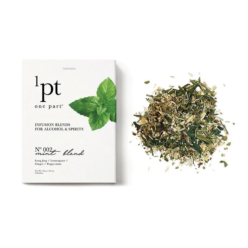
A matte white rectangular box sits beside a loose pile of dried botanicals, both resting on a clean, light surface that fades into soft shadow at the edges. The packaging features the brand name '1pt one part' in a bold serif typeface near the top left, with 'INFUSION BLENDS FOR ALCOHOL & SPIRITS' printed in smaller capital letters beneath it. A cluster of vibrant green mint leaves overlaps the right edge of the box, while the product details 'Nº 002 mint blend' appear in an elegant script font below, listing Long Jing, Lemongrass, Ginger, and Peppermint as ingredients alongside the net weight of 18g.
Visual distinction emerges from the deliberate contrast between crisp typographic hierarchy and organic texture, where the structured layout of the box meets the chaotic scatter of shredded herbs. The color palette restricts itself to deep forest greens, pale straw yellows, and the neutral white of the cardstock, creating a sophisticated restraint that feels both artisanal and modern. Typography plays a key role here, mixing authoritative sans-serif weights with flowing handwritten scripts to signal both precision and handcrafted care in the branding approach.
Art directors developing packaging for wellness or beverage brands might study this composition to understand how negative space can elevate premium positioning without clutter. Photographers specializing in food and lifestyle imagery could reference the lighting setup, which casts gentle shadows while maintaining clarity across both flat surfaces and three-dimensional textures. Brand strategists working on herbal infusion lines would find value in analyzing how ingredient photography is paired with minimalist graphic elements to communicate freshness and quality simultaneously.