MiraLAX Mix-In Pax Constipation Relief Unflavored Powder Design
Topics
Details
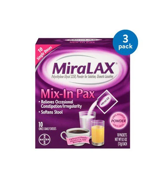
A rectangular pharmaceutical carton displays a deep violet and magenta gradient with the brand name 'MiraLAX' rendered in bold, dark purple serif lettering within a white elliptical field. The packaging features 'Mix-In Pax' in large pink sans-serif type below the main logo, accompanied by bullet points detailing its function for occasional constipation relief. Visual elements include a Bayer circular logo in the lower left corner, a blue badge indicating a 3-pack quantity in the upper right, and product photography showing individual powder packets alongside a coffee mug and glasses of milk and orange juice.
The design employs a layered color strategy that distinguishes the unflavored laxative category through clinical yet approachable aesthetics. White and pink typography creates strong contrast against the saturated purple background, while the inclusion of beverage imagery directly communicates the product's mix-in application method. Information hierarchy guides the viewer from brand recognition to specific usage instructions through varied font weights and strategic placement of the '10 Single Doses' banner.
Packaging designers studying over-the-counter medication branding can examine how this layout balances regulatory text requirements with consumer-friendly visual cues. Marketing teams developing constipation relief products might reference the color psychology and typographic choices that convey gentleness without sacrificing medical authority. Retail merchandising specialists could analyze the shelf-presence factors created by the combination of the prominent 3-pack callout and the clear depiction of serving suggestions.