Moisturizer Black Blue Neutrogena Men’s Product Design
Topics
Details
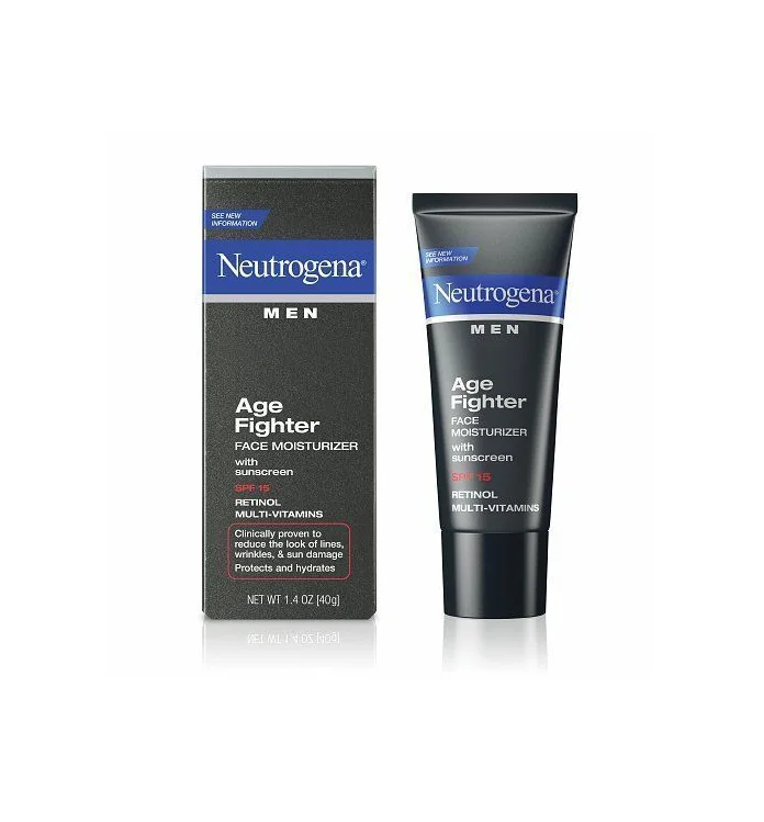
Dark charcoal packaging defines the visual identity of this Neutrogena Men's Age Fighter set, featuring a rectangular cardboard box alongside a cylindrical squeeze tube. Both items display a prominent blue horizontal band containing the brand name in white serif lettering, with 'MEN' printed in bold sans-serif capitals directly underneath. The product name appears in large white text, followed by smaller type indicating it is a face moisturizer with SPF 15 sunscreen, retinol, and multi-vitamins. Soft studio lighting creates subtle reflections beneath the objects, which are photographed from a straight-on perspective against a bright, neutral backdrop.
Masculine aesthetics drive the design language here through a restrained palette of black, navy blue, and crisp white typography that conveys clinical efficacy without unnecessary ornamentation. The contrast between the rigid geometry of the box and the soft curves of the tube creates visual balance within the composition, while the strategic use of red for the sun protection factor draws immediate attention to a key functional benefit. Information hierarchy remains clear across both formats, ensuring that essential claims about reducing lines and preventing sun damage are easily legible even at a glance.
Brand designers studying masculine skincare packaging will find this arrangement useful for analyzing how color blocking and font weight choices communicate target demographics effectively. Marketing teams could reference the layout when planning e-commerce photography that requires showcasing both primary and secondary packaging in a single cohesive shot. Students of commercial photography might also examine the lighting setup to understand how to minimize harsh shadows while maintaining enough dimension to distinguish matte versus glossy surface finishes.