Moon Walk Typography Ligatures
Topics
Details
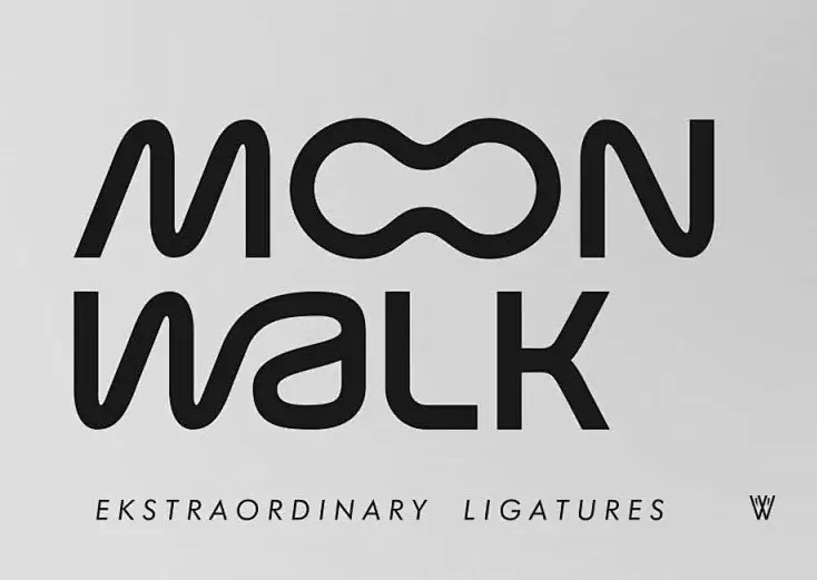
Rendered in deep charcoal against a matte light-gray field, the composition centers on the stacked words 'MOON' and 'WALK' in a bold, rounded sans-serif typeface. The letterforms exhibit fluid, continuous curves, most notably in the double 'O's which merge into an organic, figure-eight shape and the 'w' whose terminals flow seamlessly into the 'a'. Below the main logotype, the phrase 'EKSTRAORDINARY LIGATURES' appears in a smaller, lighter weight alongside a stylized 'W' mark, all captured from a direct frontal perspective with even, shadowless lighting.
Visual interest derives primarily from the aggressive use of ligatures that transform standard character spacing into interconnected, almost liquid pathways. By eliminating the negative space typically found between adjacent letters, the typeface achieves a sense of kinetic motion that reinforces the 'walk' concept through its very structure. The deliberate misspelling of 'extraordinary' further signals a typographic system that prioritizes aesthetic fluidity over orthographic convention.
Type designers studying advanced OpenType features would examine this specimen to understand how extreme ligature behavior can alter word recognition and rhythm. Brand identity teams developing identities for motion-based industries—such as footwear, dance, or aerospace—might reference this approach when seeking typography that implies physical movement. Additionally, educators teaching modernist logo construction could utilize this example to demonstrate how custom letterform connections can create proprietary visual assets without relying on pictorial icons.