Motor Oil Grey Red Champion Packaging Design
Topics
Details
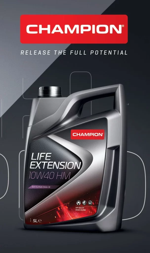
A metallic silver-grey plastic jug with an angular, aerodynamic silhouette dominates the frame, featuring a prominent handle and a black screw cap. The container's label displays a dark carbon-fiber texture intersected by a sharp silver chevron, overlaid with the white text 'LIFE EXTENSION' and '10W40 HM' in a clean sans-serif typeface. Above the product sits a bold red rectangular logo bearing 'CHAMPION' in white capital letters, while the tagline 'RELEASE THE FULL POTENTIAL' appears in spaced-out grey lettering beneath it. The background consists of a dark charcoal surface split by a diagonal lighter grey plane, accented with faint white technical line-art outlines that suggest engineering schematics.
Visual distinction emerges from the aggressive geometric interplay between the label's chevron shape and the bottle's molded contours, creating a sense of forward motion even in static presentation. The restricted palette of gunmetal grey, racing red, and high-contrast white establishes a premium industrial aesthetic that bridges automotive performance with laboratory precision. Subtle red ember-like graphics at the label's base introduce warmth without disrupting the overall cool-toned technical atmosphere, while the embossed-looking plastic texture of the jug suggests durability and chemical resistance.
Industrial designers studying packaging ergonomics might analyze the handle's integration with the body's structural ribs for grip optimization and material efficiency. Brand strategists could examine how the red-and-silver color coding communicates specific viscosity grades within a broader product ecosystem. 3D artists requiring accurate material references for rendering synthetic polymers and metallic inks would find the specular highlights on the curved surfaces particularly instructive for shader development.