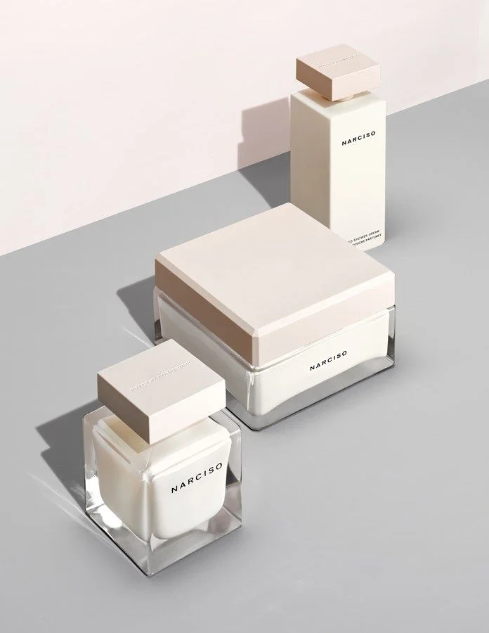
Narciso Perfume White Minimalist Clean Design
Topics
Details
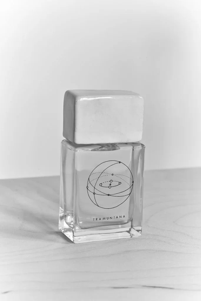
Three Narciso beauty products occupy a light gray surface, each featuring square glass bodies with frosted white caps and the brand name printed in black sans-serif. The composition includes a small perfume bottle in the foreground, a wider cream jar behind it, and a tall slender bottle positioned further back. Soft directional lighting casts distinct shadows toward the left, while a pale pink wall meets the gray floor at a right angle in the background.
Monochromatic white packaging creates a unified visual system across different product formats, from the compact cubic perfume to the broad low-profile jar and elongated body lotion bottle. The consistent use of matte finishes on the lids contrasts subtly with the transparent glass bases, establishing a tactile hierarchy between sealed and exposed surfaces. Minimalist typography placement—centered on the front face of each item—reinforces the architectural geometry without decorative interruption.
Product photographers studying luxury cosmetics packaging will find this arrangement useful for analyzing how identical branding adapts to varying container proportions. Industrial designers working on fragrance lines can reference the material transitions between opaque caps and clear vessels when developing their own cohesive collections. Art directors planning e-commerce layouts might study the diagonal spatial progression and shadow behavior to inform their own studio photography briefs.