Negative Typography
Topics
Details
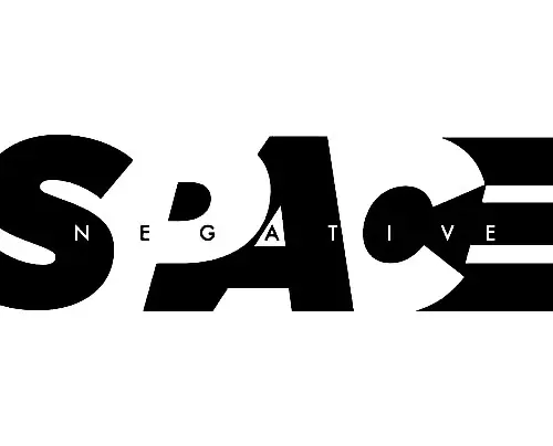
Massive, bold black letterforms spelling 'SPACE' dominate the composition with deliberate gaps carved through their heavy strokes. Within these cutouts, the word 'NEGATIVE' appears in a diminutive, clean sans-serif font, establishing a striking visual hierarchy between the two text elements. The white background visible through the negative space completes this typographic study of form and counterform.
Visual tension arises from the clever integration of the smaller text directly into the anatomy of the larger characters, forcing the viewer to read both the positive and negative areas simultaneously. By embedding the descriptor inside the subject itself, the design creates a self-referential loop that perfectly illustrates the concept of negative space typography. The extreme contrast in scale between the heavy, blocky ‘SPACE’ and the light, airy ‘NEGATIVE’ generates a dynamic rhythm that keeps the eye moving across the entire horizontal span.
Typography instructors might employ this as a prime case study to demonstrate how counter-forms can carry meaningful content rather than remaining passive background. Brand identity specialists could adapt this technique for logos where the company name is hidden within a larger symbolic shape, adding layers of meaning to a single mark. Layout artists working on editorial spreads may reference this approach to solve problems involving tight copyfitting, using the negative space of display type to house secondary information elegantly.