Nissin Cereal Pouch
Topics
Details
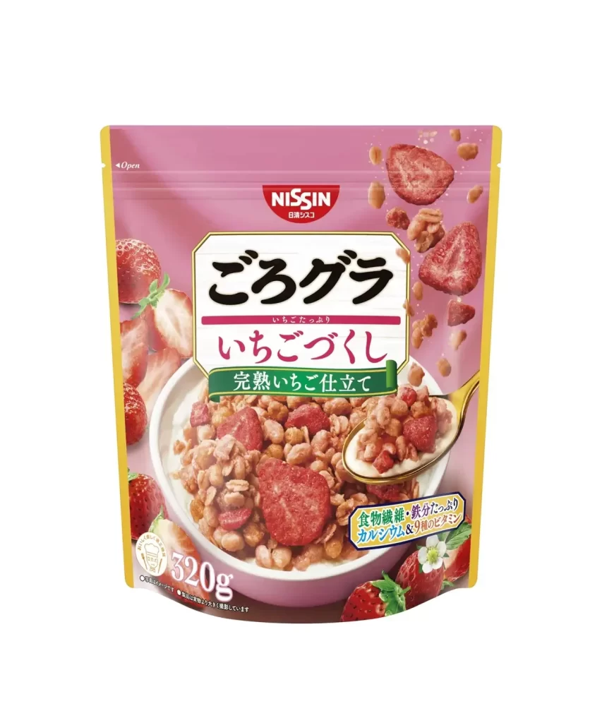
A soft, pastel pink background dominates the composition of this Nissin cereal pouch, framed by a crisp yellow border that draws the eye inward. The central focus is a white bowl filled with granola and large, freeze-dried strawberry slices, with a golden spoon lifting a portion toward the viewer. Bold black kanji characters for 'Gorogura' sit prominently above the red text for 'Ichigo Tsukuri' (Strawberry Made), while the iconic red Nissin logo anchors the top center.
Visual hierarchy is masterfully managed through the contrast between the muted pink field and the vibrant red fruit imagery scattered across the packaging. The inclusion of actual product photography—showing the texture of the oats and the porous surface of the strawberries—creates an immediate sense of appetite appeal and authenticity. A green banner cutting across the middle adds a fresh accent while highlighting the 'fully ripe strawberry' claim, balancing the overall color palette effectively.
Brand strategists analyzing Japanese FMCG packaging will find this example particularly useful for studying how localized typography integrates with international brand identities. Food photographers might reference the lighting setup used to make the milk-coated cereal look inviting without appearing soggy. Additionally, color theorists can examine how the specific shade of pink was chosen to evoke sweetness while maintaining enough contrast for shelf visibility in retail environments.