Obagi Medical Retinol + PHA Refining Night Cream Jar Detail Packaging
DownloadTopics
Details
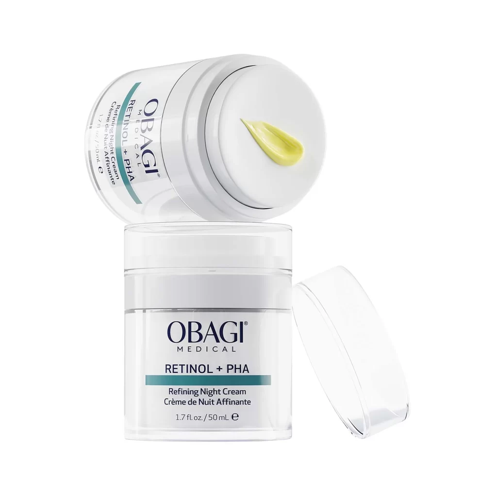
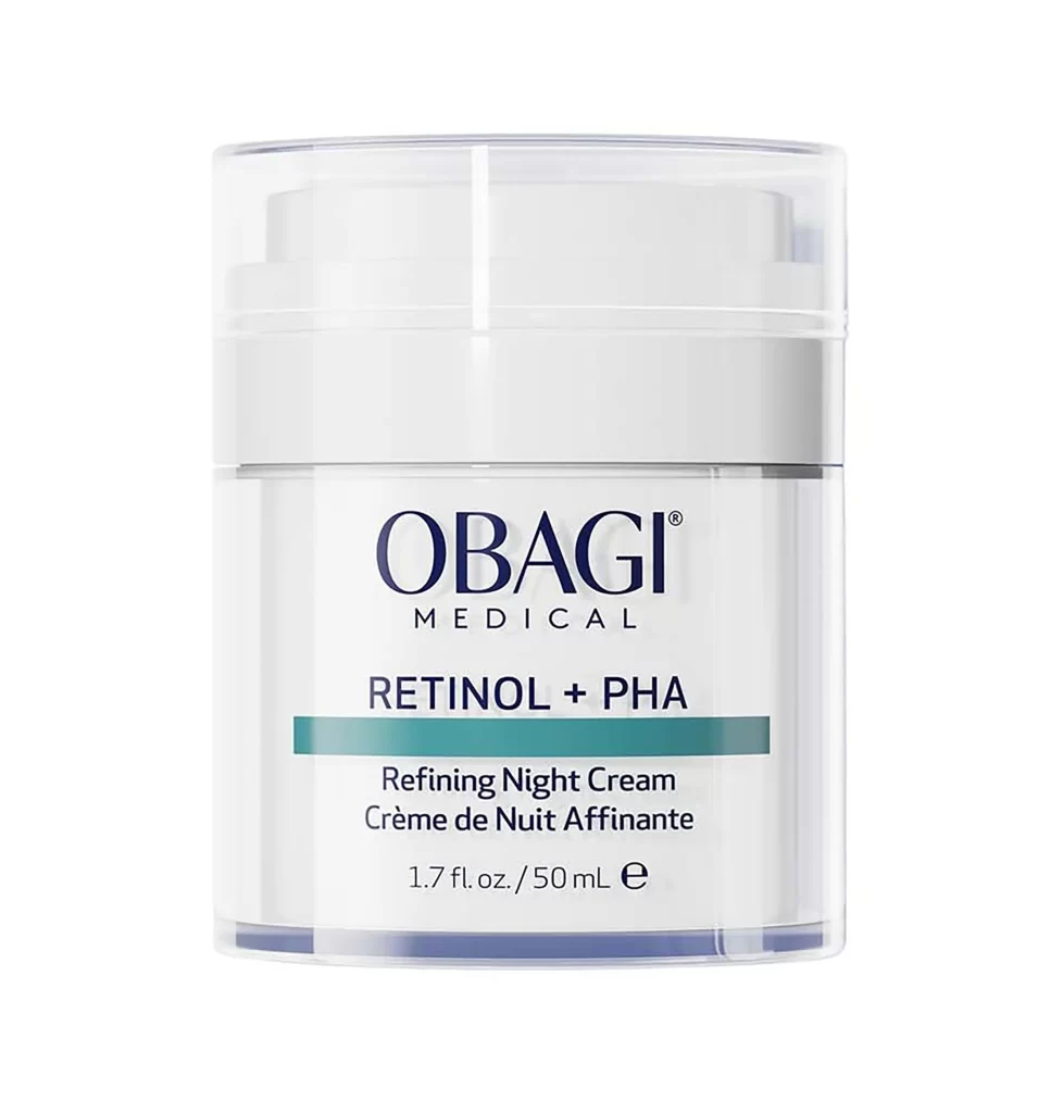
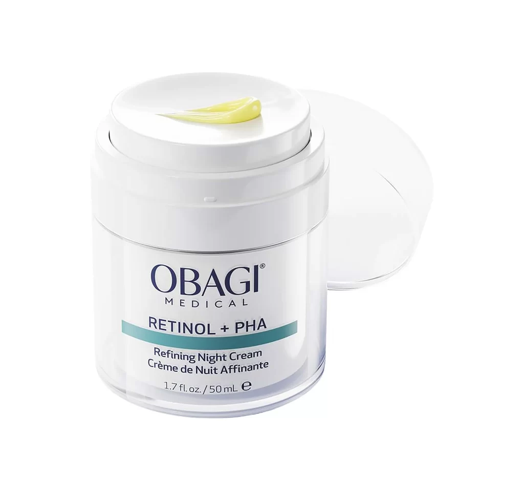
This post features a single skincare jar packshot resting on a plain white studio background with no props or people. The white lid is open and tilted beside the jar, revealing a small dollop of yellow cream on its inner surface to serve as a texture swatch. The jar itself is divided into a white upper portion and a clear transparent lower portion that shows the cream inside. Printed on the label are the OBAGI brand wordmark, MEDICAL, RETINOL + PHA, Refining Night Cream, the French bilingual line Creme de Nuit Affinante, and the size 1.7 fl. oz. / 50 mL. As the detail shot of a three-photo set, the image focuses entirely on the open lid and the cream texture.
The design language relies on a two-tone white and clear jar structure to communicate both stability and transparency. A strict typographic hierarchy governs the label, with the OBAGI wordmark as the most prominent element, followed by the MEDICAL descriptor, the RETINOL + PHA treatment name, and the smaller Refining Night Cream subtitle. The open-lid texture presentation shifts the focal point away from the container and toward the physical product itself. This minimal white ground removes all visual distractions, allowing the clear transparent lower jar and the yellow cream swatch to anchor the composition.
For packaging designers, the transparent lower jar provides a direct method to display product color without requiring an additional graphic or secondary image. The open-lid swatch effectively communicates texture and density, giving an immediate tactile reference to the formula inside the container. The bilingual label structuring demonstrates a practical approach to organizing English and French text, balancing the primary RETINOL + PHA naming with the French Creme de Nuit Affinante translation and standard size formatting. This detail shot offers a clear study in how structural choices and text hierarchy can highlight a formula's physical attributes.