Organic Noodles Packaging Yellow Pumpkin Illustration Design
Topics
Details
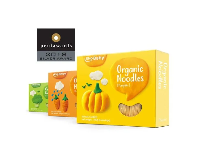
Bright yellow dominates the front of the EkoBaby Organic Noodles box, featuring a three-dimensional pumpkin illustration with a green stem and a curved window revealing the actual noodles inside. The packaging displays the brand name in a rounded orange bubble at the top left, while the product title sits within a large speech bubble shape next to the pumpkin. Behind the main box, two smaller cartons in green and orange show broccoli and carrot variations, all set against a clean white surface with a black Pentawards 2018 Silver Award badge floating in the upper left corner.
Playful clay-like textures give the vegetable illustrations a tactile, child-friendly quality that immediately signals the baby food category. The speech bubble containing the product name adds a conversational, approachable element that breaks away from typical rigid grocery shelf layouts. Color coding across the line creates instant flavor recognition, while the transparent noodle window bridges the gap between cute illustration and honest product visibility.
Packaging designers studying award-winning children's food products can analyze how the 3D rendered style balances whimsy with appetite appeal. Brand teams developing organic baby goods might examine how the color palette and typography hierarchy communicate both safety and premium quality. Illustrators working on food packaging could reference the way simple geometric shapes combine to create recognizable vegetables without photorealistic complexity.