Orijen Freeze-Dried Dog Food Red Green White Tundra
Topics
Details
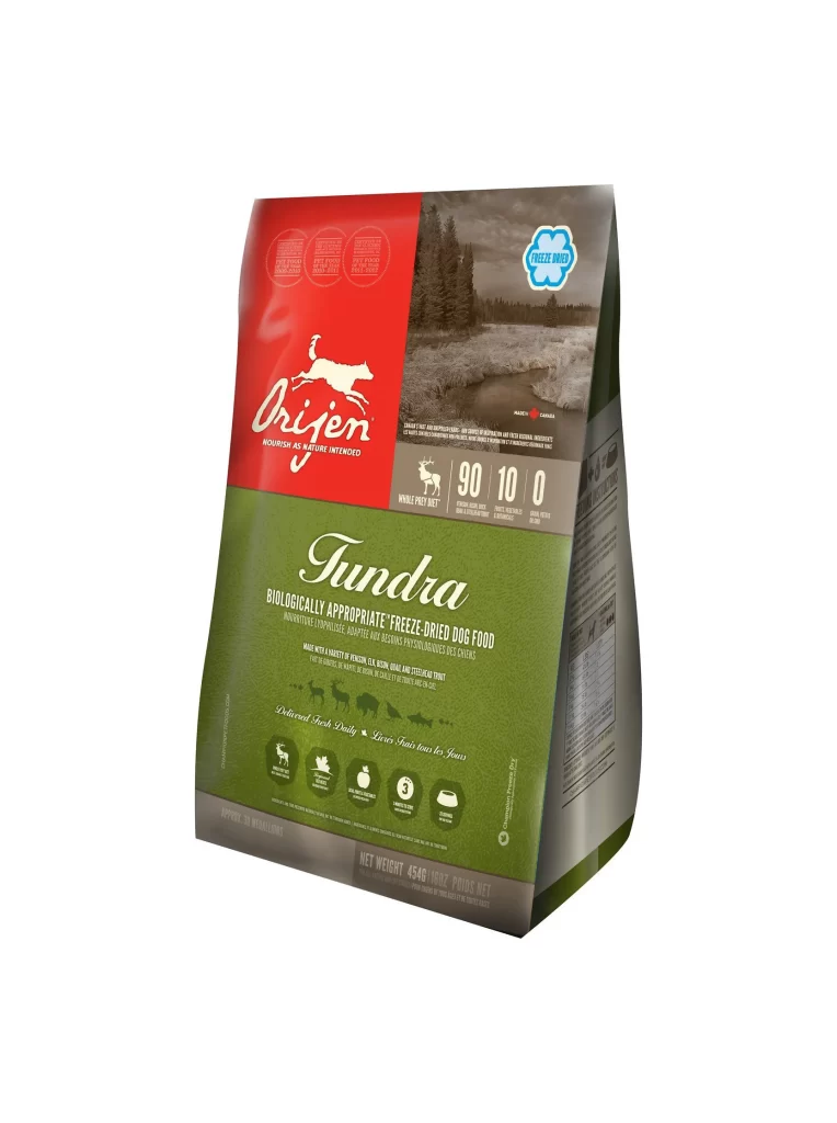
A 454g bag of Orijen Tundra freeze-dried dog food stands at a three-quarter angle, revealing its front and right-side panels against a white void. The packaging features a bold tri-color scheme with a crimson red upper section displaying the leaping white dog logo, a forest-green middle band bearing the 'Tundra' script, and a muted taupe base. A monochrome photograph of a boreal landscape occupies the upper-right corner alongside a blue 'Freeze Dried' badge, while the lower green field contains nutritional icons and the claim of being made with venison, elk, bison, and wild boar.
The visual hierarchy relies on high-contrast color blocking that separates brand identity from product specifics, creating distinct zones for quick scanning. Typography shifts dramatically between the fluid, organic curves of the Tundra wordmark and the rigid sans-serif figures showing the 90-10-0 protein-carb-fiber ratio. Silhouettes of regional wildlife appear as subtle watermarks beneath the main text, reinforcing the ingredient story without cluttering the primary information layer.
Packaging designers studying premium pet food aesthetics can analyze how earth-tone palettes communicate natural ingredients while maintaining shelf presence. Marketing teams developing freeze-dried product lines might reference this layout to balance technical specifications with lifestyle imagery. Brand strategists evaluating color-coded product families within a single line could examine how the red-green-white combination distinguishes this variant from other formulas in the catalog.