Panzani Gansettes Pasta Box Packaging
DownloadTopics
Details
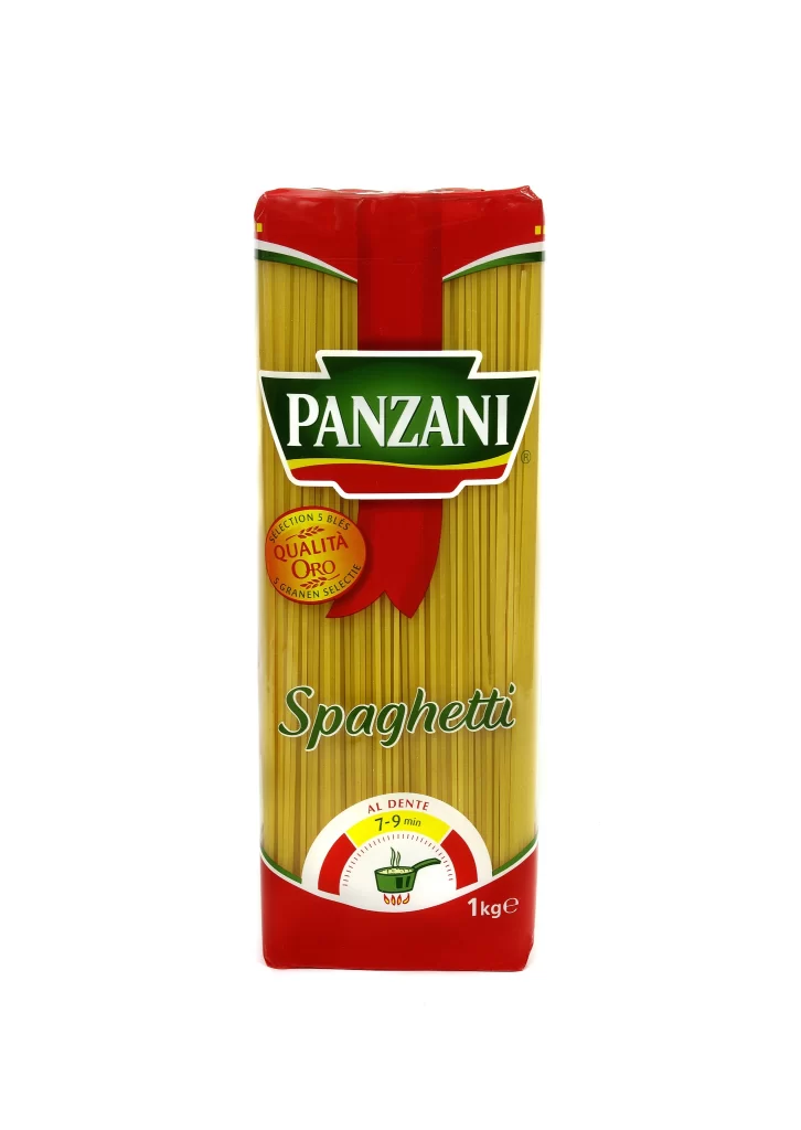
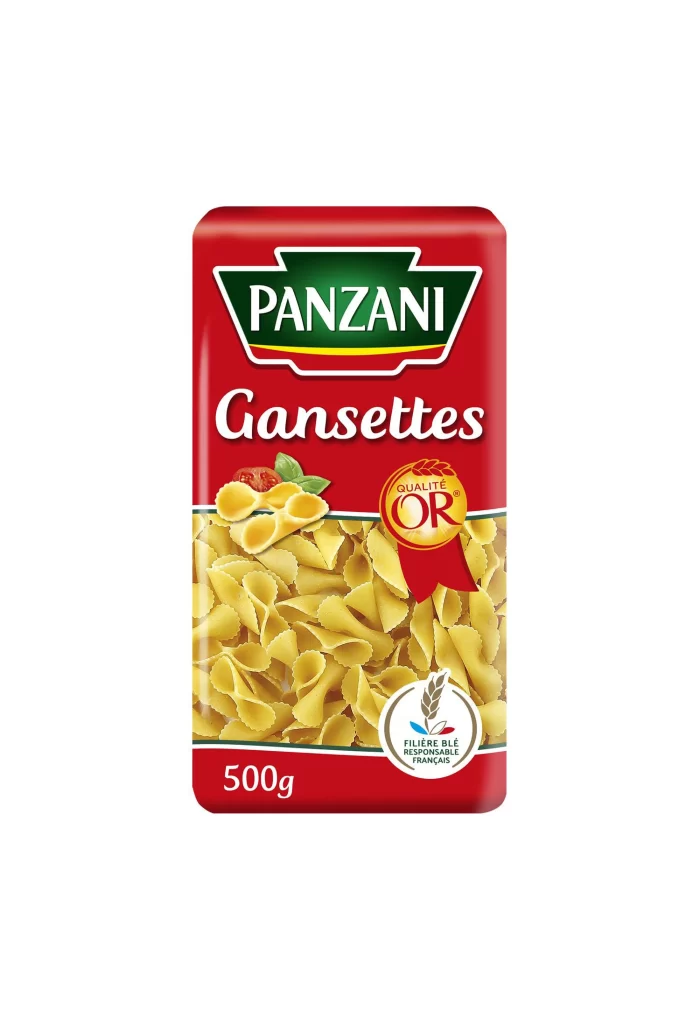
This post features a straight-on packshot of a single red cardboard carton of Panzani Gansettes pasta. Photographed against a pure white studio background, the image presents a clean, uncluttered view of the 500g French brand packaging. The straight-on angle highlights the full front panel design of the carton without any advertising distractions. This straightforward studio shot provides a clear look at the packaging structure and visual layout.
The design relies on a bold red ground to anchor the composition, immediately drawing the eye to the top third where a green shield logo with a white border frames the PANZANI wordmark in white serif caps. Below this, the product name Gansettes appears in a flowing white script, creating a sharp typographic contrast against the blocky serif lettering. A photographic window dominates the lower two-thirds, revealing pale yellow small ridged and folded pasta pieces alongside a small red tomato and green basil leaf garnish. To the right of the window rests a Qualite Or seal on a red ribbon, while a circular wheat emblem reading Filiere Ble Responsable Francais anchors the bottom section.
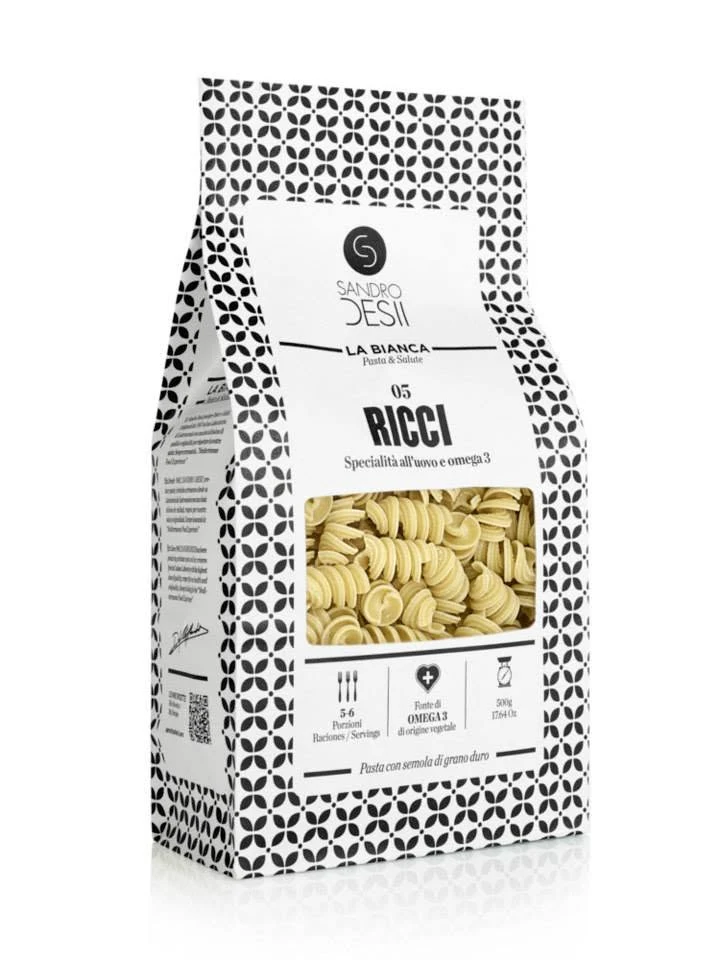
Designers can study how photographic appetite windows are strategically used to communicate product texture and flavor expectations. The placement of certification badges, such as the Qualite Or ribbon and the Filiere Ble Responsable Francais emblem, offers a lesson in balancing trust signals without overwhelming the main visual. Additionally, the packaging demonstrates a clear script-versus-serif hierarchy that separates the parent brand from the specific product variant. These elements collectively serve as strong examples of traditional French grocery heritage codes applied to modern shelf presence.