Pappardelle Pasta Olive Oil Balsamic Vinegar Black Yellow Red
DownloadTopics
Details
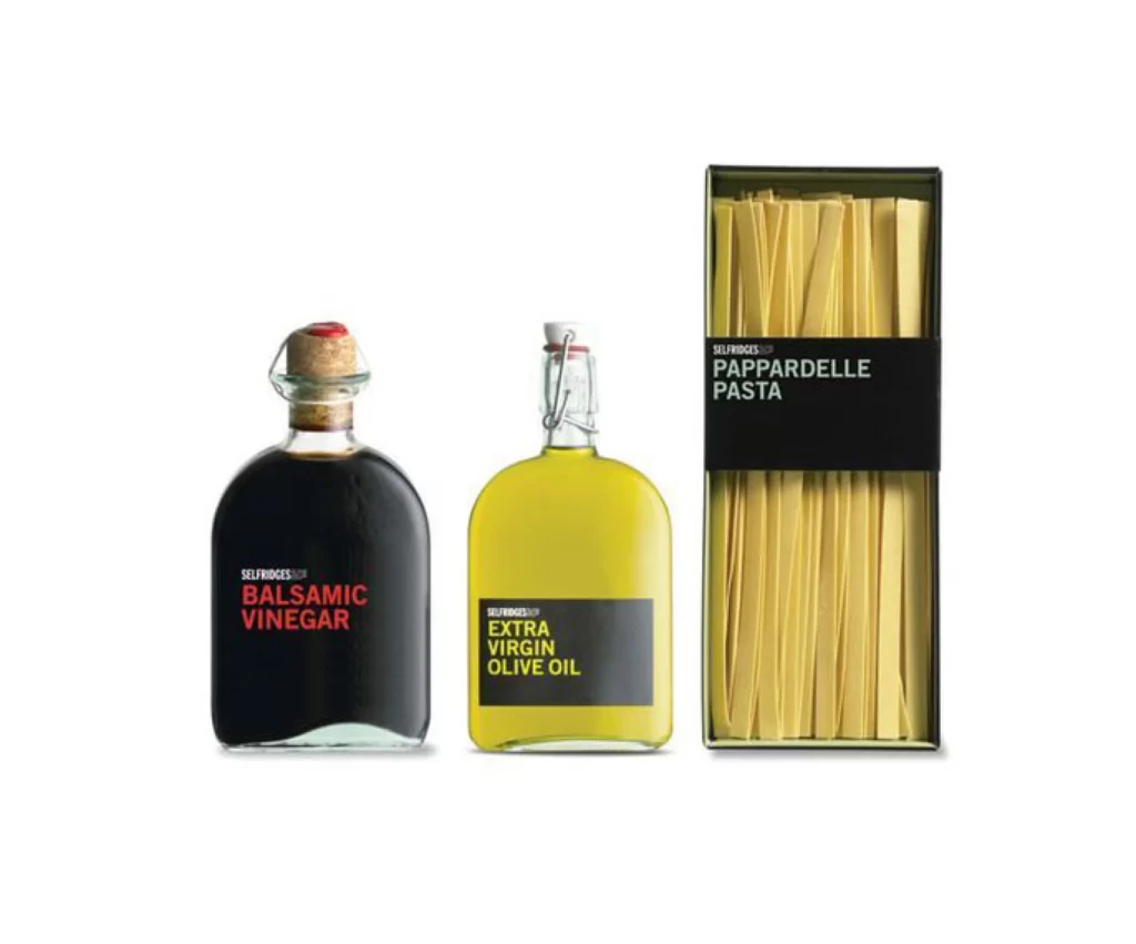
Three Selfridges food products stand in a row against a white void, each defined by bold color blocking and sans-serif typography. On the left, a dark glass bottle with a cork stopper and wire cage displays "BALSAMIC VINEGAR" in red letters on a black label. The center holds a rounded yellow bottle of "EXTRA VIRGIN OLIVE OIL" with a swing-top closure, while the right features a tall rectangular box of "PAPPARDELLE PASTA" revealing pale golden strands through its clear window.
Graphic cohesion emerges from the consistent black label bands and the restricted palette of black, yellow, and red across disparate packaging formats. The typographic hierarchy places the brand name in small caps above larger product identifiers, creating a visual rhythm that unifies liquid and dry goods. Designers studying this composition can access the full-resolution file at no cost to examine how minimal labeling transforms grocery staples into gallery-worthy objects.
Art directors developing private-label packaging systems will find this arrangement useful for analyzing scale relationships between bottles and boxes. Food photographers might reference the even, shadowless lighting setup when planning their own studio shoots for e-commerce catalogs. Brand strategists could also mine the color-coded system to understand how retailer own-brands signal quality through restraint rather than ornamentation.