Pasta Filippo Menna Teal Blue Modern Typography
DownloadTopics
Details
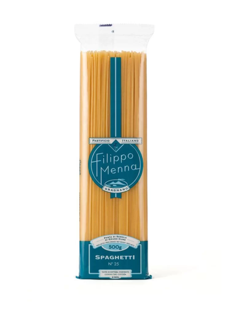
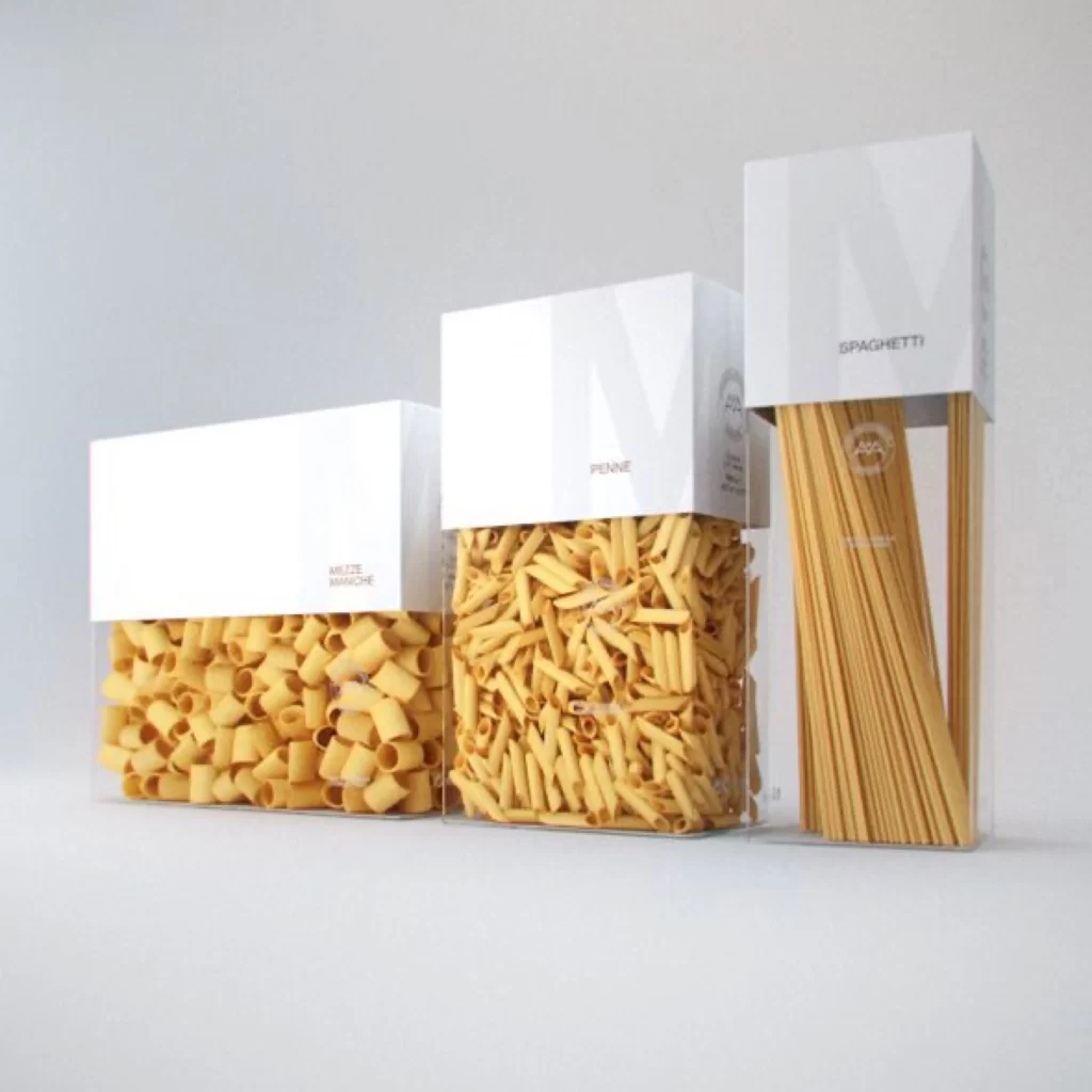
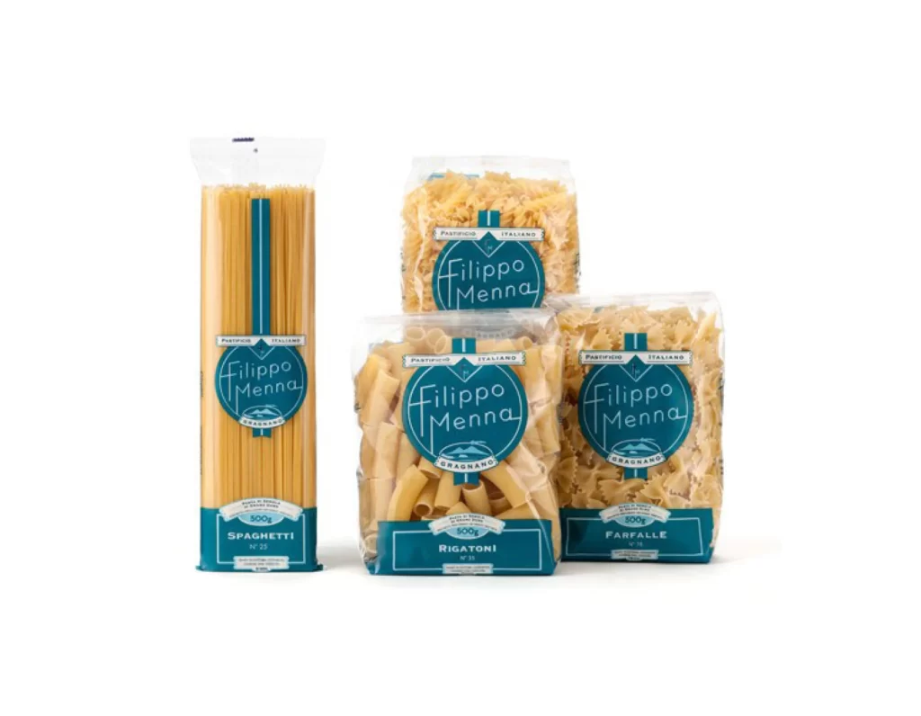
Four clear plastic packages of Filippo Menna pasta stand in a loose cluster, showcasing spaghetti, rigatoni, farfalle, and a fourth short-cut variety. Each bag features a bold teal blue label with the brand name rendered in a clean, modern white script inside a circular badge. The composition is shot straight-on under bright, even lighting that highlights the golden hue of the dried wheat through the transparent packaging material.
The visual identity relies heavily on the striking contrast between the organic, warm tones of the grain and the cool, saturated cyan of the graphic elements. This specific version of the packaging uses a distinctive typographic hierarchy where 'PASTIFICIO ITALIANO' arches over the main logo, creating a seal-like quality that feels both artisanal and contemporary. Designers looking to study this color palette or layout can access the full-resolution file for free directly from the resource page.
Brand strategists and packaging students would find this arrangement useful for analyzing how consistent branding adapts across different product shapes and sizes. It serves as a practical case study for balancing photography of physical goods with overlaid vector graphics without losing legibility. Anyone building a mood board for a food-related rebrand could pull specific texture and color values from these assets.