Pasta Packaging Clear Containers Red Label
DownloadTopics
Details
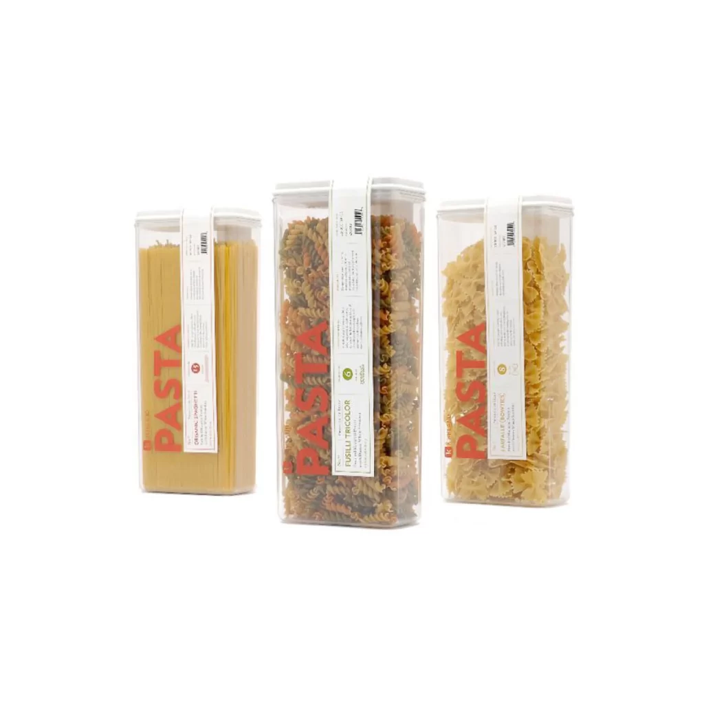
Three tall, transparent rectangular containers stand in a neat row, each filled with a different pasta variety and sealed with a white lid. The leftmost vessel holds long, golden spaghetti strands, while the center one is packed with tricolor fusilli spirals showing green, orange, and pale yellow hues, and the rightmost contains creamy bow-tie farfalle. Bold red 'PASTA' lettering runs vertically along the front of each clear plastic body, partially obscured by a white paper label displaying nutritional details and product names in smaller black text. Soft, even lighting illuminates the scene from the front, casting minimal shadows on the clean, bright surface beneath the containers.
What sets this packaging apart is its commitment to visual honesty, letting the vibrant colors and unique textures of the pasta become the primary design element. The minimalist label system creates a striking contrast between the clinical white paper and the organic shapes within, while the oversized red typography adds a confident branding touch without overwhelming the product. Designers can grab the full-resolution file for free to study how transparency and typography work together in modern food packaging.
Product photographers might reference this setup to understand how to arrange multiple SKUs in a cohesive group shot that maintains individual item clarity. Packaging engineers could analyze the structural balance between the rigid container walls and the flexible label application for their own storage solutions. Brand identity specialists will find useful notes on how limited color palettes—red, white, and the natural pasta tones—can create a memorable shelf presence without excessive decoration.