Pasta Whisk Spoon Photography
Topics
Details
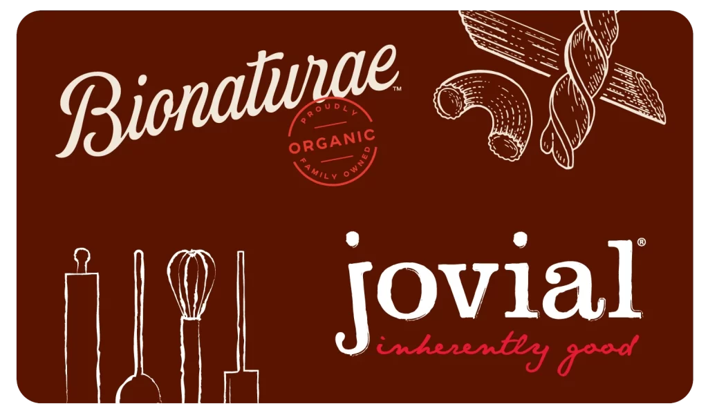
A deep chocolate-brown background supports the dual-brand composition, where Bionaturae's flowing white cursive script occupies the upper left corner above a circular red stamp reading 'Proudly Organic Family Owned.' Jovial anchors the lower right in a bold white serif font, accompanied by its 'inherently good' tagline rendered in coral-red cursive. White line-art illustrations of kitchen utensils—including a rolling pin, ladle, whisk, and spatula—line the bottom left, while pasta shapes including rigatoni and fusilli appear sketched in white at the upper right.
What distinguishes this visual arrangement is its clever juxtaposition of culinary tools with pasta shapes, creating an immediate narrative about cooking without relying on photography. The limited palette of cream white and warm red against the rich brown background evokes artisanal packaging aesthetics while maintaining clean readability. Hand-drawn illustration styles for both the kitchen utensils and dried pasta varieties add a tactile, human quality that feels approachable rather than corporate.
Food bloggers developing brand partnership content might study this layout to understand how competing or complementary brands can coexist harmoniously within a single visual frame. Packaging designers working on organic or family-owned product lines could reference the color psychology of earthy browns paired with hand-lettered elements to convey authenticity. Social media managers planning collaborative posts between kitchenware brands and food companies would find this a useful template for balancing multiple logos while keeping the overall design feeling cohesive and appetizing.