Pet Food Dog Food Chicken Salmon Cat Food GO! Black Pink Orange
Topics
Details
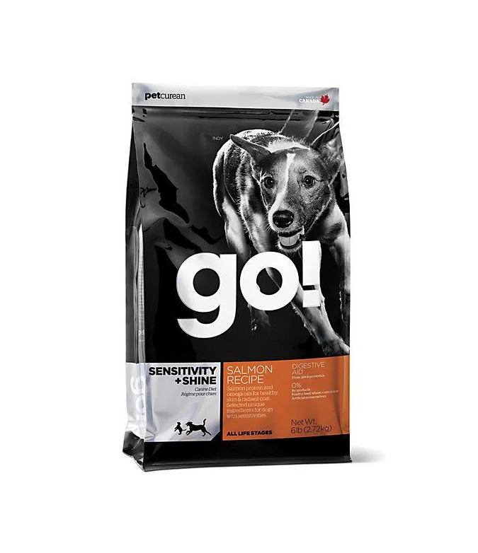
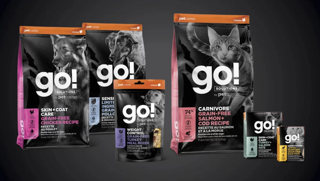
Six packages of GO! Solutions pet food by Petcurean stand in a loose cluster against a dark charcoal backdrop, illuminated by soft studio lighting that creates subtle shadows beneath each bag. The packaging features a bold black base accented with vibrant magenta, orange, and teal side panels, while the front displays large white lowercase 'go!' typography above high-contrast monochrome photographs of dogs and cats. Visible text includes product variants such as 'Skin + Coat Care Grain-Free Chicken Recipe,' 'Sensitive Limited Ingredient Grain-Free,' 'Weight Control Grain-Free Meal Mixer,' and 'Carnivore Grain-Free Salmon + Cod Recipe,' alongside Canadian origin markers and nutritional percentages like '74%'.
Visual distinction emerges from the striking juxtaposition of grayscale animal photography against saturated color blocking, creating immediate shelf presence through high-contrast graphic hierarchy. The consistent typographic system—white bold lettering paired with color-coded category indicators—establishes a cohesive brand language across different product sizes and formulations. Matte finish materials catch light gently along the bag edges, emphasizing the three-dimensional form of the flexible packaging while maintaining legibility of the detailed ingredient information printed in smaller type.
Brand managers analyzing competitive pet food packaging strategies would examine this composition to understand how color psychology influences consumer perception of premium nutrition products. Packaging engineers could reference the structural layout when developing similar resealable bag formats that balance visual impact with functional labeling requirements. Marketing teams preparing retail display mockups might study the spatial arrangement to optimize how multiple SKUs appear together in promotional photography or e-commerce category pages.