Pet Food Dog Food Grain-Free Chicken Salmon Design Style Black White
Topics
Details
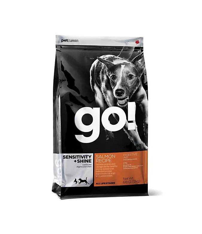
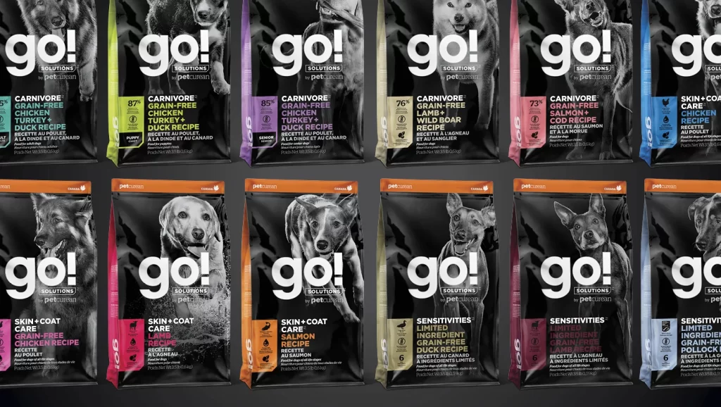
Twelve rectangular bags of go! Solutions pet food by Petcurean are arranged in a precise two-by-six grid, each featuring a high-contrast black background with a monochrome dog portrait occupying the upper half. Bold white sans-serif typography spells out the brand name "go!" above smaller text reading "SOLUTIONS" and "by petcurean," while vertical color-coded strips on the left edge distinguish each variety with specific hues like lime green, purple, pink, and orange. Product details appear in clean white and colored fonts, listing ingredients such as grain-free chicken, salmon, duck, and lamb alongside life-stage indicators like "puppy," "senior," or numerical ratings, all photographed from a straight-on frontal perspective under even studio lighting that eliminates harsh shadows.
Visual hierarchy relies heavily on the interplay between the stark black packaging and the photographic animal imagery, creating immediate shelf presence through consistent brand architecture across different product lines. The systematic use of color-coding allows consumers to quickly identify dietary categories—carnivore formulas versus skin and coat care or sensitivity options—without disrupting the overall cohesive aesthetic. Typography remains tightly controlled with the oversized lowercase "go!" serving as an unmissable anchor point that draws the eye before guiding it to the specific recipe information positioned below the dog portraits.
Brand managers developing premium pet nutrition lines could study this layout to understand how to maintain visual consistency while differentiating multiple SKUs within a single product family. Packaging designers tasked with creating retail-ready animal food containers might reference the balance between photography and text to optimize scannability for shoppers browsing crowded store aisles. Marketing teams planning e-commerce category pages could adapt this grid presentation style to showcase complete product ranges while ensuring each variant remains individually identifiable through strategic accent colors.