Pet Treats Frango Natural Pink Illustration
Topics
Details
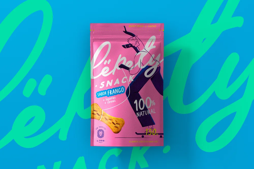
A vibrant magenta stand-up pouch for Lôpetty Snack dominates the frame, featuring a stylized dark blue canine figure skateboarding across the center. White cursive script spells the brand name above a blue rectangular badge reading 'Sabor Frango' (Chicken Flavor), while bold white typography declares '100% Natural' near a realistic bone-shaped biscuit graphic. The packaging rests on a bright cyan field overlaid with large, semi-transparent mint-green lettering spelling 'Lôpetty Snack', photographed from a straight-on perspective with even studio lighting.
Visual distinction emerges from the energetic interplay between the playful hand-drawn illustration and the bold typographic hierarchy. The saturated pink base creates immediate shelf impact, while the oversized background text adds depth without obscuring the product details. This specific iteration balances whimsical character art with clear nutritional claims, making it a strong example of modern pet food branding that appeals to younger demographics through lifestyle imagery rather than traditional animal photography.
Brand strategists developing premium pet product lines would examine this composition to understand how color blocking directs consumer attention toward flavor indicators and natural certifications. Packaging designers could reference the integration of illustrative elements with functional text zones when creating snack categories targeting millennial pet owners. Marketing teams planning e-commerce assets might study how the layered background graphics enhance visual interest without compromising legibility of essential product information.