Pet treats Karamelleriet Handcrafted Caramel Rocks Natural Stones
Topics
Details
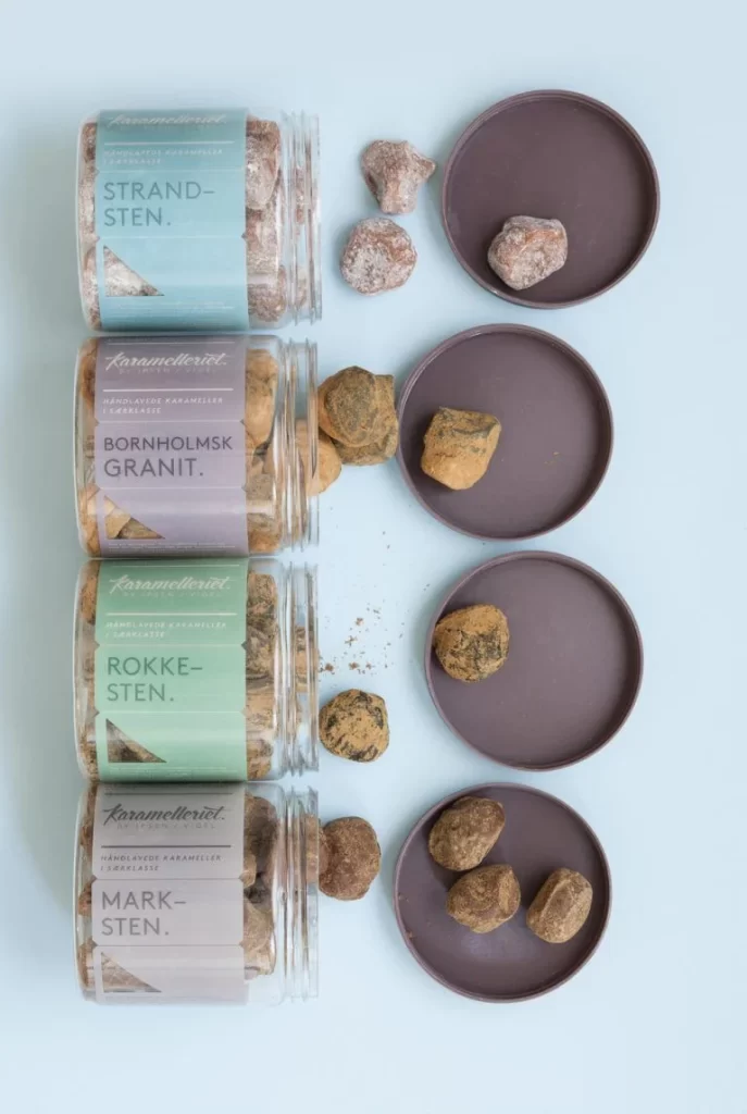
Four cylindrical glass jars stand in a vertical row, each filled with irregularly shaped confections that mimic the appearance of natural stones and minerals. The containers bear pastel labels in soft blue, lavender, mint green, and pale gray, displaying Danish text including 'STRAND-STEN.', 'BORNHOLMSK GRANIT.', 'ROKKE-STEN.', and 'MARK-STEN.' beneath the brand name 'Karamelleriet'. To the right of each jar, a dark brown circular lid holds one or more of the textured treats, which range from dusty gray to golden-brown with speckled surfaces, all photographed from a direct overhead perspective against a light blue-gray surface under even, diffused lighting.
Visual intrigue arises from the deliberate trompe-l'oeil effect where edible caramel candies convincingly replicate geological specimens through careful texturing and coloration. The systematic arrangement creates a satisfying grid-like rhythm that contrasts the organic, rough-hewn shapes of the individual pieces against the clean geometric lines of the glass cylinders and circular lids. Typography choices—mixing elegant script for the brand with bold, modern sans-serif for product names—establish a sophisticated Scandinavian aesthetic that bridges artisanal craft and contemporary minimalism.
Food photographers studying prop styling might analyze how the scattered placement of loose candies around the lids adds casual spontaneity to an otherwise rigid composition. Packaging designers could examine the color-coded label system as a case study in creating visual hierarchy across a product line while maintaining brand cohesion. Concept artists working on fantasy game assets might reference the material qualities of these stone-like sweets when designing collectible items that need to appear both natural and valuable.