Petcurean Go Sensitivity + Shine Duck Recipe Dog Food Packaging
Topics
Details
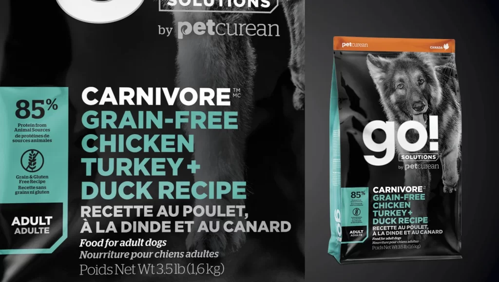
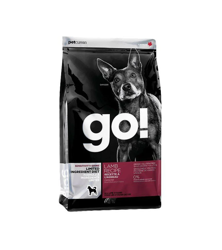
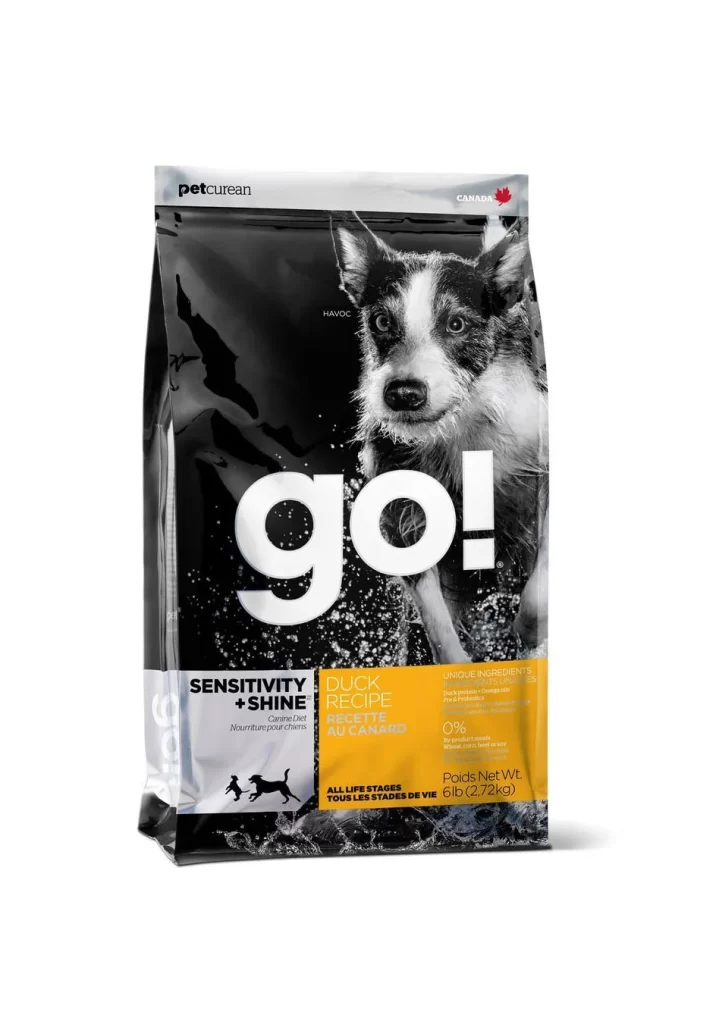
This post shows a product packshot of a single 6 lb (2.72 kg) bag of Petcurean Go Sensitivity + Shine Duck Recipe dry dog food, standing upright against a plain white studio background. The image presents the item as a straightforward packshot rather than an advertisement, allowing the packaging structure and surface graphics to be evaluated clearly. It captures the exact bilingual English-French Canadian retail bag as it appears on shelf, providing an unobstructed view of the full front face.
The design language relies on a glossy black laminated plastic ground that anchors the layout and gives the bag a premium, high-density feel. A bold white lowercase go! wordmark sits at the center, overlapped by a dynamic photograph of a black-and-white Border Collie that brings energy and realism to the front face. Color-blocked panels organize the lower zone: a white panel reading SENSITIVITY + SHINE with small silhouettes of running dogs at the left, and a yellow panel at the right carrying DUCK RECIPE, ALL LIFE STAGES, the 6 lb net weight, and the claims UNIQUE INGREDIENTS and 0%. The top row places the gray petcurean wordmark at the left and CANADA with a red maple leaf icon at the right, completing the bilingual Canadian layout.
Designers can study how the high-contrast black ground and white go! wordmark create strong pet food shelf presence from a distance. The photograph-over-wordmark layering demonstrates a method for combining a real animal image with brand typography without losing legibility. The color-blocked information zones show a clear way to separate line identity from recipe and life-stage details, and the bilingual English-French Canadian label structuring offers a practical model for organizing dual-language content within limited vertical space.