PETIT Dog Food Salmon Turkey Chicken
Topics
Details
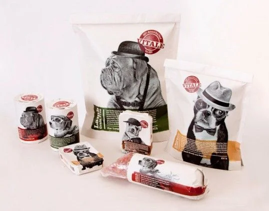
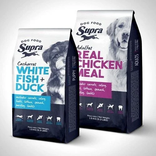
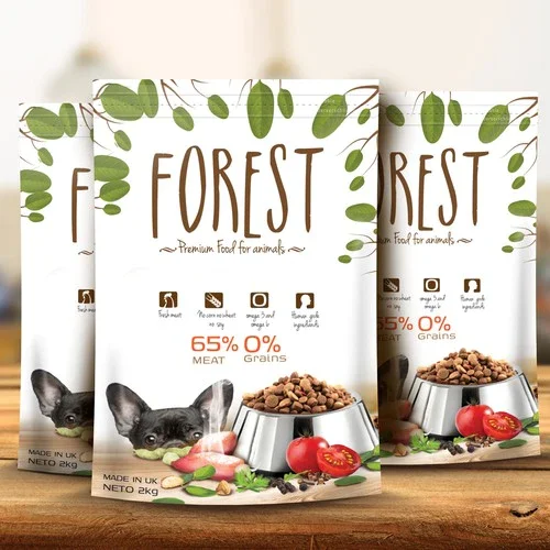
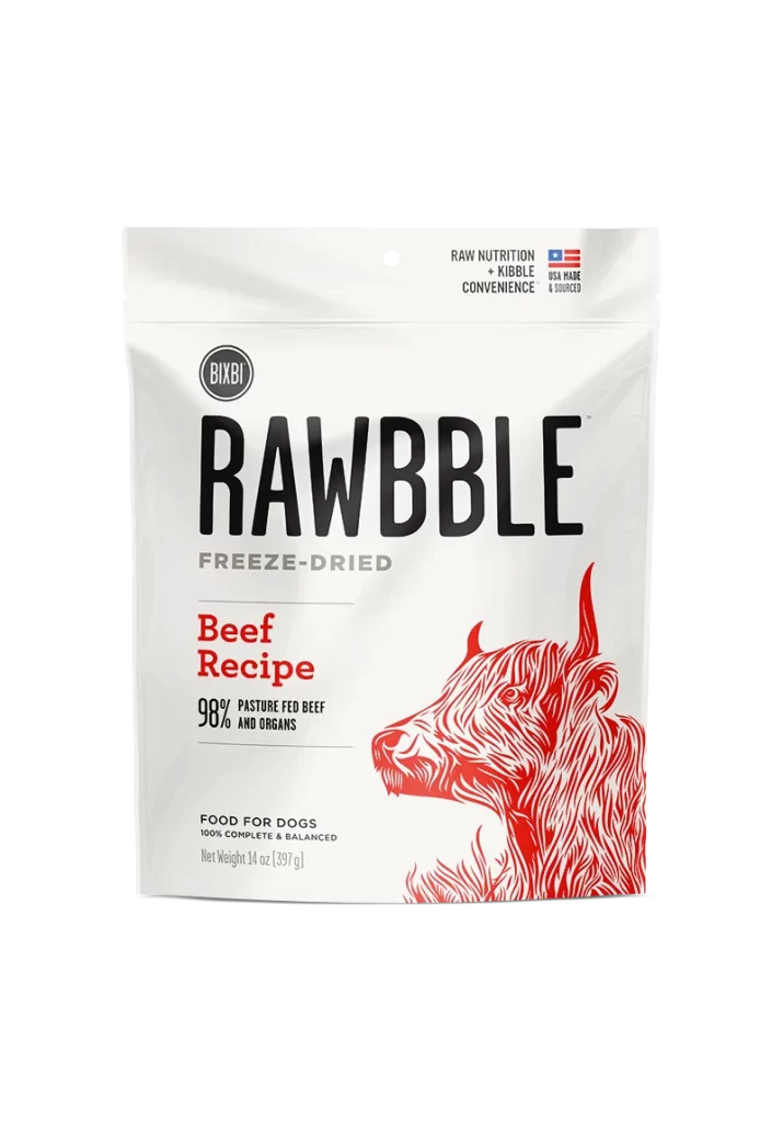
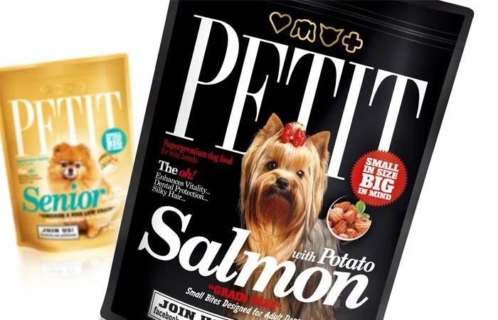
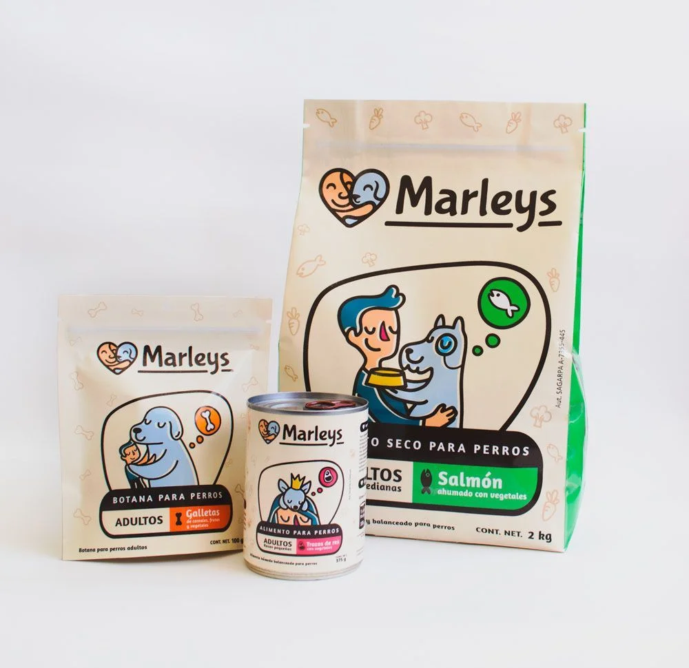
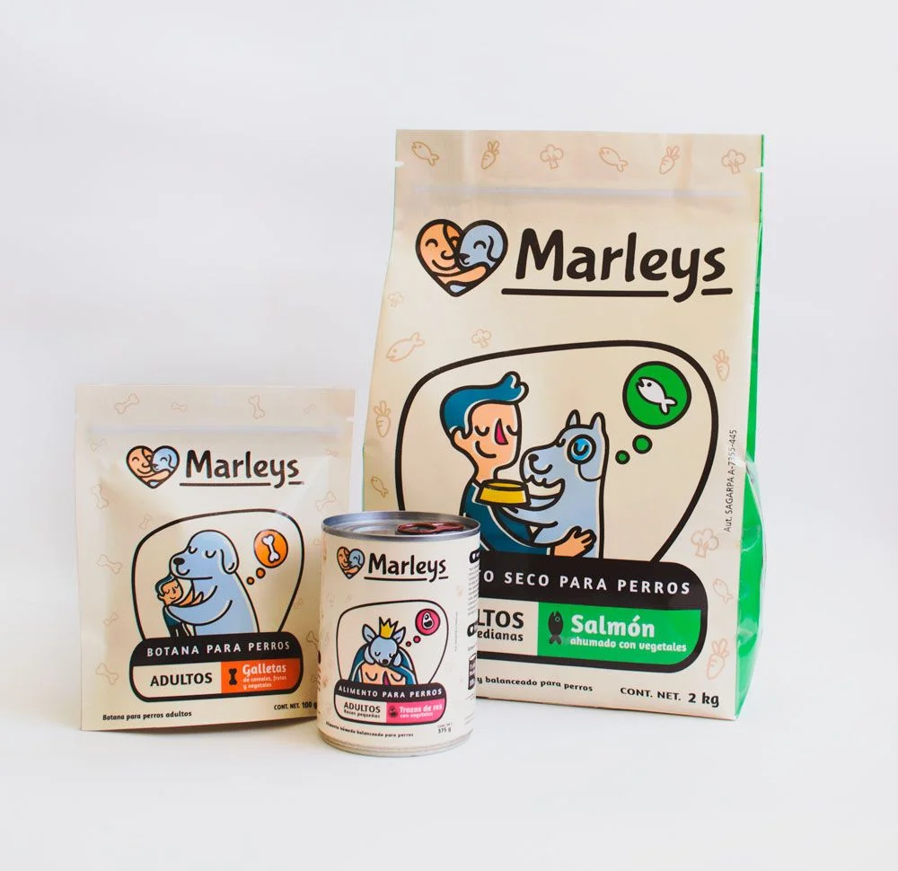
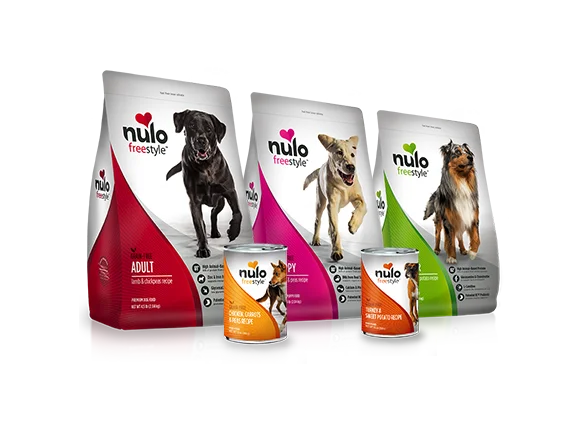
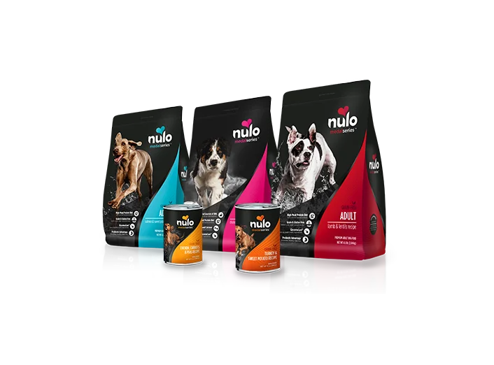
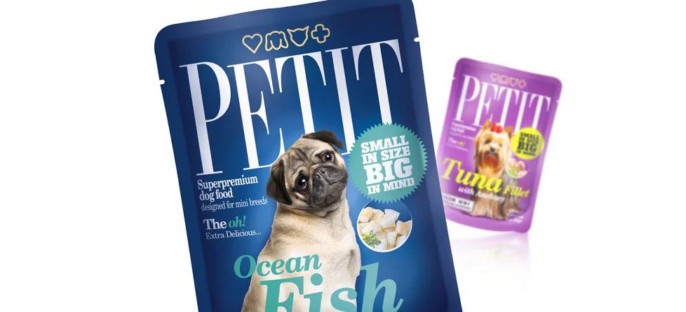
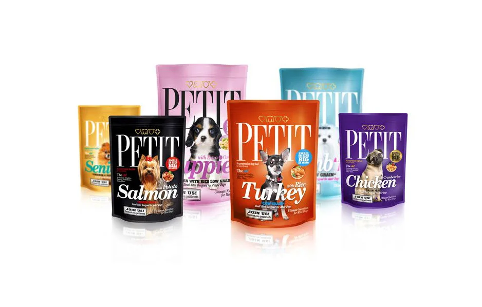
Six stand-up pouches of PETIT brand dog food are arranged in a gentle arc, showcasing a vibrant palette of mustard yellow, pastel pink, matte black, burnt orange, sky blue, and deep purple. Each bag features the brand name in bold white serif lettering above a specific protein flavor—Salmon, Turkey, and Chicken are clearly legible—accompanied by a photograph of a different dog breed. The packaging incorporates circular badges highlighting "with Rice" or "Low Grain" formulations, while a small "JOIN US!" call-to-action anchors the bottom of every design.
Color-coding serves as the primary organizational logic here, allowing consumers to distinguish between recipes at a glance without reading the fine print. The consistent typographic hierarchy across all variants creates a unified family look, yet the unique canine portraits on each bag inject personality and emotional resonance into the product line. Subtle metallic accents on the logos and badges catch the light, adding a premium tactile quality that contrasts with the soft, matte finishes of the main body materials.
Brand managers studying pet-food packaging trends will find this arrangement useful for analyzing how color psychology influences shelf presence and category navigation. Packaging designers can reference the layout to understand how to balance large typography with photographic elements within a restricted vertical format. Marketing teams might also examine the badge placement strategies to see how nutritional claims are visually prioritized alongside the primary brand identity.