Picco Packaging
Topics
Details
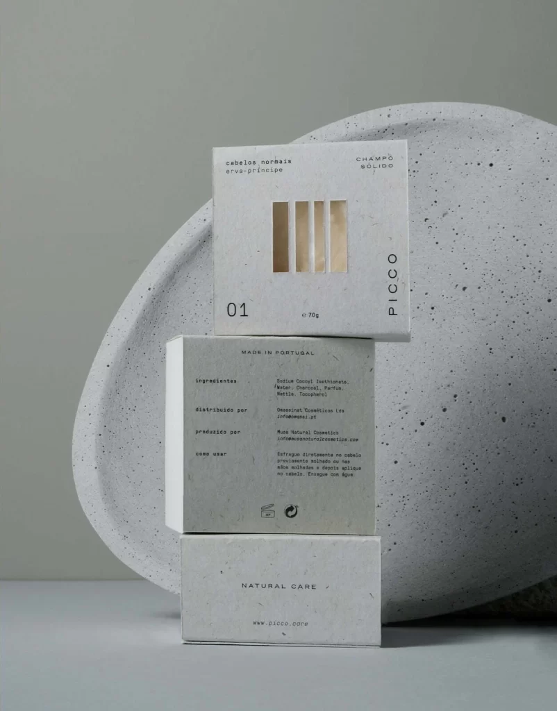
Three minimalist cardboard boxes stack in a staggered formation before a large, speckled concrete disc, set upon a muted sage backdrop. The top package features a translucent window revealing four pale bars alongside text reading 'cabelos normais' and 'CHAMPO SÓLIDO,' while the middle box displays detailed Portuguese ingredients and 'MADE IN PORTUGAL.' Soft, diffused lighting accentuates the raw textures of the unbleached paper and the porous concrete surface.

Visual interest stems from the deliberate interplay between industrial concrete and organic, seed-embedded cardboard textures. The vertical orientation of the brand name ‘PICCO’ creates a dynamic counterpoint to the horizontal layout of product information, while the die-cut window adds depth without compromising the monochromatic palette. Such restrained aesthetics rely on tactile qualities and precise typographic hierarchy rather than decorative elements to convey luxury and sustainability.
Art directors developing eco-conscious beauty brands will find this composition invaluable for planning photoshoots that emphasize material honesty. Packaging engineers can study how structural design supports brand storytelling through minimal ink usage and functional cut-outs. Additionally, stylists seeking to master neutral-toned product photography might analyze the balance between geometric packaging forms and organic background shapes to achieve similar sophisticated atmospheres.