Pink Background Blurred
Topics
Details
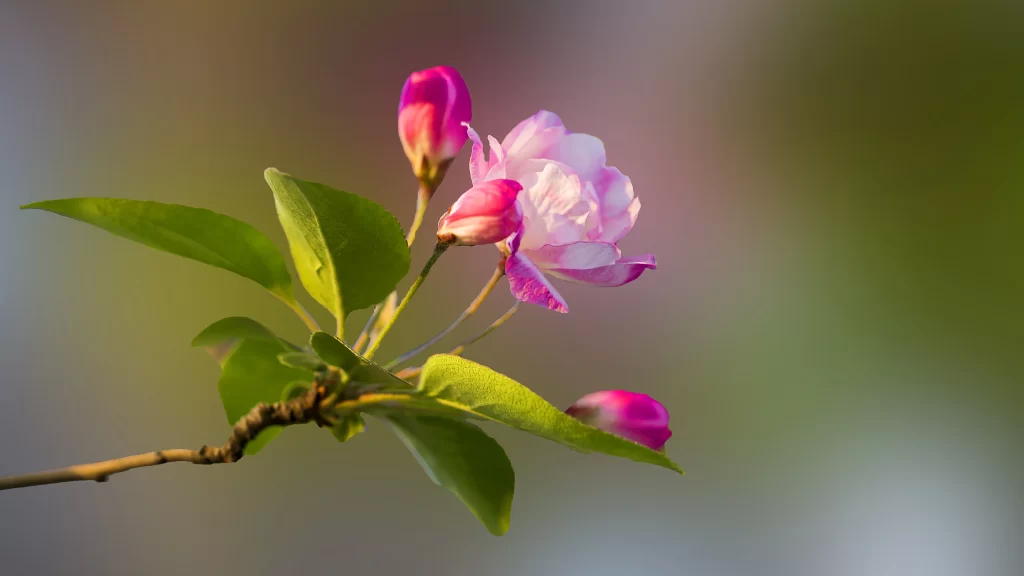
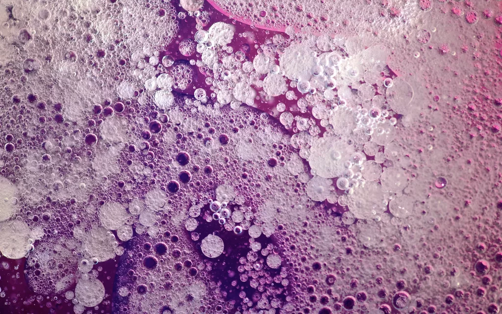
Soft pastel pinks and creamy whites bleed into one another across the frame, creating a hazy, atmospheric wash that suggests out-of-focus floral elements or diffused light. Faint green accents peek through the upper left quadrant, hinting at stems or leaves rendered as indistinct shapes beneath the blur. The composition favors negative space, with visual weight concentrated toward the edges while the center remains luminous and nearly colorless.
Visual interest derives from the deliberate loss of sharpness, which transforms potential botanical detail into pure chromatic texture and tonal gradation. The shallow depth-of-field effect produces a dreamlike quality where form dissolves into ambient color, making this background particularly effective for overlay work requiring minimal distraction. Subtle variations in saturation between the rose-tinted periphery and the pale central region create gentle depth without introducing competing focal points.
Social media managers might employ this as a canvas for quote graphics or announcement posts targeting beauty, wellness, or spring-themed campaigns. Presentation designers could layer translucent text boxes atop the gradient to maintain readability while preserving the soft aesthetic. Photographers seeking backdrops for product shots—especially cosmetics, fragrances, or delicate accessories—would find the muted palette complementary without overpowering foreground subjects.