Pink Gradient Background
Topics
Details
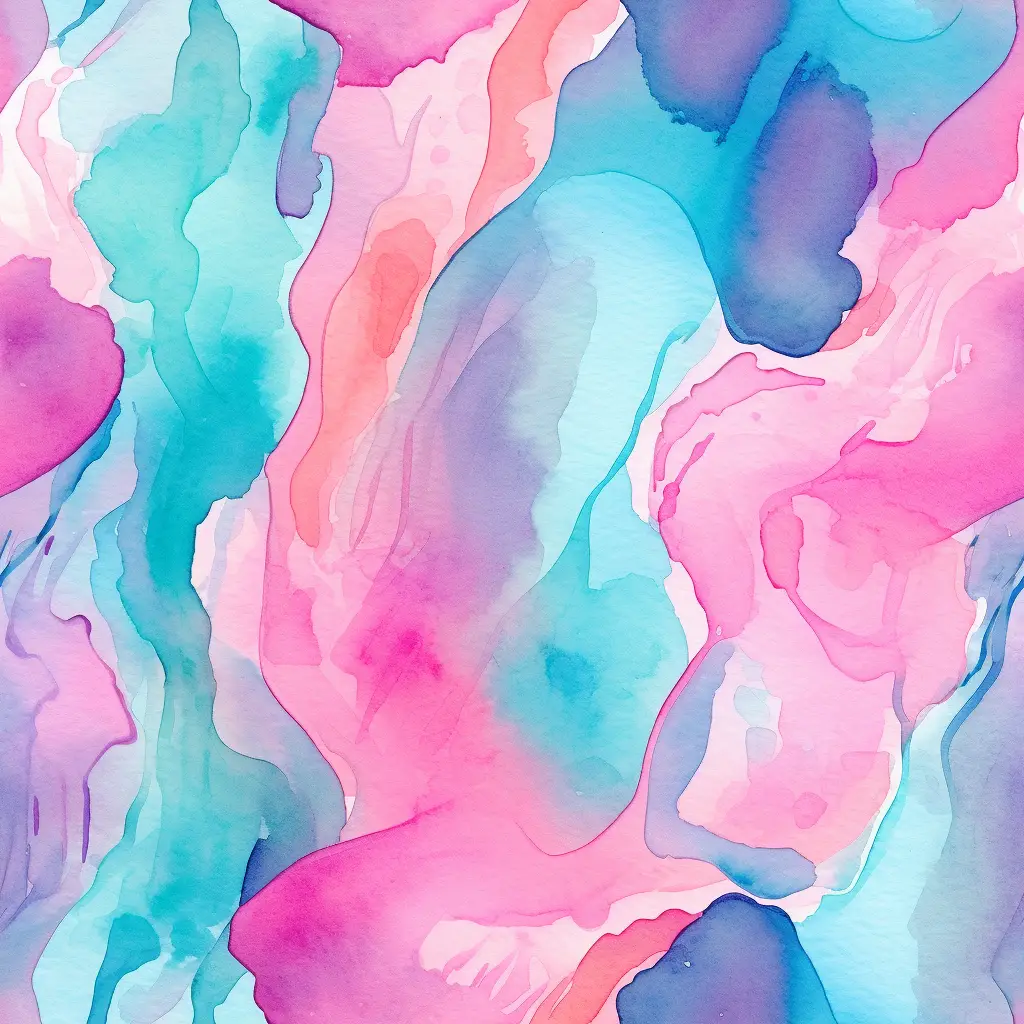
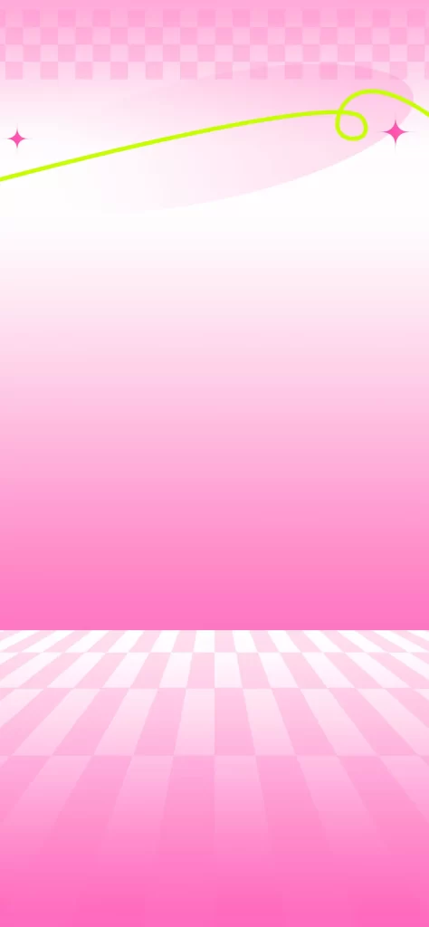
Horizontal striations of coral and rose pink drift across the upper half of the frame, softening into a pale cream that occupies the central expanse before dissolving into a gentle lavender haze at the bottom edge. The composition relies on these layered bands of color, each blurred at its boundaries to create smooth transitions between the warm pinks and the cooler violet tones. Subtle linear textures run parallel throughout the gradient, suggesting either a digital brushstroke technique or the faint impression of woven fabric caught in diffused light.
What distinguishes this particular arrangement is the deliberate asymmetry between the saturated upper region and the ethereal lower portion, creating a visual weight that draws the eye upward before allowing it to settle. The interplay of temperature—warm coral against cool lilac—generates depth without requiring any representational elements or geometric forms. Such restrained chromatic movement offers versatility that more complex patterns cannot match, functioning as both a statement and a neutral foundation depending on context.
Social media managers might deploy this as a backdrop for lifestyle content, where the soft palette complements photography without competing for attention. App developers seeking elegant onboarding screens would find the vertical color progression useful for guiding user focus from functional areas to interactive elements. Stationery designers could adapt the horizontal banding for wedding invitation suites or brand collateral that demands sophistication without ornamentation.