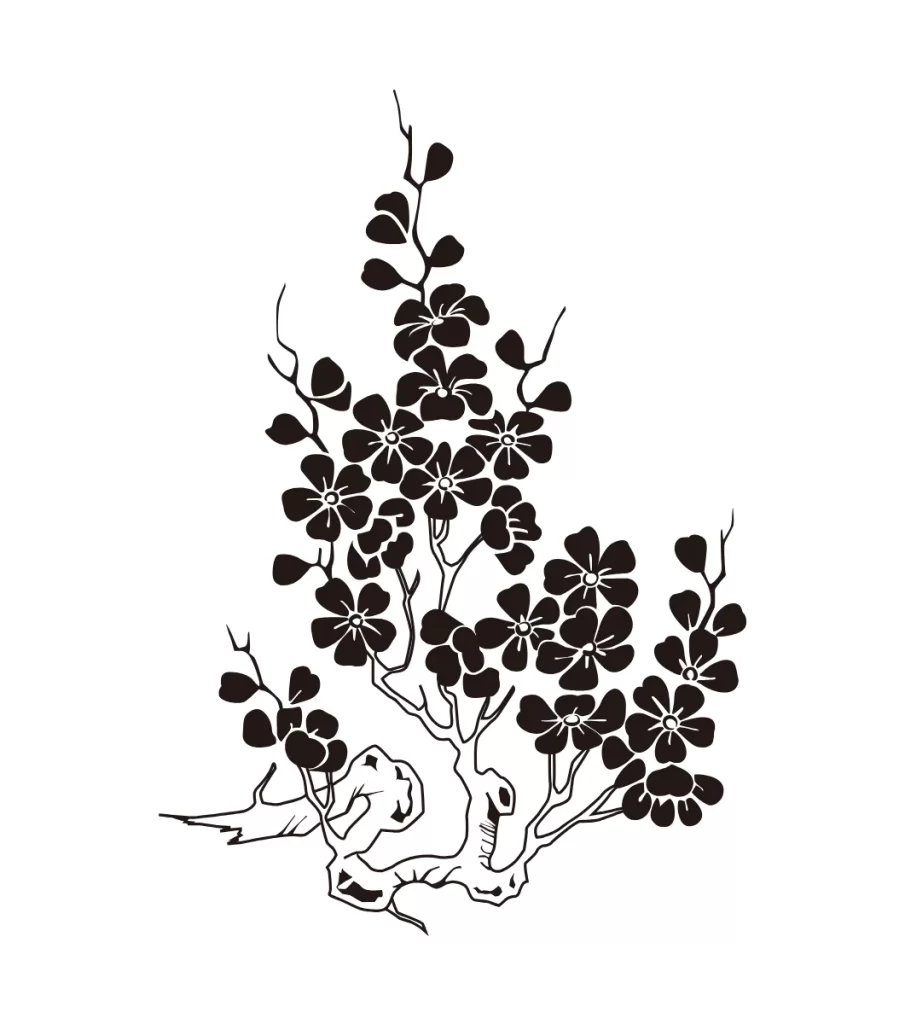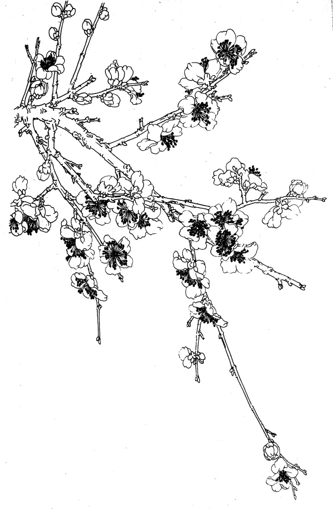
Plum Blossom Chinese Line Drawing Botanical Art
DownloadTopics
Details
A rectangular cardboard box with a pale yellow base and cream-colored front panel displays the Sanella brand name in bold blue serif lettering inside a golden tag shape. A red ribbon banner curves beneath the logo bearing the slogan 'Backen ist Liebe' (Baking is Love), while the right side features a bright yellow panel printed with 'Die Welt des Backens seit 1904' and a diagonal red 'NEU' badge. The central photography showcases a powdered sugar-dusted bundt cake with a sliced section revealing its airy crumb, positioned beside a savory quiche topped with cherry tomatoes and herbs, all captured from a three-quarter overhead perspective against a clean white void.
The packaging achieves visual distinction through its dual-category food presentation, pairing a sweet baked good with a savory tart to suggest product versatility beyond traditional cake baking. Warm yellow and red tones dominate the color palette, creating appetite appeal while the 'NEU' badge introduces urgency through high-contrast placement against the lighter background. Typography hierarchy effectively separates brand identity from heritage claims and novelty status, guiding the eye from the prominent logo to the supporting text elements.
Packaging designers studying European grocery aesthetics could analyze this layout for balancing multiple product applications within limited real estate. Food photographers might reference the lighting setup that eliminates harsh shadows while maintaining texture detail on both the porous cake surface and glossy tomato skins. Brand strategists evaluating legacy food brands could examine how historical dating ('seit 1904') integrates with contemporary 'new product' signaling without creating temporal dissonance.