Purina Farm to Flock Grower Blend Hen Food Packaging
Topics
Details
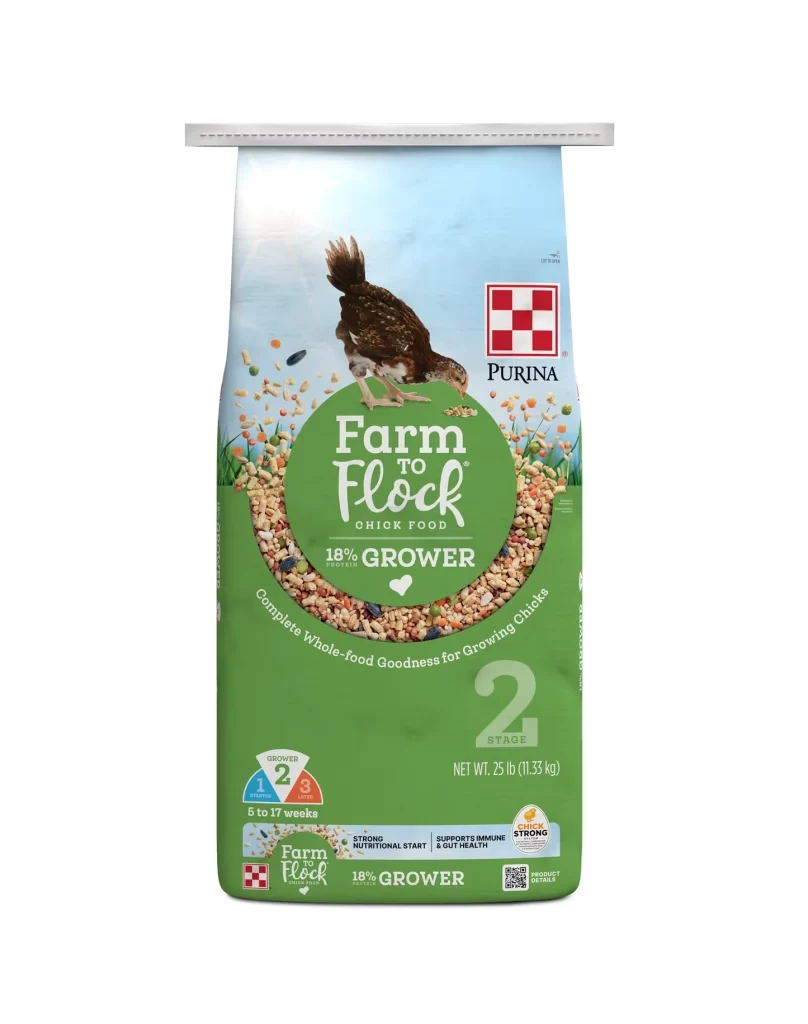
Dominating the frame is a vertical, gusseted bag of Purina Farm to Flock 18% Grower chick food, set against a sterile white void that isolates the subject for clear inspection. The packaging utilizes a vibrant green base color that transitions into a soft blue sky at the top, where a realistic illustration of a brown and white speckled chick is captured mid-peck. Central to the composition is a large circular graphic filled with textured grain imagery, housing the product title in a clean, white serif font, while the iconic red and white Purina checkerboard logo anchors the upper right quadrant.
Visual hierarchy is established through the strategic use of scale and color blocking, specifically the oversized '2 STAGE' numeral which immediately signals the product's lifecycle positioning. The design integrates informational density without clutter by employing distinct iconography—such as the segmented blue and orange circle indicating the 5 to 17-week growth window—alongside functional claims like 'Strong Nutritional Start.' This specific iteration balances agricultural authenticity with modern branding cues, utilizing the circular motif of scattered seeds to create a sense of organic abundance and whole-food quality.
Brand strategists and packaging engineers would examine this artifact to understand how color psychology is applied within the competitive animal nutrition sector, particularly the use of green to signify health and growth. Marketing teams could deconstruct the typographic choices to see how technical specifications are made accessible to lay consumers through visual shorthand. Furthermore, illustrators studying commercial realism would find value in the rendering of the avian subject and the textural representation of the feed blend as a benchmark for product photography standards.