Qingyou Design Sake Bottle View
Topics
Details
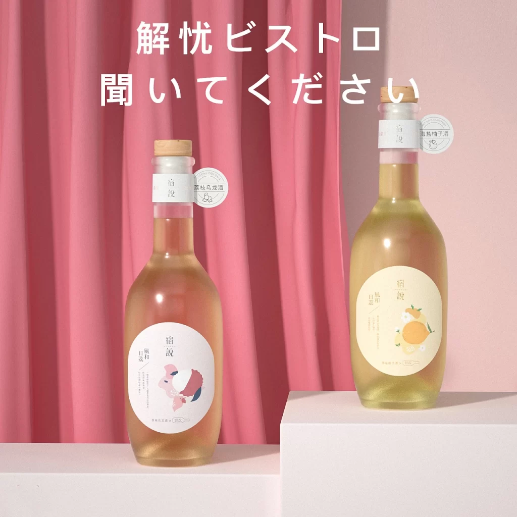
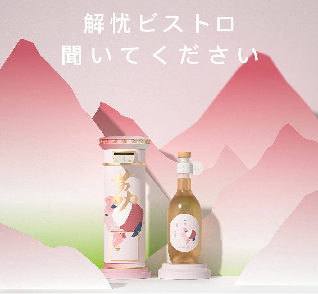
Set against a soft, pastel gradient of pink and green, two sake-related objects sit on a clean white surface. To the left stands a tall, cylindrical container resembling a vintage postbox, finished in white with gold trim and pink accents at the base and top rim. Beside it rests a clear glass bottle filled with golden liquid and sealed with a cork stopper, both items featuring whimsical illustrations of a stylized animal in shades of pink and blue. Japanese characters in gold and black are printed on the packaging, while bold white text reading '解憂ビストロ 聞いてください' floats above the scene against a backdrop of layered, paper-cut style mountains.
What makes this composition particularly striking is the playful fusion of traditional beverage packaging with nostalgic postal aesthetics. The postbox-shaped container serves as an unconventional gift box that immediately draws the eye through its unique silhouette and metallic detailing. Soft, diffused lighting enhances the gentle color palette, creating a dreamy atmosphere that feels both modern and comforting. This approach transforms a standard product shot into a miniature narrative scene, using the mountain silhouettes to add depth without overwhelming the central subjects.
Brand strategists might study this layout to understand how to create emotional connections through color psychology and unexpected form factors. Packaging designers could reference the way the illustration style bridges the gap between the outer container and the inner bottle label for cohesive branding. Art directors planning lifestyle photography sessions would benefit from analyzing how simple geometric background shapes can provide context while keeping focus on the product itself.