Qingyou Design Sake Bottle
Topics
Details
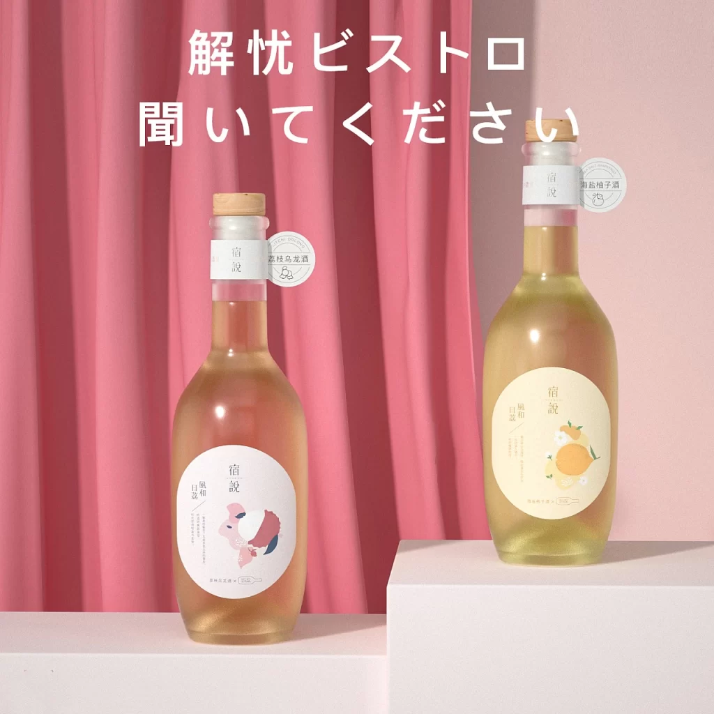
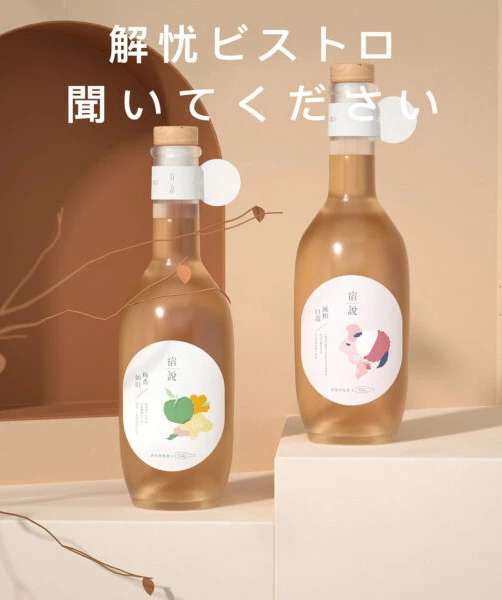
Set against a backdrop of warm, earthy beige tones, two glass bottles of sake rest on staggered white platforms, bathed in soft, diffused light that highlights the translucent amber liquid within. Each vessel is sealed with a natural cork and features a minimalist white circular label adorned with delicate, watercolor-style illustrations of fruit—one showcasing a green pear and yellow citrus, the other a pink peach. Bold Japanese characters float above the composition, reading '解憂ビストロ 聞いてください' (Jieyou Bistro, Please Listen), while thin, dried branches with sparse leaves weave through the foreground, adding an organic, tactile layer to the serene scene.
Visual distinction emerges from the harmonious blend of traditional craftsmanship and modern graphic sensibility, where the rustic texture of the cork meets the clean, geometric precision of the typography. The color palette—dominated by sandy neutrals, pale golds, and muted botanical hues—evokes a sense of calm sophistication that feels both contemporary and deeply rooted in cultural aesthetics. Subtle details, such as the slight variation in label art and the gentle shadows cast by the curved glass, transform a simple product shot into a curated narrative about sensory experience and mindful consumption.
Art directors crafting campaigns for artisanal beverages or wellness brands will find the compositional balance and lighting techniques invaluable for mood-board development. Packaging designers can study the interplay between illustrative elements and negative space to inform their own label layouts for premium goods. Furthermore, photographers specializing in still-life or lifestyle imagery might utilize this as a benchmark for arranging props to achieve a similarly airy, editorial atmosphere in their own studio setups.