Real Handful Fruit Nut Choc Mix Mint Choc Chipper
Topics
Details
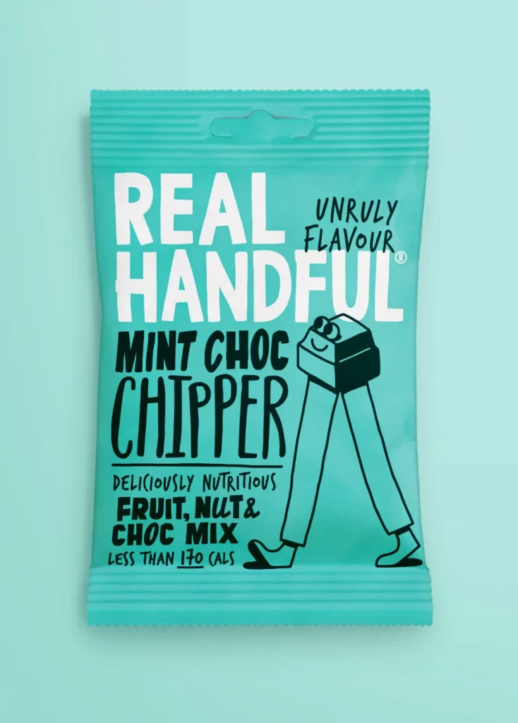
A turquoise foil snack pouch features bold white and black typography reading 'REAL HANDFUL' above 'MINT CHOC CHIPPER' in a hand-drawn sans-serif style. The packaging displays a whimsical line-drawn character with a rectangular chocolate-mint head, stick legs, and simple shoes walking toward the right edge. Smaller text indicates 'DELICIOUSLY NUTRITIOUS FRUIT, NUT & CHOC MIX' and 'LESS THAN 170 CALS', while the upper right corner carries the 'UNRULY FLAVOUR' trademark. The bag sits on a matching cyan surface under even studio lighting that eliminates harsh shadows.
Visual distinction emerges from the playful anthropomorphic mascot that transforms a standard snack package into a character-driven brand asset. High-contrast black linework against the vibrant teal background creates immediate legibility while the irregular, slightly wobbly letterforms convey an artisanal, approachable personality. This specific variant uses color psychology effectively—the cool mint tone reinforces the flavor profile before consumers read any descriptive copy.
Brand strategists might analyze this composition when developing snack-food identity systems requiring mascot integration without cluttering nutritional information. Packaging engineers could reference the seal-top construction and vertical text hierarchy for similar single-serve formats. Illustrators studying commercial character design would benefit from examining how minimal line weight conveys movement and emotion within tight product-label constraints.