Rice Stick Cardinal Packaging Multicolored Modern
DownloadTopics
Details
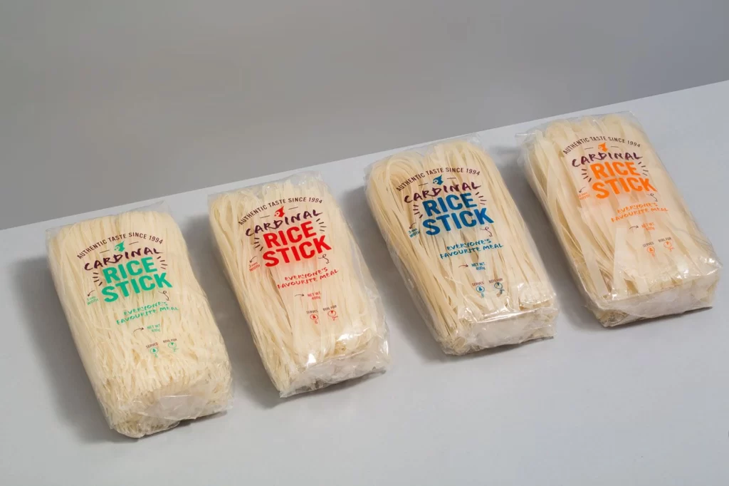
Four rectangular blocks of dried rice noodles sit in a diagonal row, each sealed in clear plastic that reveals the pale, bundled strands inside. The packaging features the brand name "Cardinal Rice Stick" in bold, hand-drawn lettering, with each of the four bags displaying a different accent color—teal, red, blue, and orange—for the main product title. Soft, diffused lighting casts gentle shadows beneath the packages on a light gray surface, while a slightly darker gray wall forms the backdrop, creating a clean but not sterile studio environment.
The visual distinction here lies in the playful typographic hierarchy and the strategic use of color coding across an otherwise uniform product line. By varying the hue of the central text while keeping the black brand identifier consistent, the design creates immediate shelf differentiation without altering the fundamental package structure or material. This approach demonstrates how minimal graphic changes can effectively distinguish SKUs within a single brand family. Designers studying this composition can access the full-resolution file at no cost to examine the finer details of the print finish and color application.
Packaging engineers and brand identity specialists would consult this reference when developing systems for product variant differentiation in food retail contexts. The image serves as a concrete example for art directors planning photoshoots involving translucent packaging materials and stacked product arrangements. Students of commercial photography might also analyze the lighting setup to understand how to minimize glare on glossy plastic surfaces while maintaining text legibility.