Title

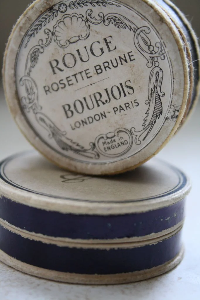
Rouge Rosette Bourjois London Paris Vintage Makeup Box Design


Topics

CosmeticsMakeup BoxVintage Packaging

Details

Uploaded user: Leo

A circular vintage makeup tin sits atop a stacked pair of similar containers, its cream-colored lid displaying the text 'ROUGE ROSETTE BRUNE' and 'BOURJOIS LONDON-PARIS' in a classic serif typeface. Ornate black line art frames the typography, featuring a shell motif at the top, scrolling leaf patterns along the sides, and a small 'Made in ENGLAND' stamp nestled within the lower decoration. The composition captures the object from a slightly elevated angle, revealing the aged, fibrous texture of the cardboard edges and the deep navy blue band encircling the base containers beneath.

The visual appeal of this piece lies in its sophisticated typographic hierarchy and the delicate contrast between the off-white background and the crisp black ink illustrations. Unlike modern packaging that often relies on bold color blocks, this design utilizes negative space and intricate filigree to convey luxury and heritage. The specific combination of French branding with English manufacturing marks creates a fascinating historical narrative that is reflected in the elegant, almost architectural quality of the decorative borders.

Historical fiction authors or period drama set designers might study the specific font choices and ornamental flourishes to accurately recreate early 20th-century cosmetic aesthetics. Illustrators working on retro-themed branding projects could analyze the balance between the central text and the surrounding botanical motifs to inform their own layout compositions. Even prop makers constructing authentic-looking vanity sets for film or theater would find the specific shade of navy blue and the worn texture of the paper edges invaluable for achieving the correct patina of age.