Royal Canin Dog Food Crown Jewels
Topics
Details
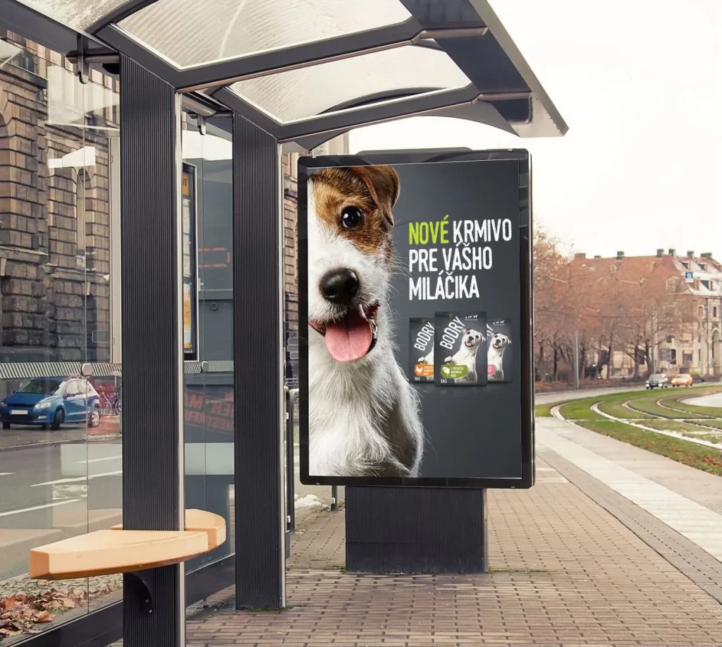
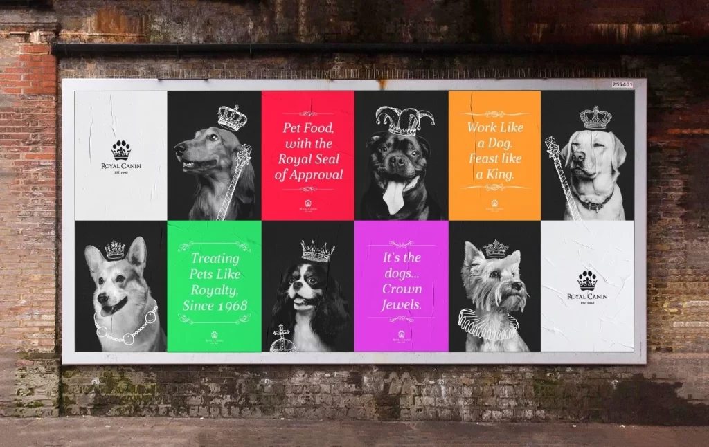
A large rectangular billboard with a silver metal frame displays a ten-panel grid mounted on an aged brick wall with visible mortar lines and rusted pipes above. The composition alternates between monochrome dog portraits and saturated color blocks—crimson red, bright orange, lime green, and magenta pink—each containing white serif text. Six different canine breeds appear in black-and-white photography, adorned with crowns, scepters, and jeweled collars, while the Royal Canin paw-print logo occupies two white panels at opposite corners.
Visual interest stems from the deliberate rhythm between photographic realism and flat color fields, creating a checkerboard effect that guides the eye across the advertising narrative. The typographic choices mix elegant script flourishes with bold sans-serif statements, while the regal accessories on each dog reinforce the brand's aristocratic positioning without cluttering the layout. This particular execution balances luxury branding cues with accessible pet imagery through its structured grid system and high-contrast palette.
Advertising art directors might study this layout to understand how modular grid systems can accommodate both portraiture and copy-heavy panels within a single campaign. Brand strategists could reference the color-coded messaging approach when developing visual identity systems that require flexible template structures. Print production teams would find value in examining how metallic framing interacts with weathered architectural surfaces for outdoor installation mockups.