Sandra G Desil Kefir & Lime Ice Cream Tube
Topics
Details
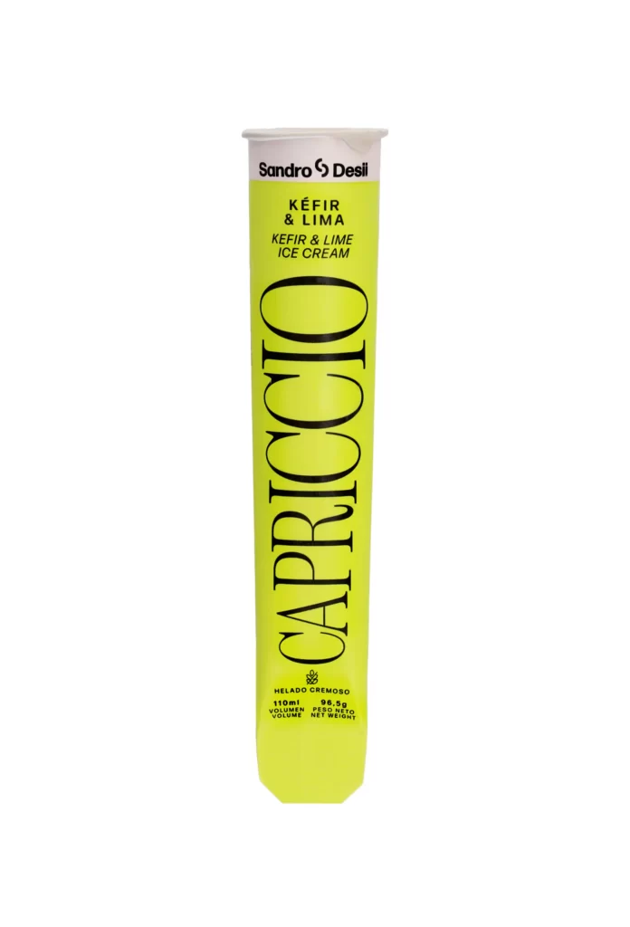
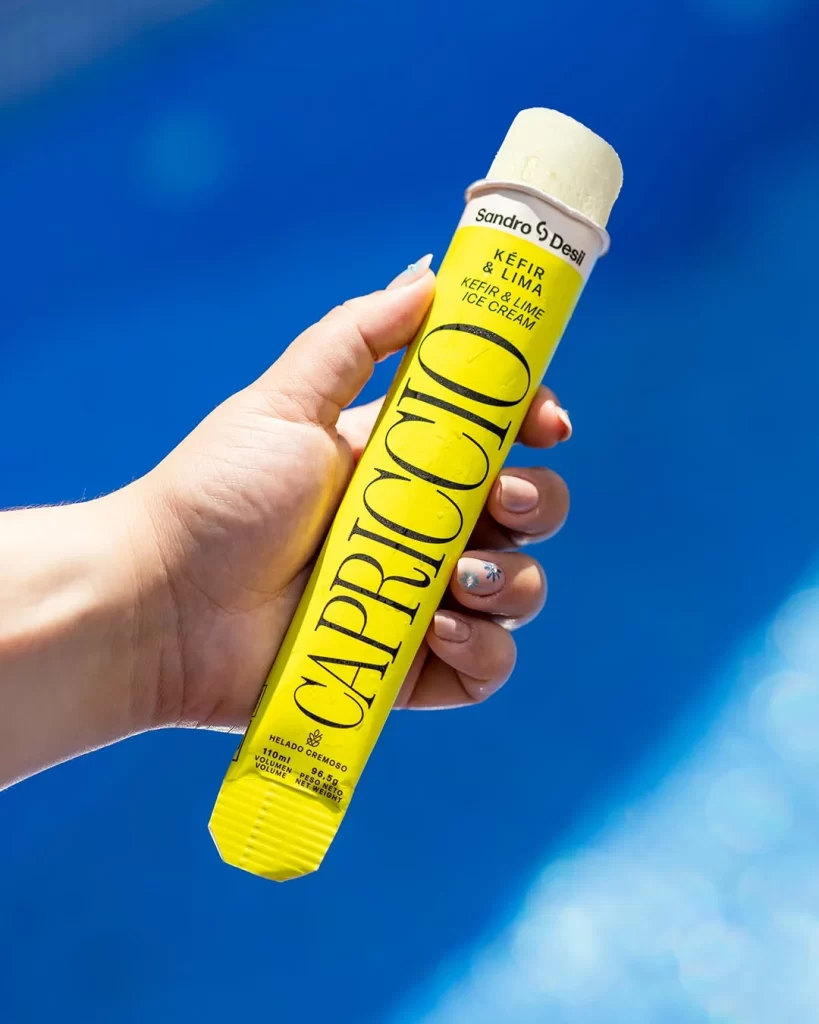
Against a saturated azure backdrop suggesting a sunlit pool, a hand grips a vibrant canary-yellow ice cream tube diagonally across the frame. The cylindrical cardboard packaging features bold, black serif typography spelling 'CAPRICCIO' vertically along its length, with 'Sandro & Desil' and 'KEFIR & LIMA ICE CREAM' printed in smaller text near the white plastic cap. Natural daylight illuminates the scene from the upper right, casting soft shadows that emphasize the texture of the skin and the matte finish of the tube's ribbed base.
Visual distinction emerges from the striking contrast between the electric yellow substrate and the elegant black lettering, creating immediate legibility despite the product's slender form factor. The collaboration branding occupies minimal real estate at the crown, allowing the flavor designation and primary brand name to dominate the visual hierarchy. Subtle details like the manicured nails with pale polish and the exposed frozen dessert at the top add tactile authenticity to the commercial presentation.
Packaging designers studying color theory applications in frozen confectionery marketing would find this composition particularly instructive for understanding how high-chroma backgrounds influence product perception. Photographers documenting consumer goods might reference the hand-positioning technique to achieve natural scale indication without artificial staging. Brand strategists analyzing premium positioning within the kefir category could examine how minimalist typography communicates artisanal quality cues effectively.