Shiseido White Lucent Luminizing Infuser Bottle Packaging
Topics
Details
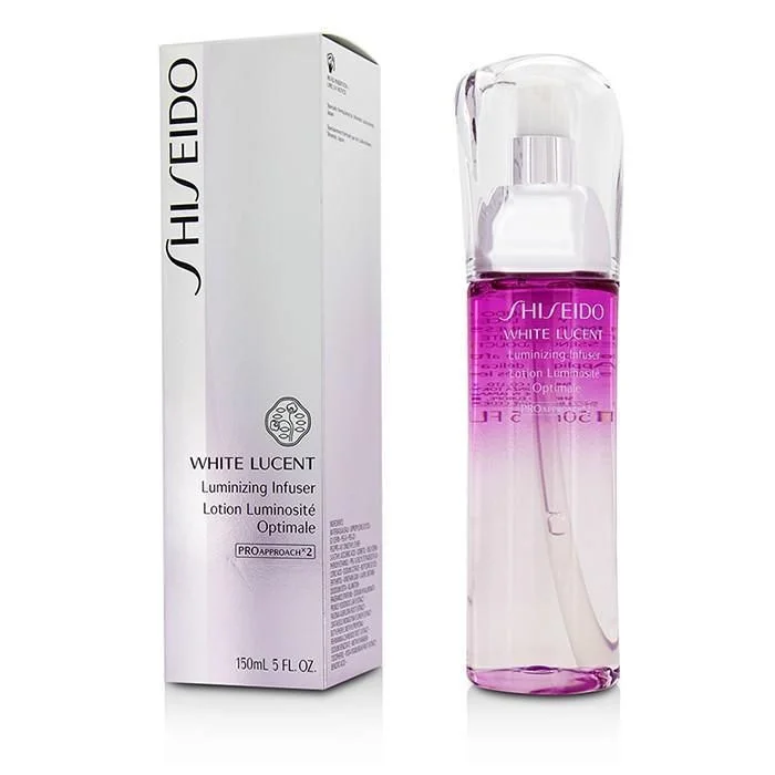
A tall, rectangular Shiseido box stands to the left of a clear, cylindrical bottle containing a vibrant magenta liquid that fades into clear at the base. The packaging features the brand name in bold black vertical lettering, while the bottle displays 'WHITE LUCENT' and 'Luminizing Infuser' in white and purple text beneath a transparent pump cap. Both items rest on a reflective surface with soft studio lighting that creates subtle shadows and highlights the glossy finish of the materials.
The gradient effect inside the glass container creates an immediate visual focal point, drawing attention to the product's color-shifting properties. Typography hierarchy is clearly established through varying font weights and sizes, with the French translation 'Lotion Luminosité Optimale' adding international appeal. The combination of the opaque white carton alongside the transparent vessel offers a study in contrasting material textures and how light interacts differently with each surface.
Product photographers can utilize this composition to understand standard cosmetic staging techniques, particularly the placement of secondary packaging alongside the primary container. Packaging designers might examine the balance between minimalism and informational density required for luxury skincare branding. Marketing teams could reference the color psychology of the purple-to-clear transition when developing visual assets for brightening or anti-aging product lines.