Skincare Lotion White Gold Elegant Minimalist Design
Topics
Details
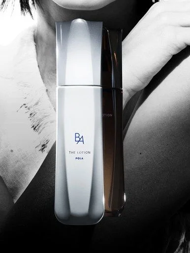
A tall, frosted white bottle with a sleek, angular silhouette stands as the central focal point, its surface catching light to reveal subtle vertical ridges and a cool, metallic sheen. The minimalist label features the stylized 'BA' monogram above the text 'THE LOTION' and 'POLA', rendered in a clean, dark sans-serif typeface that contrasts sharply with the pale container. Behind this primary vessel, a second, darker bottle in deep amber or black glass is partially obscured, while a monochromatic human figure with visible skin texture provides an organic backdrop, all illuminated by dramatic, high-contrast lighting that emphasizes form and materiality.
Visual interest derives from the sophisticated interplay between the opaque, matte finish of the foreground container and the translucent, warm-toned glass of the background element, creating a layered depth rarely seen in standard product photography. The architectural geometry of the bottle's shoulders and cap introduces a sculptural quality that elevates the object beyond mere packaging into a piece of industrial design. Furthermore, the deliberate use of grayscale for the human element focuses attention entirely on the product's refined color palette and tactile qualities, demonstrating how selective desaturation can enhance luxury branding.
Art directors developing campaigns for high-end cosmetic brands would utilize this composition to study effective methods for juxtaposing multiple SKUs within a single frame without visual clutter. Packaging engineers might analyze the specific curvature and ergonomic implications of the bottle's profile when designing similar dispensing systems for premium liquids. Additionally, photographers specializing in beauty editorial work could reference the lighting ratios and shadow placement to replicate this specific mood of understated opulence in their own studio setups.