Snack Mix Yellow Natural Beachy Packaging Design
Topics
Details
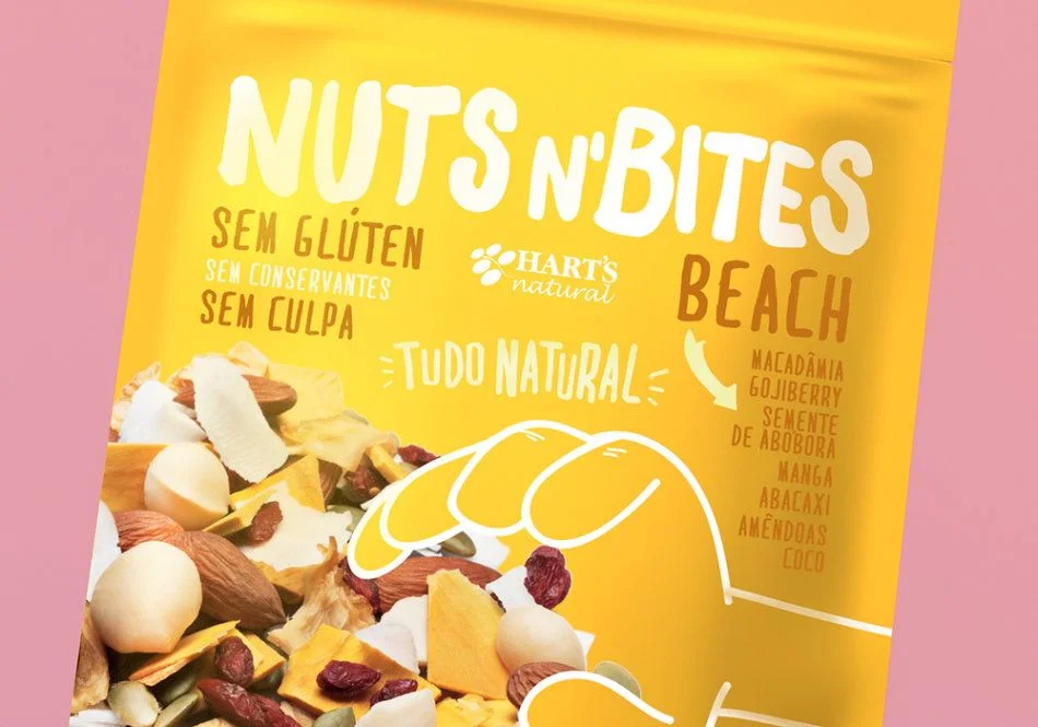
A vibrant canary-yellow flexible pouch dominates the frame, displaying the brand name 'NUTS N'BITES' in bold, rounded white lettering across the upper portion. Below the main title, Portuguese text declares the product is free from gluten, preservatives, and guilt, while the HART'S natural logo sits centrally between these claims and the flavor designation 'BEACH' in brown capitals. The lower half features a photographic spread of macadamia nuts, coconut flakes, dried mango, goji berries, pumpkin seeds, and other ingredients, partially obscured by a white line-art illustration of a hand reaching toward the mix, all set against a soft pink backdrop that frames the package edges.
Visual hierarchy relies on typographic contrast between the oversized white brand name and smaller brown functional claims, creating immediate readability while maintaining a playful, organic aesthetic. The hand-drawn graphic element introduces a human scale and tactile invitation that bridges the gap between the realistic food photography and the flat color fields of the packaging design. Color psychology leverages the energetic yellow to suggest sunshine and vitality, directly reinforcing the beach theme listed in the ingredient callout which includes tropical components like mango, coconut, and abacaxi.
Brand strategists developing health-conscious snack lines might study this layout to understand how to balance nutritional claims with appetizing visual elements without cluttering the composition. Packaging engineers could analyze the placement of multilingual text and iconography to optimize shelf appeal for bilingual markets requiring clear dietary information. Food photographers may reference the lighting techniques used here to highlight varied textures from glossy nuts to matte dried fruits within a single cohesive shot.