SPARTANI Edition Box
Topics
Details
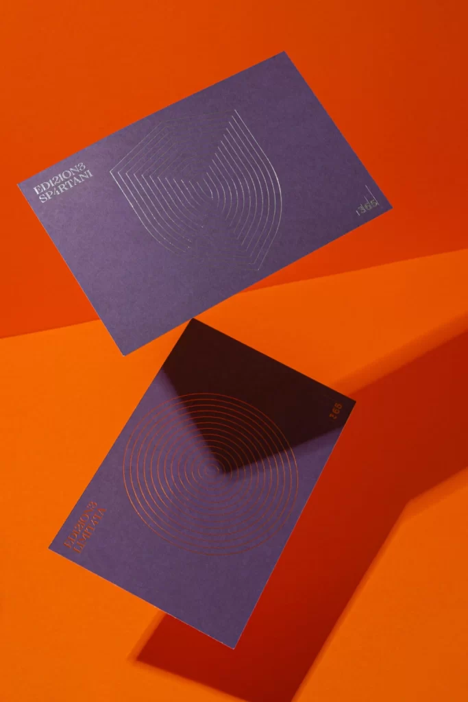
Against a vibrant orange backdrop, two deep violet cards float in a dynamic diagonal arrangement, casting sharp shadows that emphasize their physical presence. The upper card displays the text 'EDIZIONI SPARTANI' in crisp white lettering alongside an intricate, shield-like pattern of concentric lines embossed in a subtle metallic finish. Below it, a second card mirrors this aesthetic with circular radiating lines and rotated typography, all captured from a slightly elevated perspective that highlights the rich texture of the paper stock.
Visual interest stems from the sophisticated interplay between the bold complementary color palette and the precise geometric linework that adorns each surface. The tactile quality of the materials suggests premium production values, where the foil-stamped patterns catch light differently depending on the viewing angle. Such careful attention to typographic hierarchy and spatial balance transforms simple stationery into a cohesive visual system that feels both modern and timeless.
Art directors seeking to pitch luxury packaging concepts will find concrete value in studying how these elements combine to convey exclusivity and craftsmanship. Print designers can analyze the specific way shadows interact with the card edges to better understand three-dimensional mockup photography for their own portfolio presentations. Anyone developing brand identity systems for cultural institutions or high-end publishers should examine how minimal graphic motifs can carry significant visual weight when executed with such restraint.