Spring-Themed Soap With Floral Design Box
Topics
Details
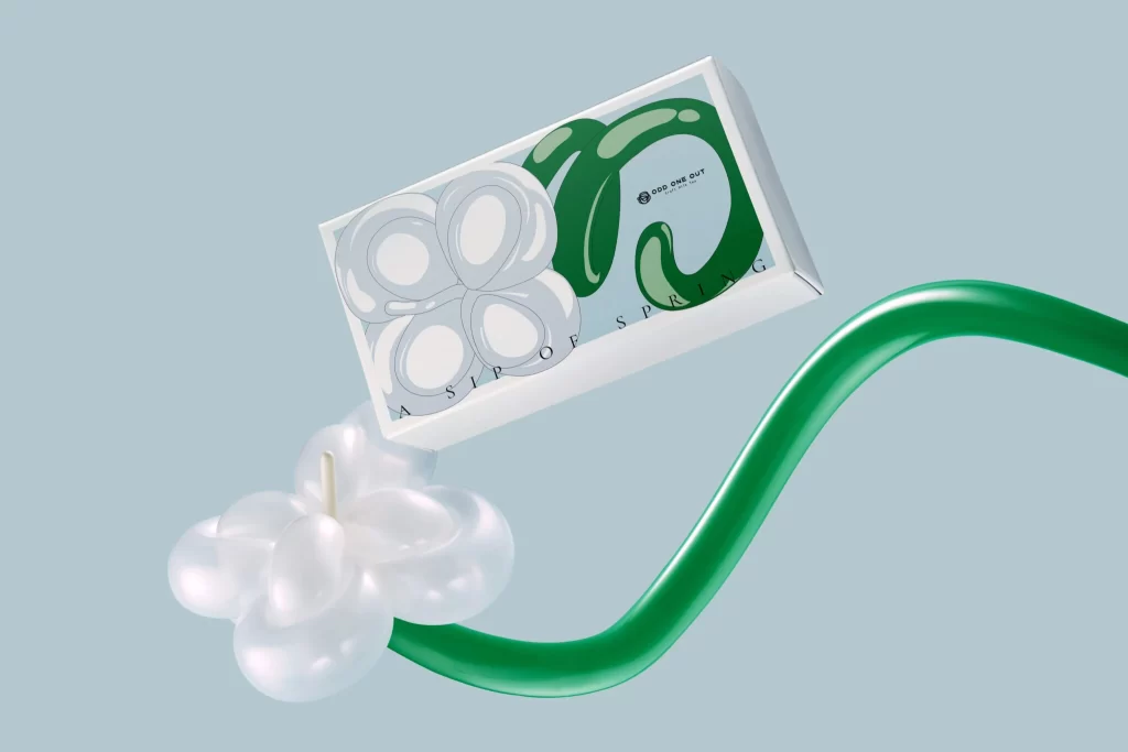
Against a pale mint background, a rectangular white box floats at an angle, displaying bold green and silver lettering alongside the phrase 'A SIP OF SPRING' in spaced capitals. Below the packaging, a translucent white flower-shaped object with a visible wick sits beside a glossy, curved green tube that sweeps across the lower right. Soft, even lighting eliminates harsh shadows, while the camera maintains a slightly elevated perspective that emphasizes the three-dimensional forms of all three elements.
The visual distinction lies in the interplay between the matte paper texture of the box and the high-gloss plasticity of the floral candle and the sinuous green form. Typography on the packaging uses inflated, balloon-like letterforms that echo the organic curves found throughout the composition. This cohesive approach to material finishes—ranging from frosted translucency to deep emerald sheen—creates a unified seasonal aesthetic that feels both playful and premium.
Product photographers might study the arrangement to understand how to stage multiple components without cluttering the frame. Packaging designers could analyze how the oversized typography interacts with negative space to create visual hierarchy. Art directors working on beauty or lifestyle campaigns would find this useful for planning color palettes that balance pastel backgrounds with saturated accent tones.