Title

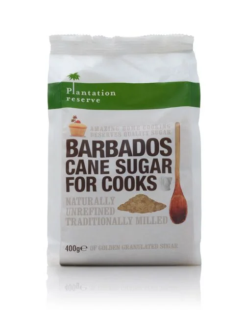
Sugar Bag White Green Natural Unrefined Design


Topics

No Topics

Details

Uploaded user: Leo

A matte white paper pouch with a crimped top seal stands as the central subject, featuring a bold emerald green horizontal band across its upper third that contains the brand name 'Plantation reserve' in white sans-serif type. Below this stripe, the product title 'BARBADOS CANE SUGAR FOR COOKS' dominates the visual field in heavy dark brown capital letters, flanked by a small cupcake illustration on the left and a vertical wooden spoon graphic on the right. A mound of golden-brown granulated sugar sits near the bottom center of the bag, while the weight indication '400g' and the phrase 'GOLDEN GRANULATED SUGAR' anchor the lower portion in smaller grey typography.

Visual interest emerges from the deliberate contrast between the crisp white packaging substrate and the saturated green accent color, which immediately draws the eye to the brand identity before guiding it downward through the typographic hierarchy. The inclusion of photographic elements—specifically the textured sugar pile and the realistically rendered wooden spoon—adds tactile dimension to an otherwise flat graphic layout, bridging the gap between industrial packaging design and artisanal food photography. This particular composition balances commercial clarity with organic warmth, utilizing the spoon's verticality to create a strong linear element that counterbalances the horizontal text blocks.
Packaging designers studying grocery retail aesthetics would find value in analyzing how the color blocking technique separates brand equity from product information without cluttering the visual field. Food photographers might reference the lighting setup and shadow placement when shooting similar dry goods, noting how the soft reflections beneath the bag suggest a controlled studio environment with diffused overhead sources. Illustrators working on culinary branding projects could examine the integration of vector graphics with photographic assets, particularly how the cupcake icon and spoon image complement rather than compete with the primary typography.