Sugar Free Cake Minimalist Brown Japanese
Topics
Details
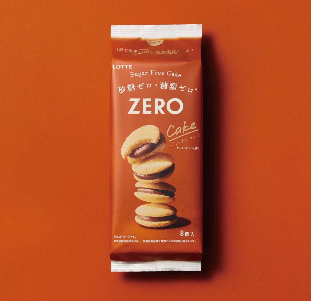
A vertical brown package of Lotte Sugar Free Cake stands against a solid burnt-orange backdrop, its surface catching soft, even light that highlights the matte texture of the wrapper. The packaging features bold white typography with the word ZERO dominating the center, while Japanese text reading 砂糖ゼロ・糖類ゼロ arches above it in a clean sans-serif font. Below the main branding, a stack of five sandwich cookies filled with dark chocolate cream leans slightly to the left, their golden-brown biscuit surfaces contrasting sharply with the deep reddish-brown background.
The visual strength lies in the monochromatic harmony between the chocolate-toned package and the warm orange environment, creating a sophisticated yet appetizing aesthetic. Typography plays a crucial role here, mixing English and Japanese characters with varying weights to establish a clear hierarchy that guides the eye from the brand name down to the product photography. The minimalist approach strips away unnecessary decorative elements, allowing the rich color palette and crisp text rendering to communicate the sugar-free health positioning without clutter.
Packaging designers studying Japanese confectionery trends would find this composition valuable for understanding how limited color palettes can convey premium quality. Food photographers might reference the lighting setup and cookie stacking arrangement when planning shoots for similar sandwich-style baked goods. Brand strategists could analyze the bilingual typography layout to inform their own cross-market product labeling decisions.