Sugarless Chocolate Geometric Patterns Colorful
DownloadTopics
Details
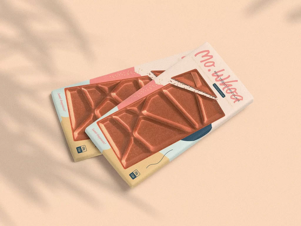
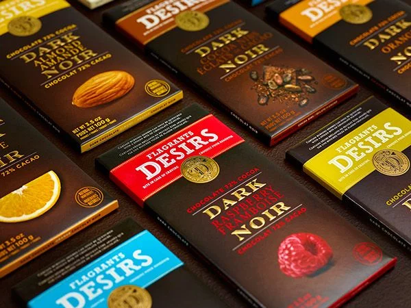
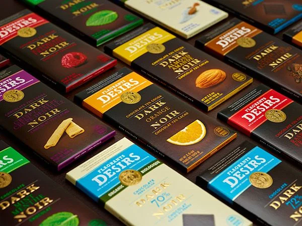
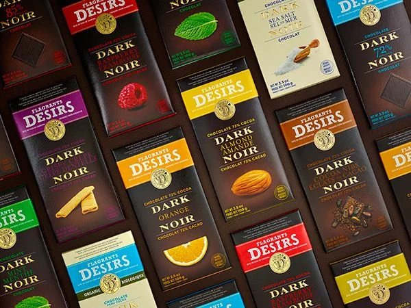
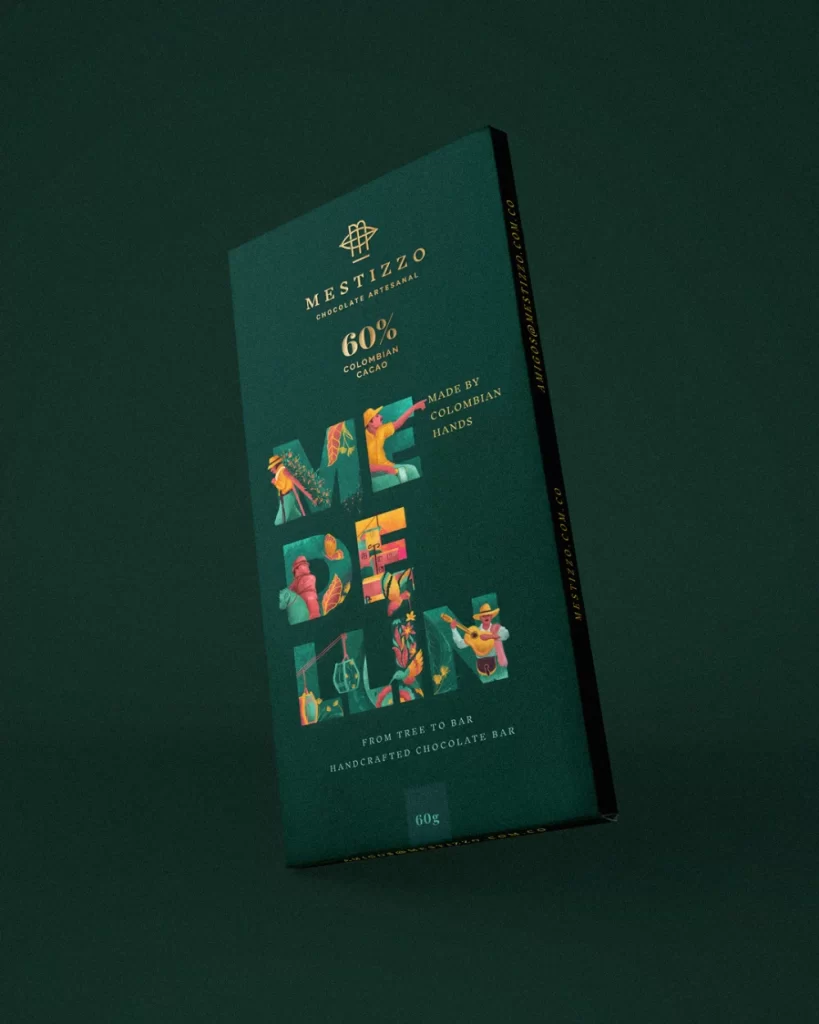
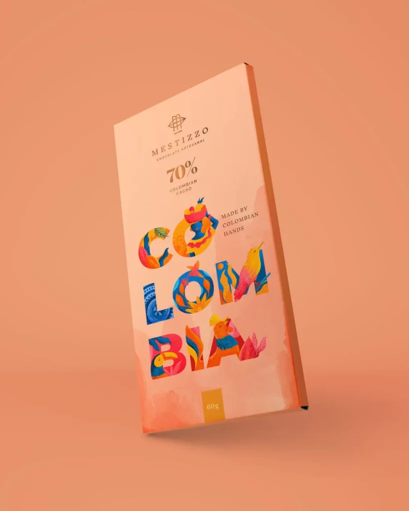
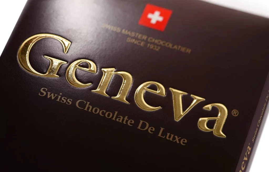
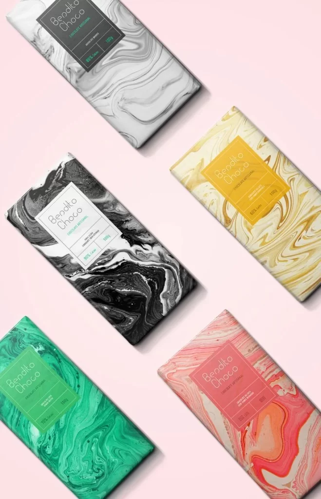
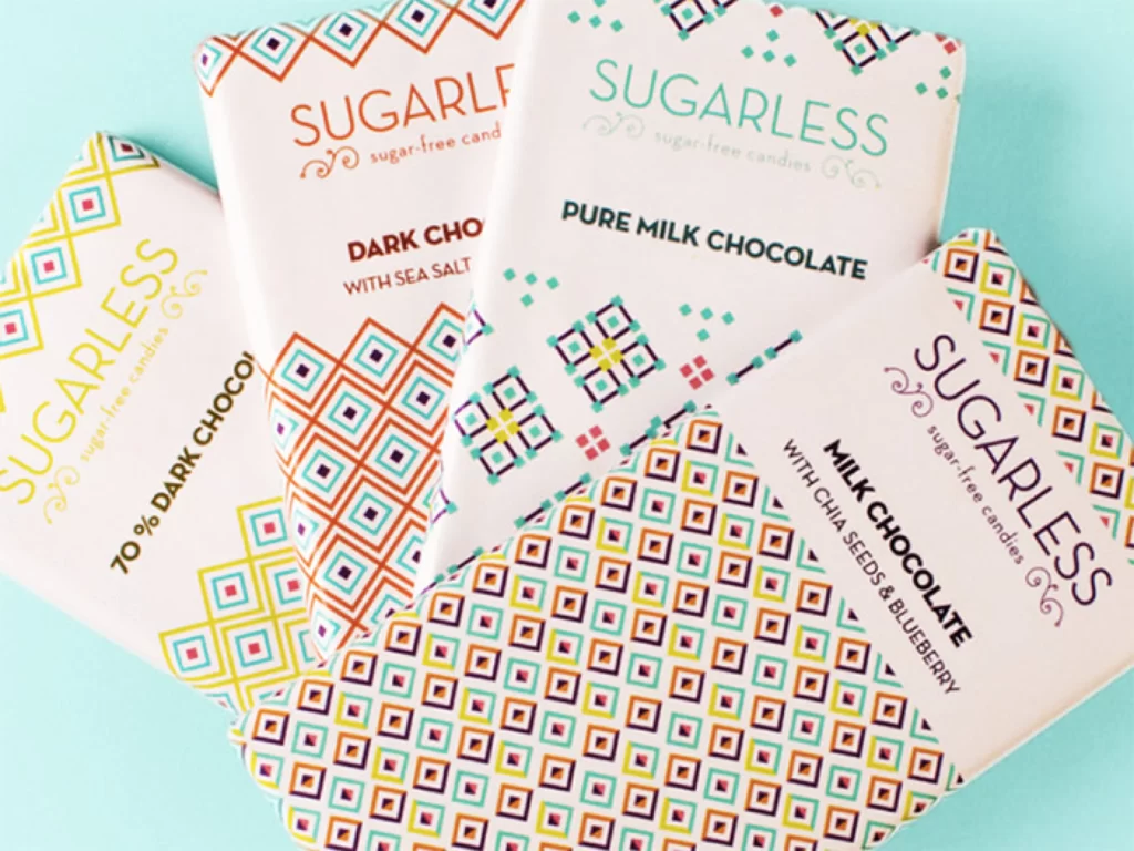
Four rectangular chocolate bars lie scattered across a solid mint-blue surface, each wrapped in white paper decorated with intricate geometric motifs. The packaging features repeating diamond and square patterns rendered in vibrant shades of orange, teal, yellow, and deep purple, with the brand name 'SUGARLESS' printed in varying typographic styles above flavor descriptions like '70% DARK CHOCOLATE,' 'PURE MILK CHOCOLATE,' and 'MILK CHOCOLATE WITH CHIA SEEDS & BLUEBERRY.' Soft, even lighting illuminates the scene from a slightly elevated angle, revealing crisp text details and the tactile quality of the paper wrappers.
What distinguishes this particular arrangement is the clever use of ethnic-inspired tessellations that transform standard confectionery packaging into a piece of modern graphic art. Each bar employs a unique color palette within its geometric grid system, creating visual rhythm while maintaining brand cohesion through consistent typography placement. The interplay between bold sans-serif flavor labels and delicate decorative borders demonstrates how pattern density can guide the viewer's eye across a product surface.
Packaging designers studying color theory applications in food branding would find these variations particularly useful for understanding how identical layouts adapt to different hue combinations. Brand identity specialists might reference the way ornamental borders frame essential product information without overwhelming legibility. Anyone needing detailed texture samples for mood board creation can grab the full-resolution file at no cost directly from the resource section.