Sunscreen Lotions With Different Spf Levels Tube View
Topics
Details
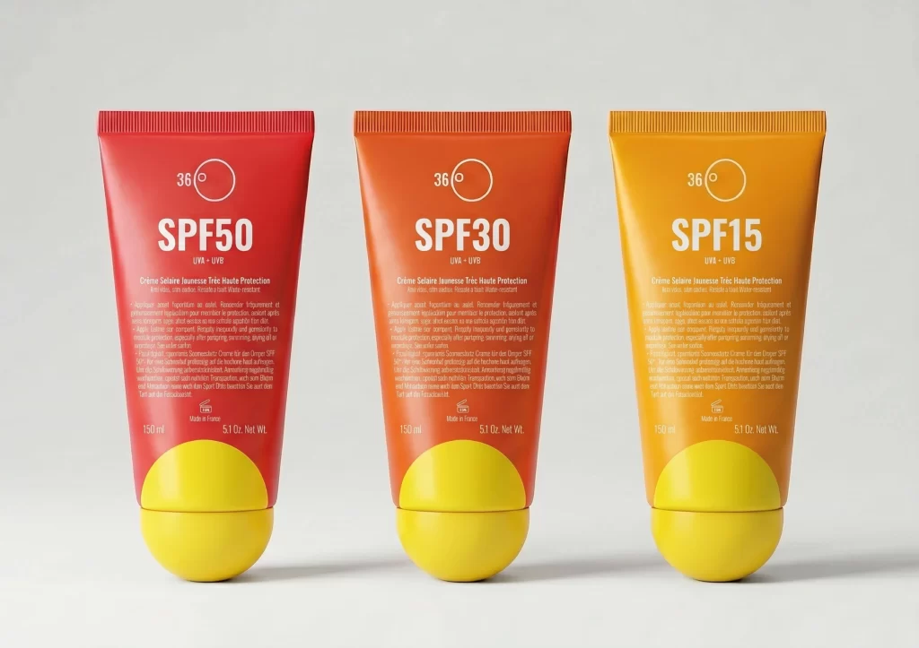
Arranged in a neat horizontal row against a seamless light gray backdrop, three sunscreen tubes display a clear progression of protection levels. Each container features a distinct color gradient—vivid red for SPF50, a warm orange-red for SPF30, and a golden yellow-orange for SPF15—all capped with identical bright yellow spherical bases. White typography dominates the front of each tube, prominently displaying the SPF rating below a circular '36°' icon and the text 'UVA + UVB', while smaller French and English product descriptions fill the lower portion alongside 150ml volume markings.
The visual hierarchy here relies heavily on color psychology to communicate function, using the intensity of the red spectrum to imply stronger protection compared to the lighter orange tones. Spherical caps break the conventional flat-end tube mold, adding a tactile, playful element that suggests ease of use and a modern aesthetic. Consistent placement of the temperature icon and protection claims across all three variants creates a unified brand identity despite the varying colorways.
Product photographers can study the even, shadowless lighting setup used to eliminate distractions and highlight material textures like the ribbed tube tops. Packaging designers might reference this layout to understand how to effectively differentiate product lines through color coding while maintaining typographic consistency. Marketing teams evaluating cosmetic branding could analyze how the combination of bold numerical data and minimalist iconography conveys essential information at a glance.