Sunscreen Lotions With Different Spf Levels Tube
Topics
Details
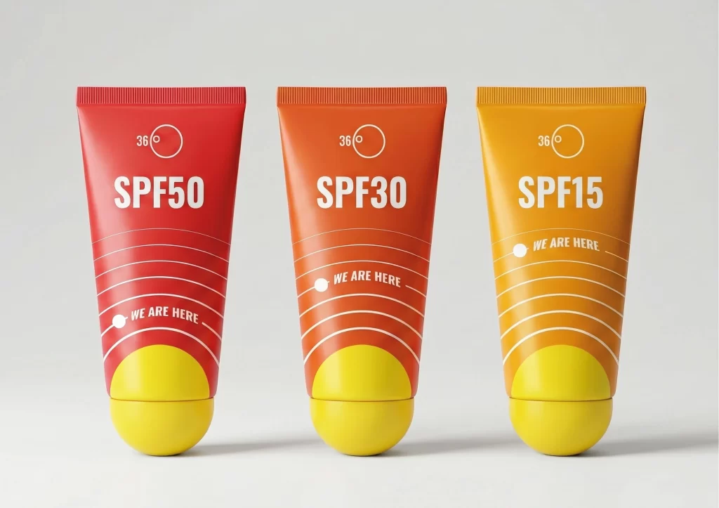
Arranged in a strict horizontal row against a neutral, seamless gray backdrop, three sunscreen tubes present a deliberate chromatic progression from deep crimson to burnt orange and finally to a bright marigold. Each container features a cylindrical body that tapers into a rounded, bulbous yellow cap at the base, while the upper edge is finished with a ribbed seal. Bold white typography dominates the front face, displaying 'SPF50', 'SPF30', and 'SPF15' respectively, accompanied by a circular '36°' icon and the curved phrase 'WE ARE HERE' positioned over a series of concentric arc lines.
Visual hierarchy is established through the strategic use of color temperature to communicate product efficacy, where the intense red suggests maximum protection and the lighter orange implies a lower defense threshold. The graphic elements utilize a consistent geometric language, employing radiating lines that draw the eye downward toward the weighted yellow base, creating a sense of solar energy or heat. Such a systematic approach to packaging allows for instant differentiation between variants while maintaining a cohesive brand identity through shared typographic weights and iconographic placement.
Product photographers and 3D environment artists might study this arrangement to understand how subtle shifts in hue can categorize items within a single product line without altering the physical form. Marketing teams developing skincare branding could analyze the balance between playful, rounded geometry and serious, high-contrast informational text to appeal to a health-conscious demographic. Furthermore, industrial designers examining this reference would note the tactile contrast between the smooth tube surface and the textured cap, suggesting a focus on user interaction during application.