Sunscreen Lotions With Spf Labels Tube
Topics
Details
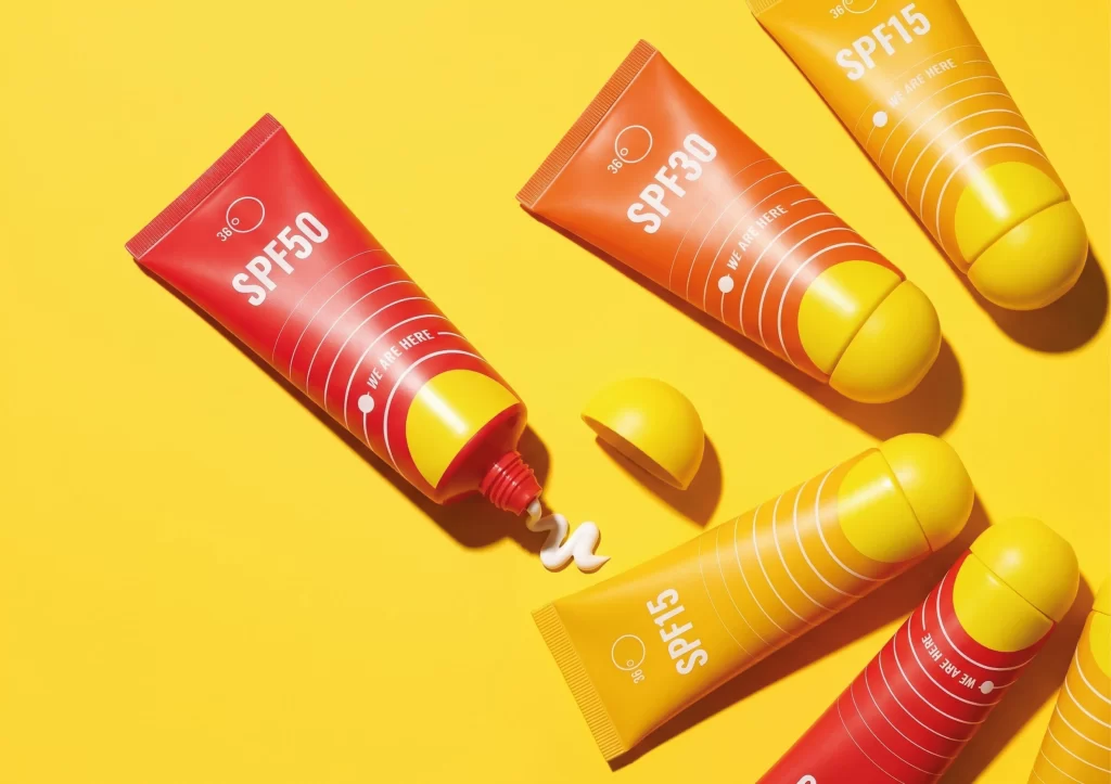
Against a saturated canary-yellow backdrop, several sunscreen tubes lie scattered in a casual, overhead arrangement. The containers transition from deep crimson to burnt orange and golden yellow, each capped with a bulbous, lemon-shaped lid that matches the background hue. Bold white typography announces protection levels like SPF50, SPF30, and SPF15, while concentric circular lines and the phrase "WE ARE HERE" wrap around the cylindrical bodies. One crimson tube stands slightly apart, its red nozzle dispensing a creamy white dollop onto the surface beside a discarded cap, all illuminated by sharp, directional light casting crisp shadows.
What distinguishes this particular product lineup is the playful integration of spherical, fruit-like caps that transform utilitarian packaging into sculptural objects. The gradient color-coding intuitively suggests varying sun protection strengths, moving from intense red for high defense to lighter yellows for minimal coverage. Graphic elements such as the radiating stripes and minimalist sun icons create a cohesive visual language that feels both medical and whimsical, bridging the gap between serious skincare and summer leisure.
Brand strategists developing cosmetic packaging might study this composition to understand how color psychology communicates product efficacy without words. Industrial designers could reference the unconventional cap shapes when brainstorming ergonomic solutions for travel-sized toiletries. Meanwhile, art directors planning seasonal beauty campaigns would find the high-contrast palette and dynamic scattering useful for storyboarding vibrant, sun-drenched editorial spreads.