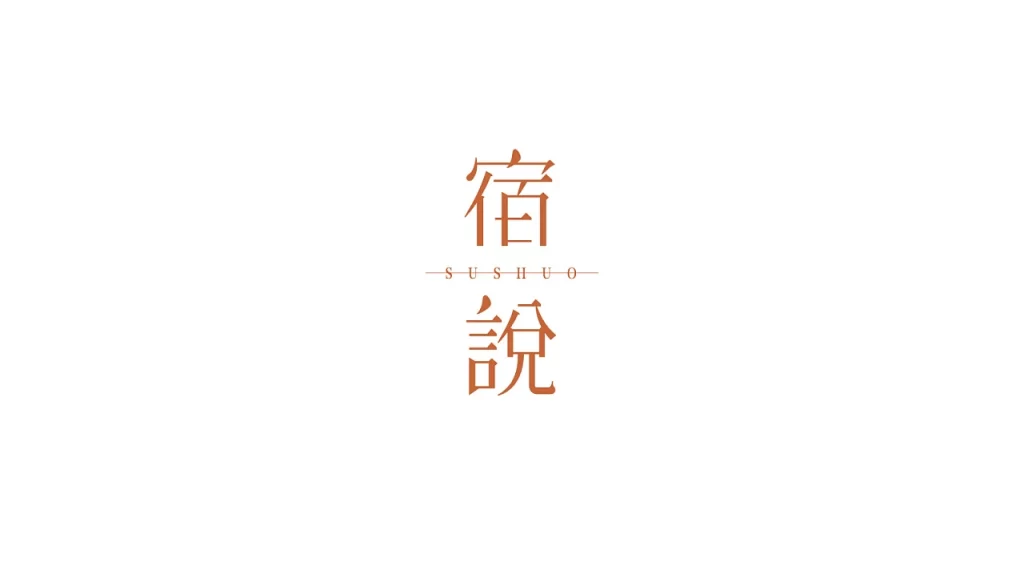
Sushuo Label
Topics
Details
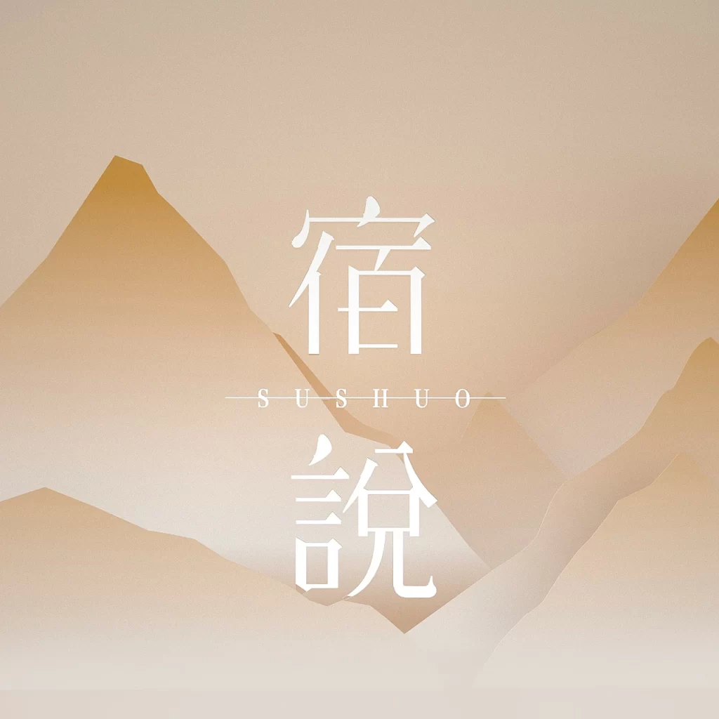
Against a stark white backdrop, two large Chinese characters rendered in a warm terracotta hue dominate the central field. The top character, 宿, sits directly above 説, with the English transliteration 'SUSHUO' positioned between them in a smaller, spaced-out serif font flanked by thin horizontal lines. The composition is strictly symmetrical and frontal, utilizing flat lighting that eliminates shadows to emphasize the clean geometry of the typography.
Visual interest stems from the deliberate contrast between the traditional, heavy weight of the logographic characters and the delicate, minimalist Latin script acting as a bridge. The specific burnt-orange tone adds an organic warmth that softens the otherwise rigid vertical alignment of the text blocks. Such a layout effectively balances cultural heritage with modern minimalism through its restrained color palette and generous negative space.
Branding specialists working on hospitality or lifestyle projects might utilize this arrangement for logo concepts requiring an East-meets-West aesthetic. Typography researchers could analyze the kerning and stroke width relationships between the Hanzi and the Roman letters. Additionally, art directors planning editorial layouts for bilingual publications may reference this structure to achieve a sophisticated, uncluttered look.