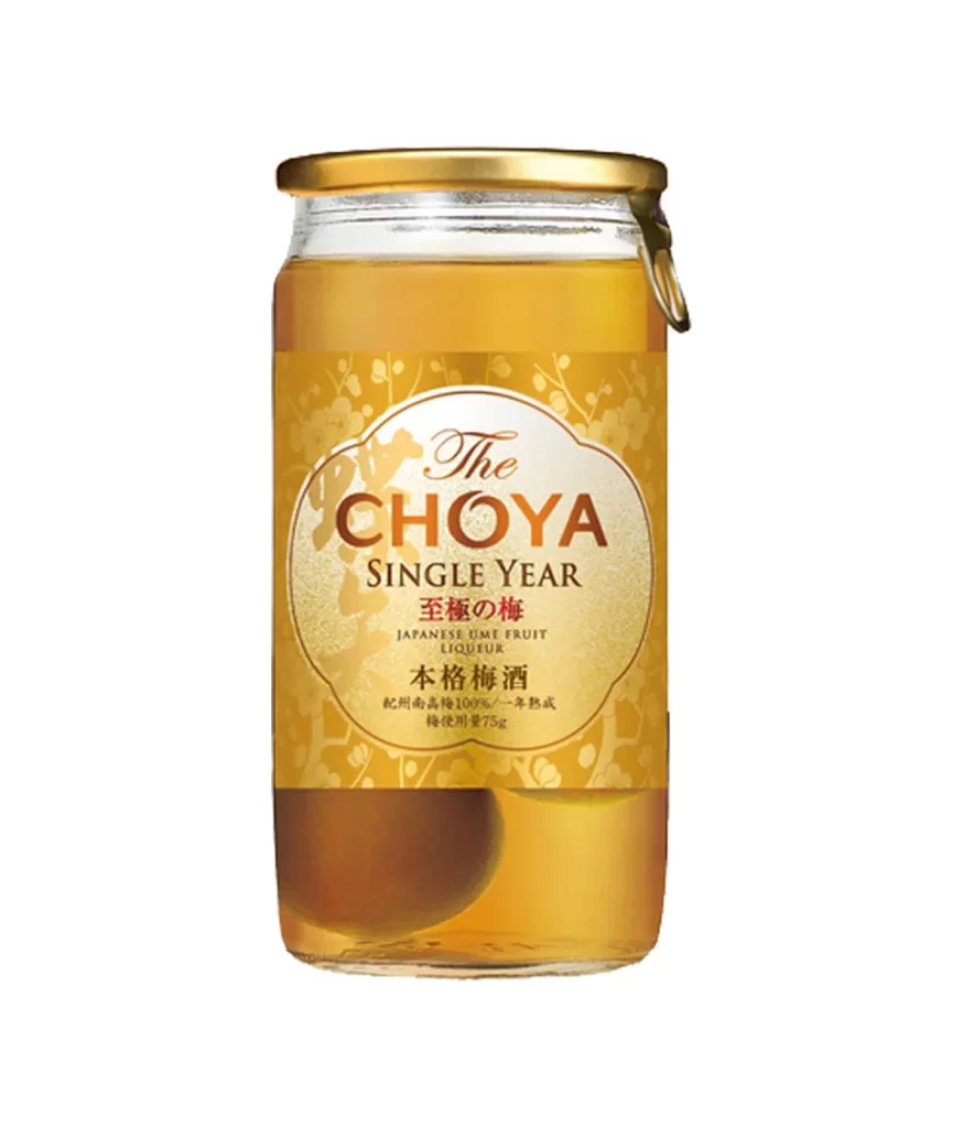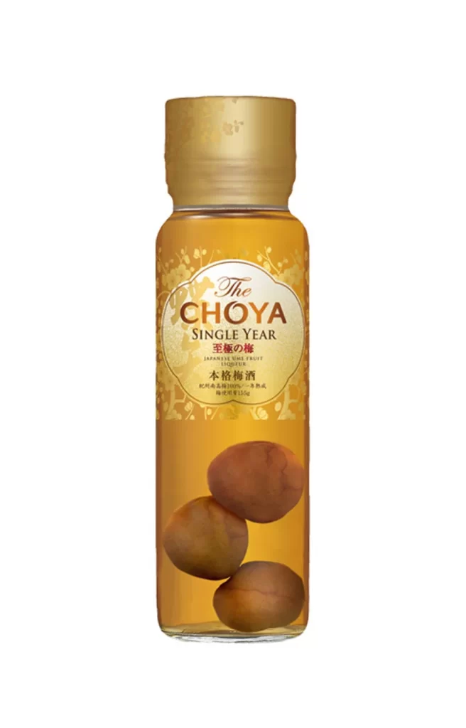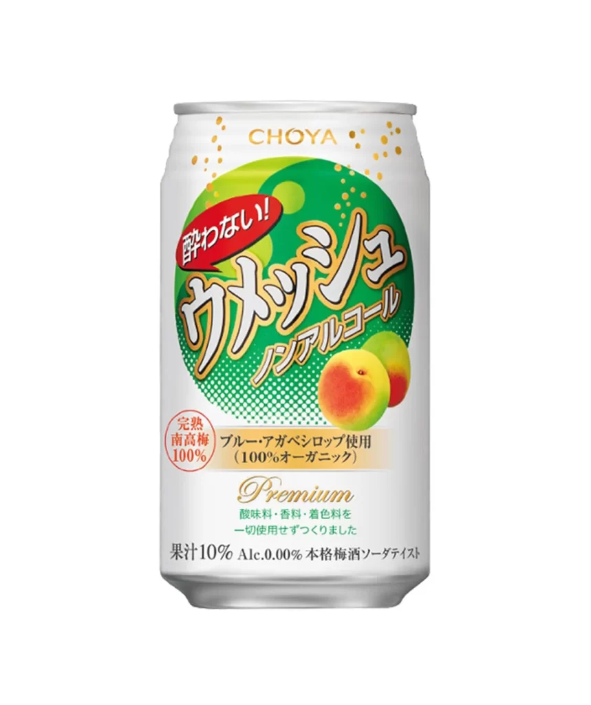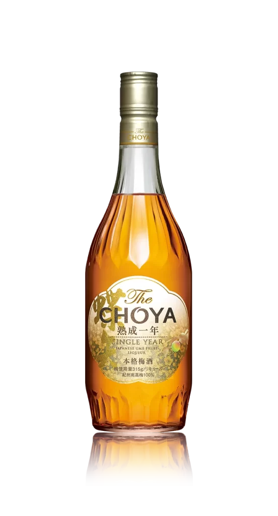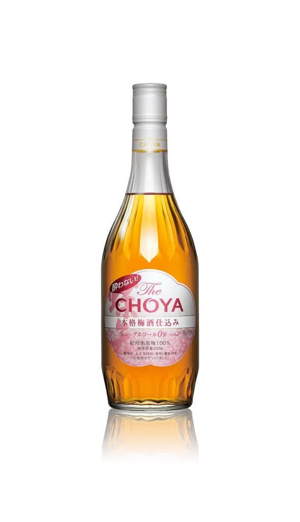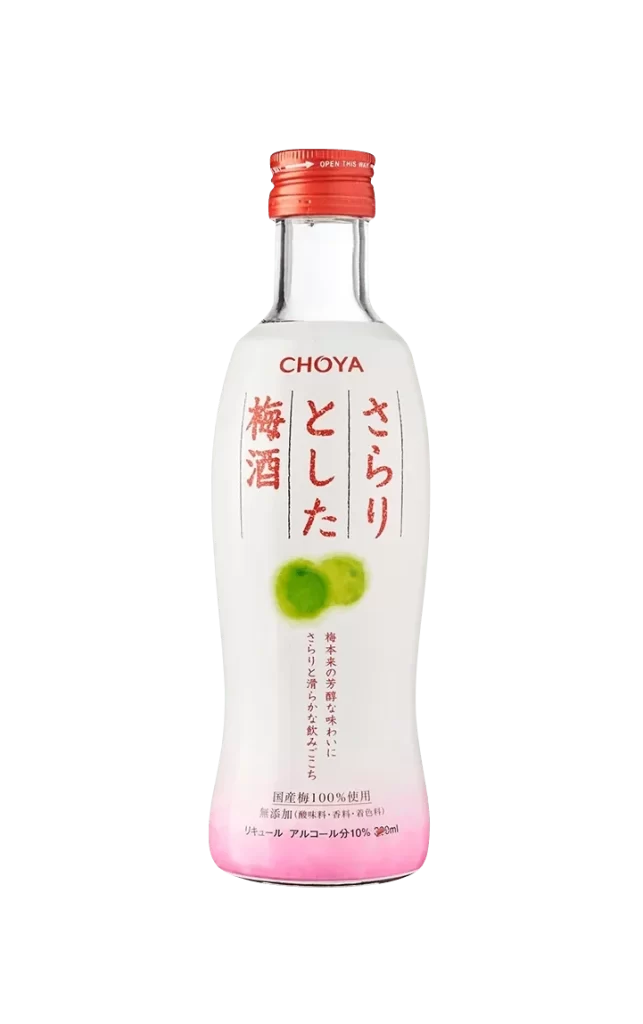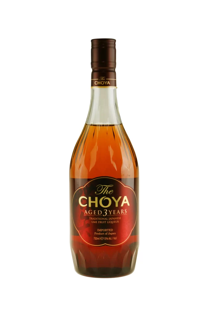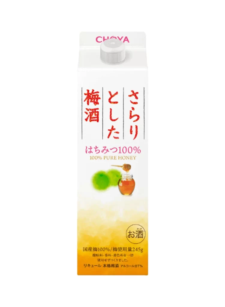
The Choya Golden Ume Honey Two Bottle Packaging
Topics
Details
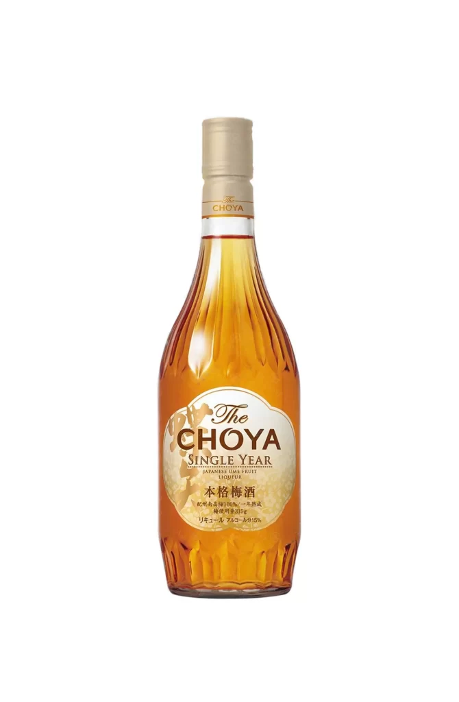
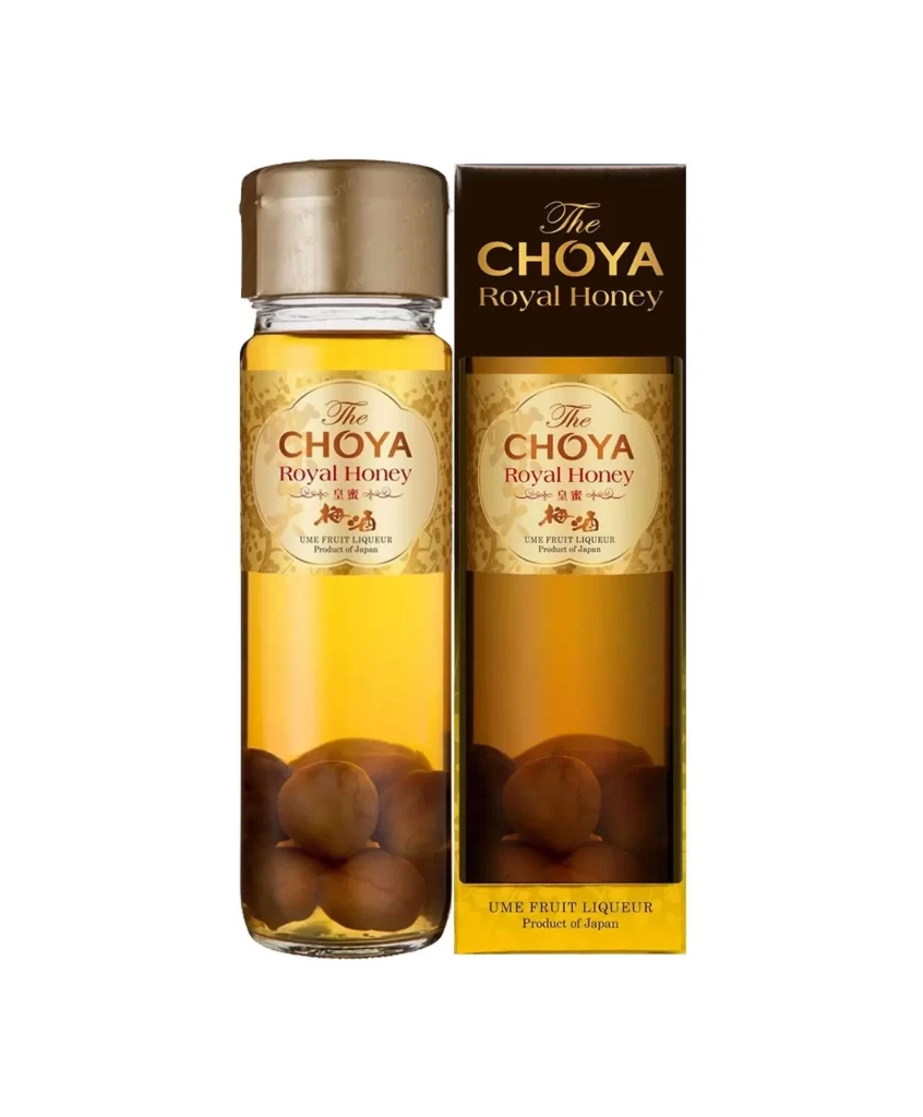
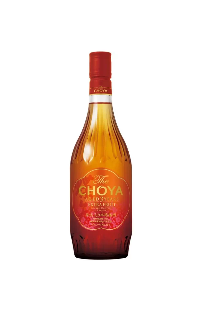
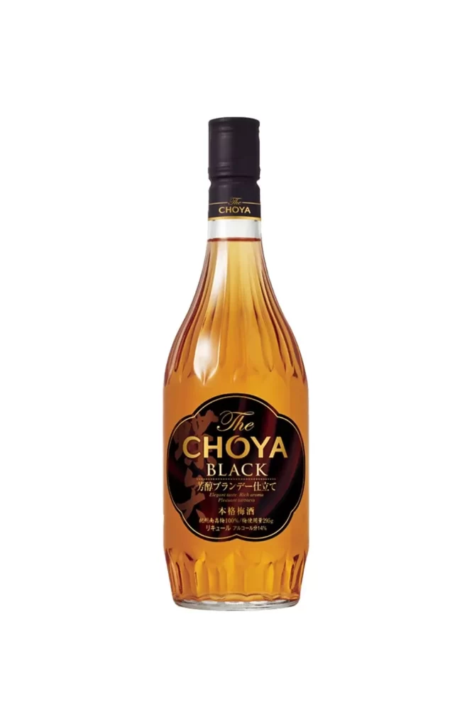
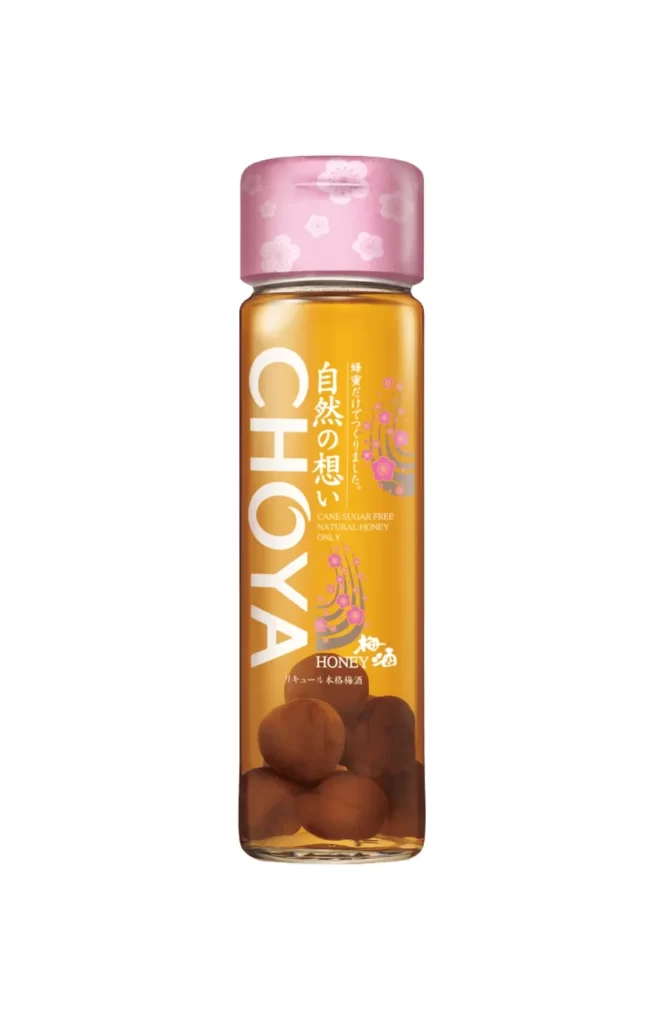
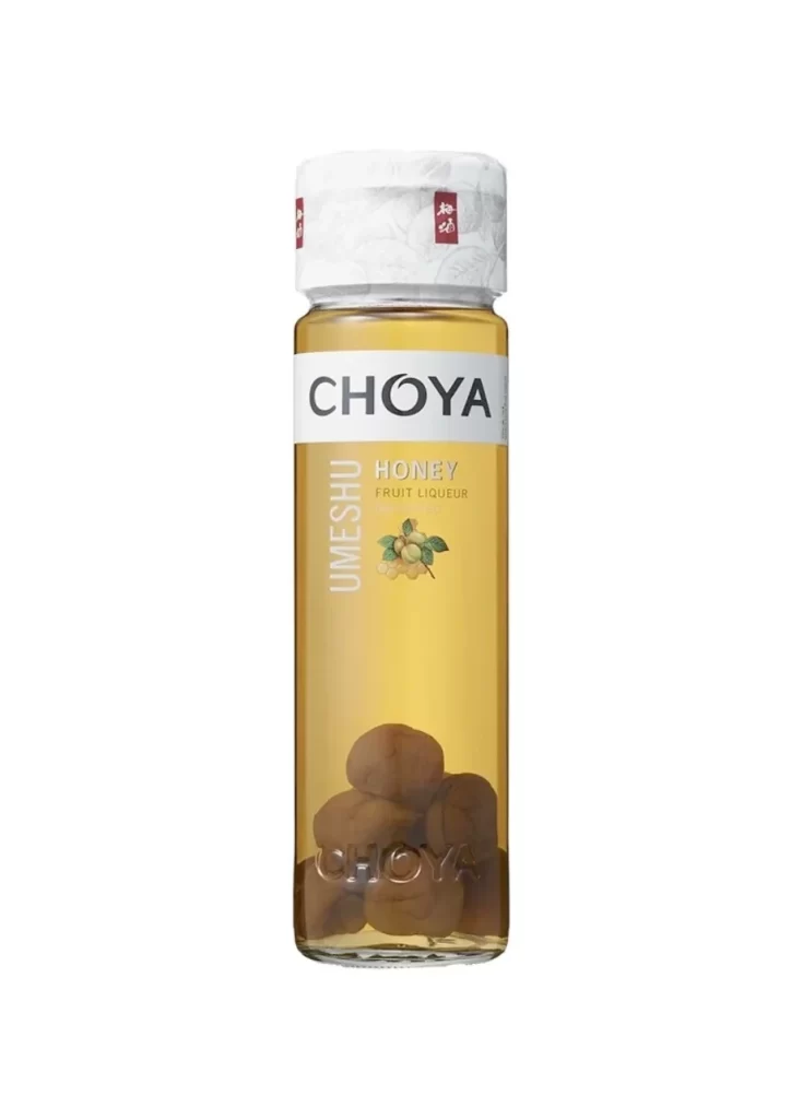
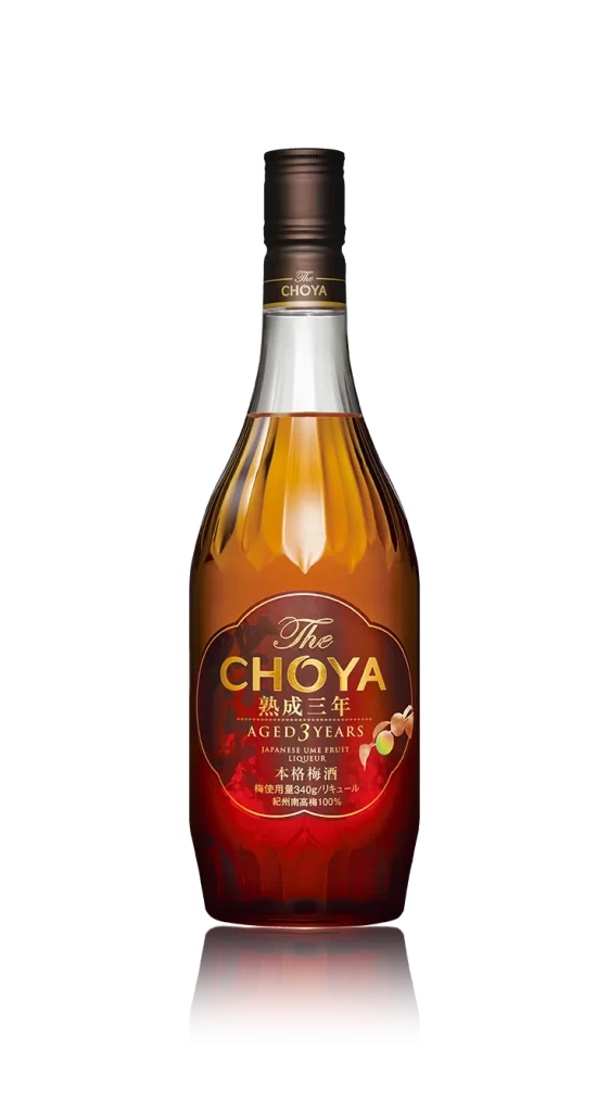
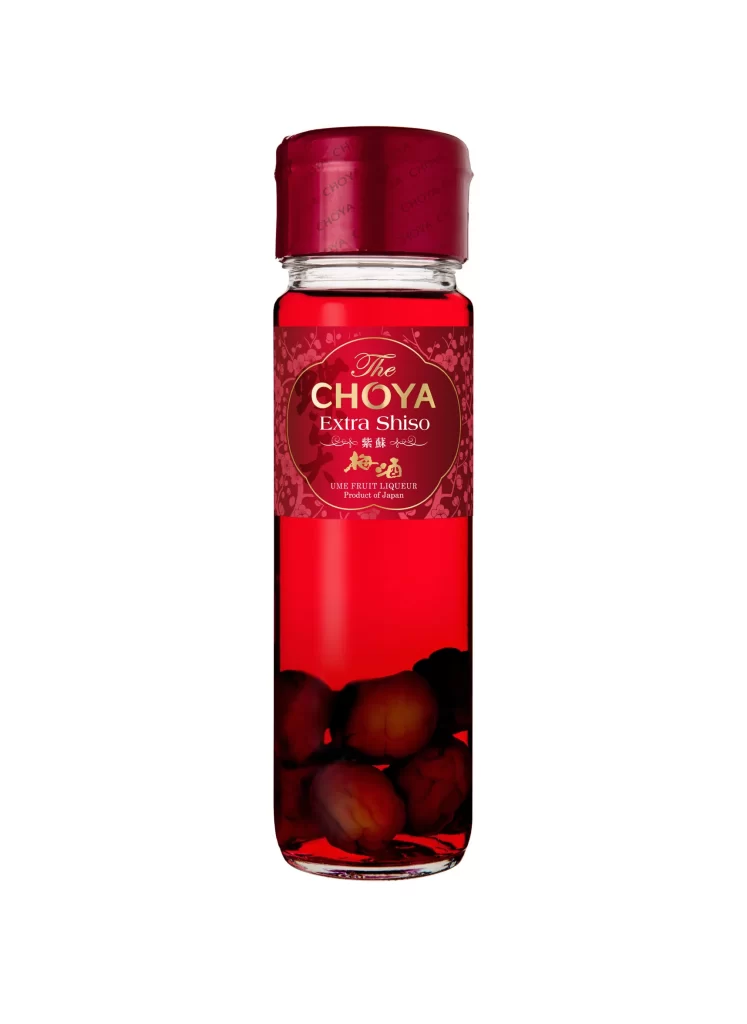
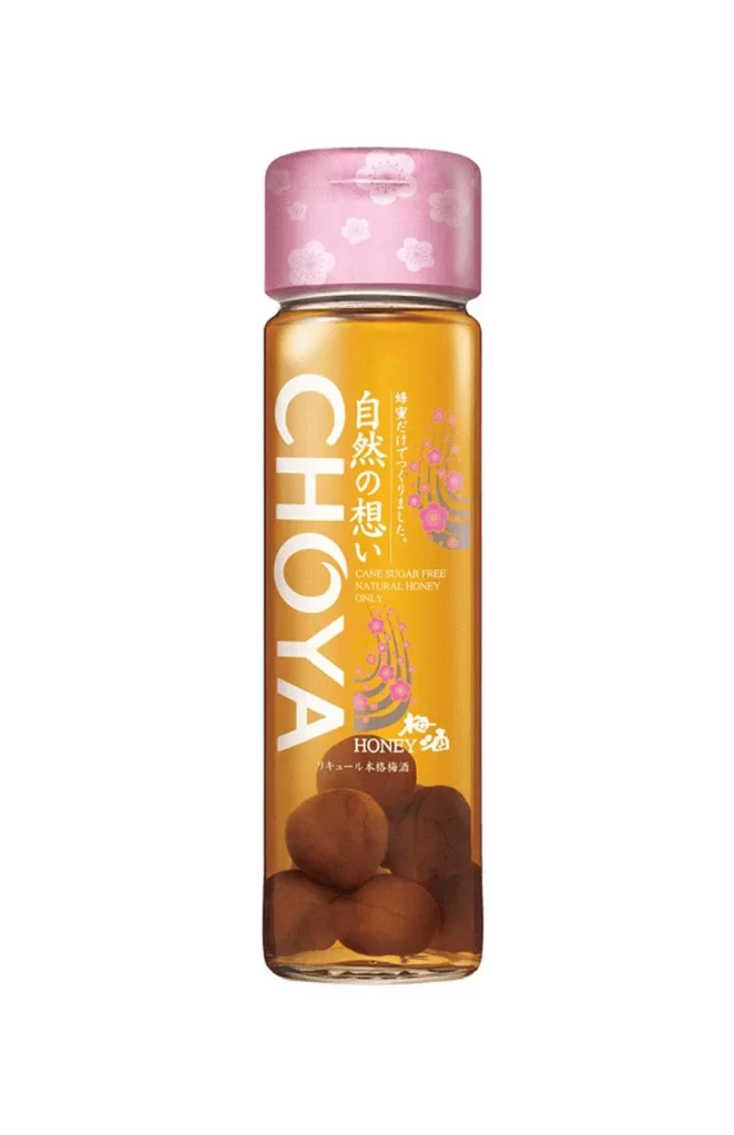
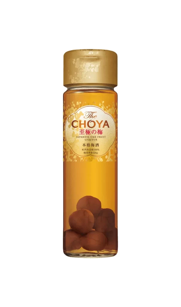
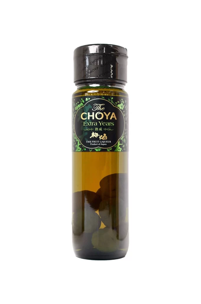
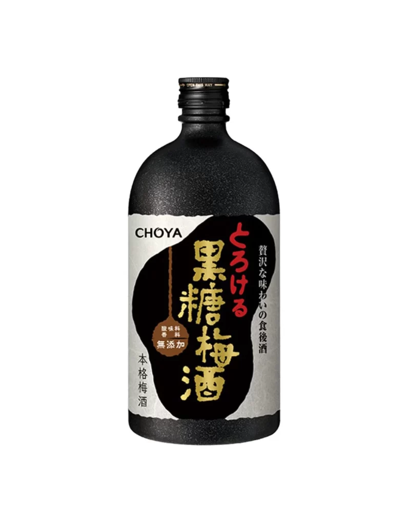
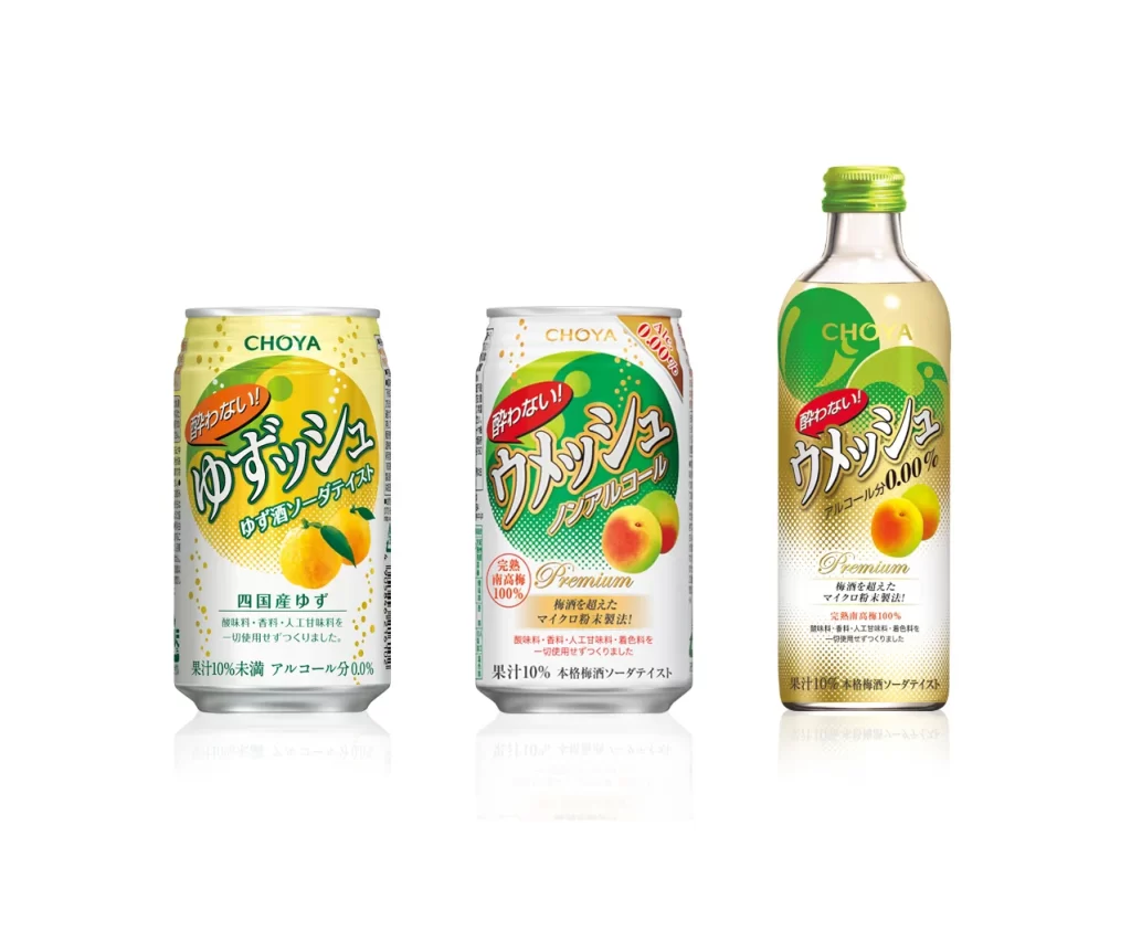
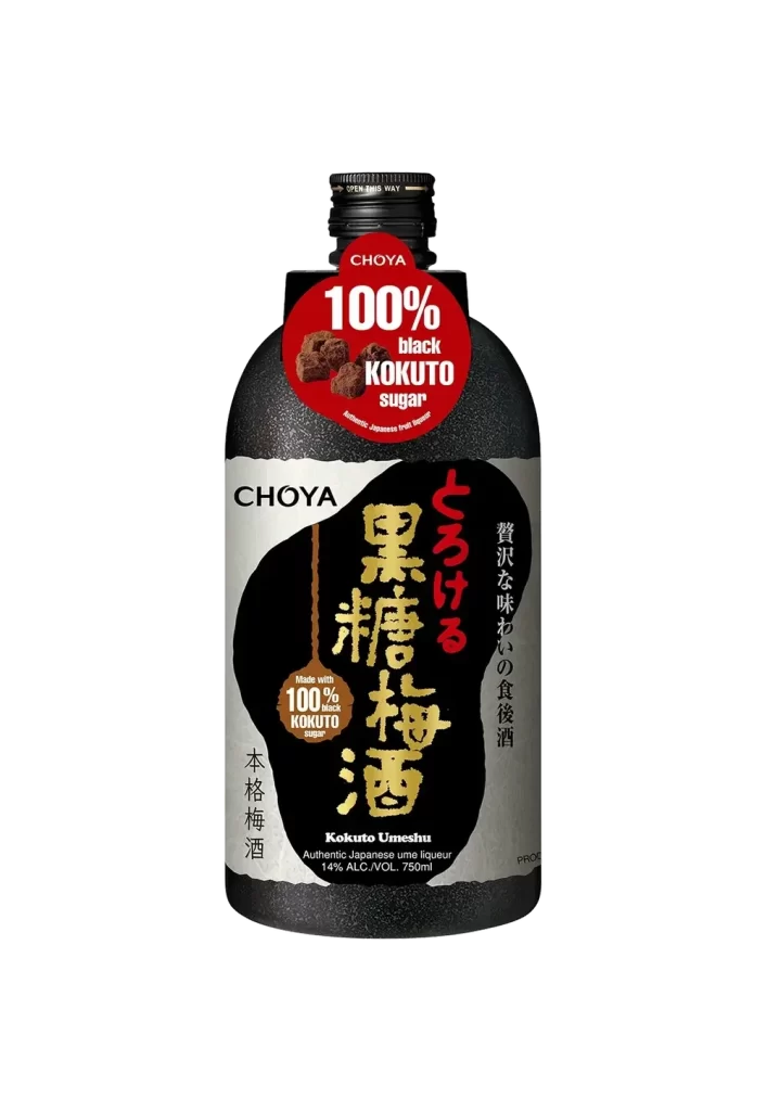
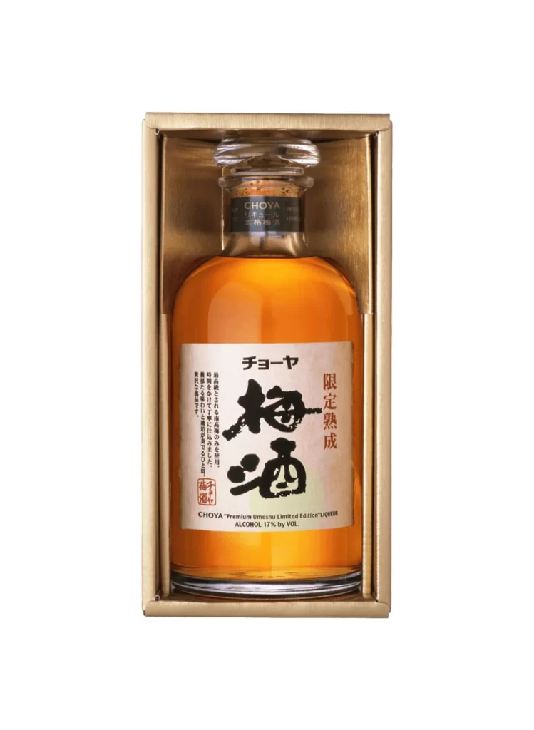
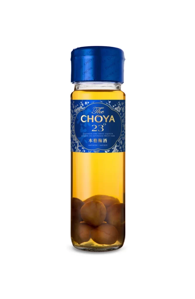
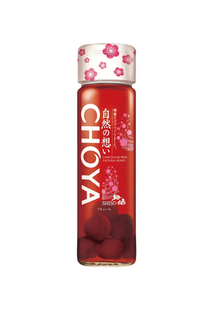
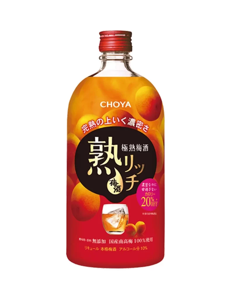
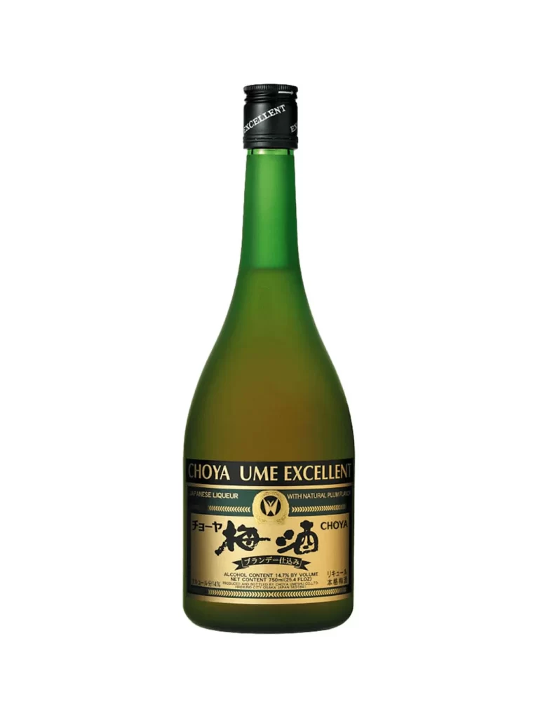
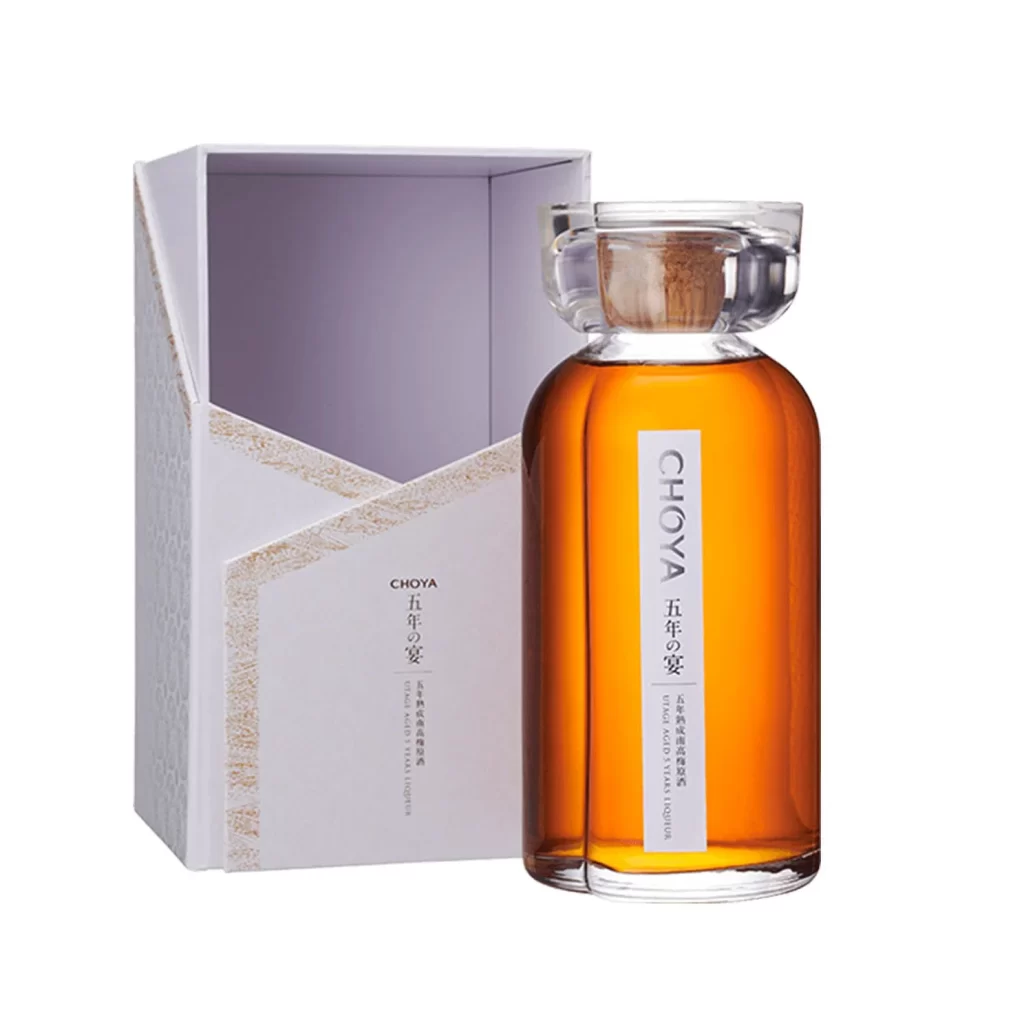
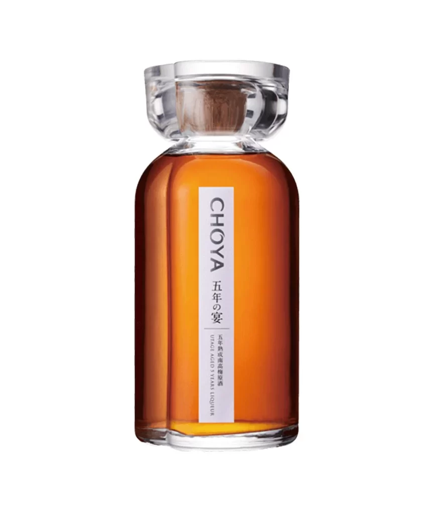
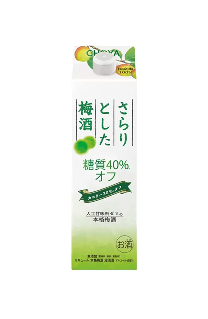
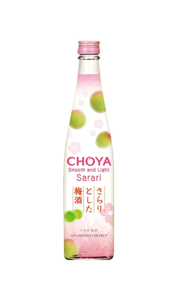
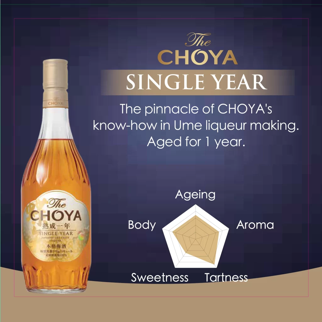
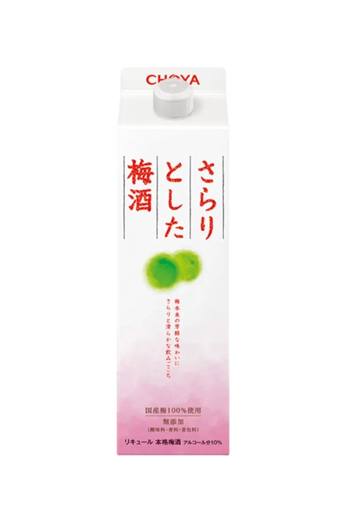
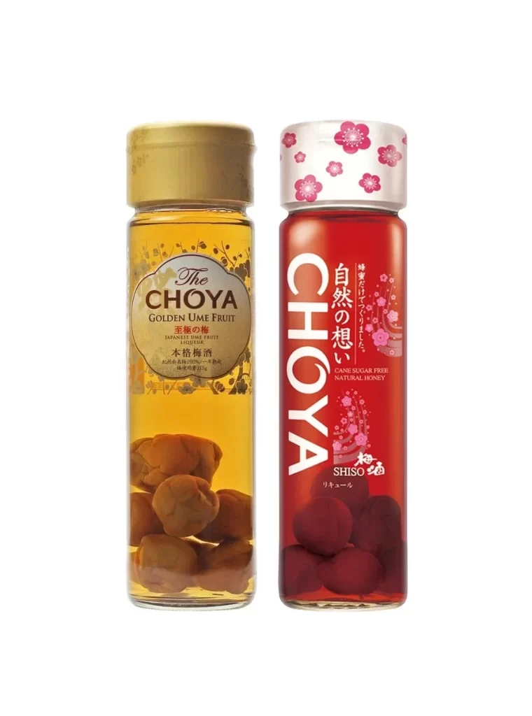
Positioned against a pure white background, two distinct bottles of The Choya umeshu stand side by side. On the left, the Golden Ume fruit liqueur features a sophisticated gold cap and transparent glass revealing whole ume fruits, while its companion on the right boasts a vibrant red liquid, a white cap adorned with pink floral patterns, and prominent labeling indicating it is cane sugar free and made exclusively with natural honey.
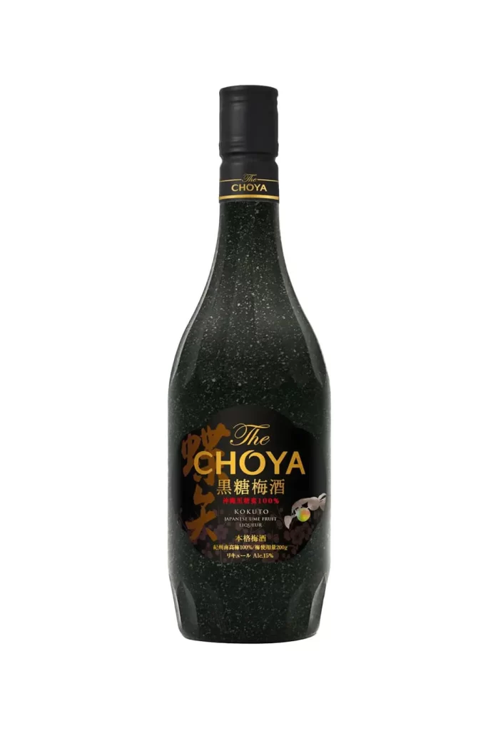
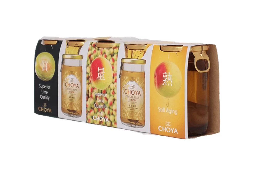
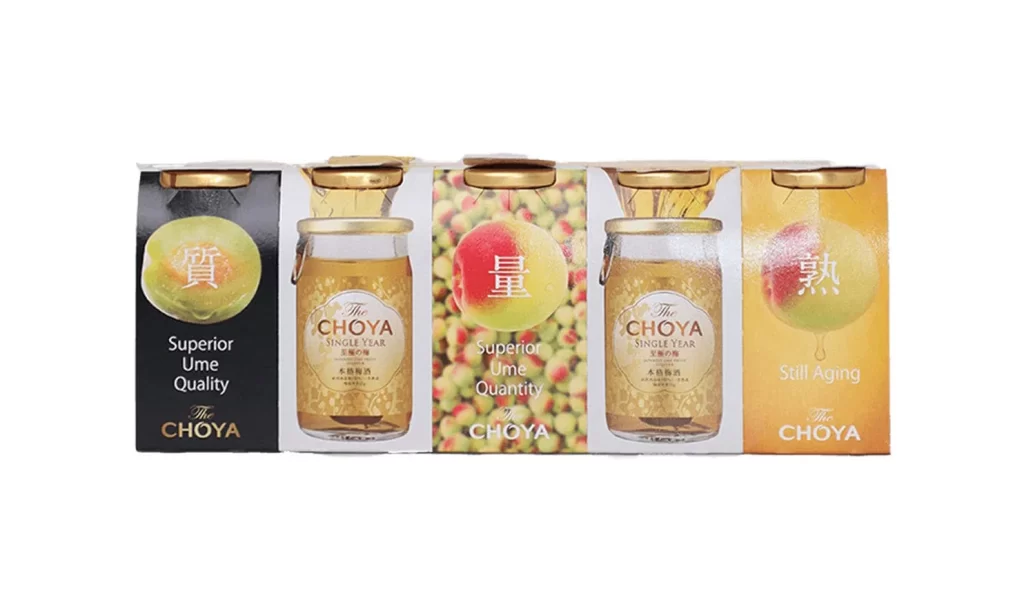
Choya stands as a premier producer of Japanese plum wine, and these two variants showcase their range from traditional luxury to modern health-conscious options. The inclusion of whole fruit within the bottles serves as a visual testament to the authenticity and quality of the brewing process, appealing to consumers seeking genuine artisanal spirits.
Packaging designers can draw significant inspiration from the contrasting yet complementary visual language used here. The strategic use of color psychology—gold for prestige and red for vitality—combined with tactile elements like the patterned cap, demonstrates how to effectively communicate different product values within a single brand family.