Tomato Sauce Red Yellow Green Classic Packaging Design
Topics
Details
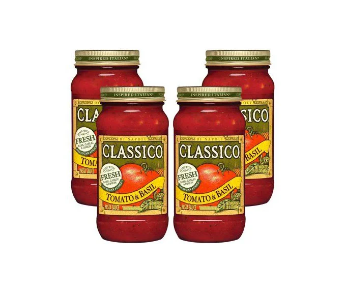
Four glass jars of Classico Tomato & Basil pasta sauce stand in a loose cluster, their cylindrical forms filled with a deep crimson liquid. Each vessel features a metallic gold screw-top lid embossed with the phrase 'INSPIRED ITALIAN' in dark green lettering. The label design centers on a cream-colored field dominated by the brand name 'CLASSICO' in bold black serif typography, flanked by a circular 'FRESH TASTE GUARANTEE' seal and a vibrant yellow banner announcing the flavor variant. A realistic illustration of a ripe red tomato and green basil leaves anchors the lower half of the packaging, while the entire arrangement sits on a neutral light surface under even, shadowless lighting that emphasizes the glossy texture of the glass and the saturated reds, yellows, and greens of the branding.
Visual distinction emerges from the deliberate color blocking between the warm tomato-red contents and the earthy olive-green accents framing the label's perimeter. The yellow flavor-identifier banner creates a strong horizontal break that draws the eye immediately to the product variety, while the circular quality seal adds a layer of institutional trust through its stamp-like geometry. Typography hierarchy plays a crucial role here, with the oversized brand name commanding attention above the more delicate script elements describing the Italian inspiration, creating a balanced yet assertive shelf presence that communicates both tradition and freshness.
Packaging analysts studying condiment-market visual strategies would examine this arrangement to understand how established brands maintain recognition across multiple SKUs through consistent color coding. Brand identity developers could reference the specific combination of serif fonts with botanical illustrations when crafting heritage-food product lines that require an artisanal yet accessible aesthetic. Retail merchandising planners might utilize this grouping pattern to test how staggered jar placement affects consumer perception of abundance versus organized display in grocery aisle configurations.