Tsingpaitea House Tea Box View
Topics
Details
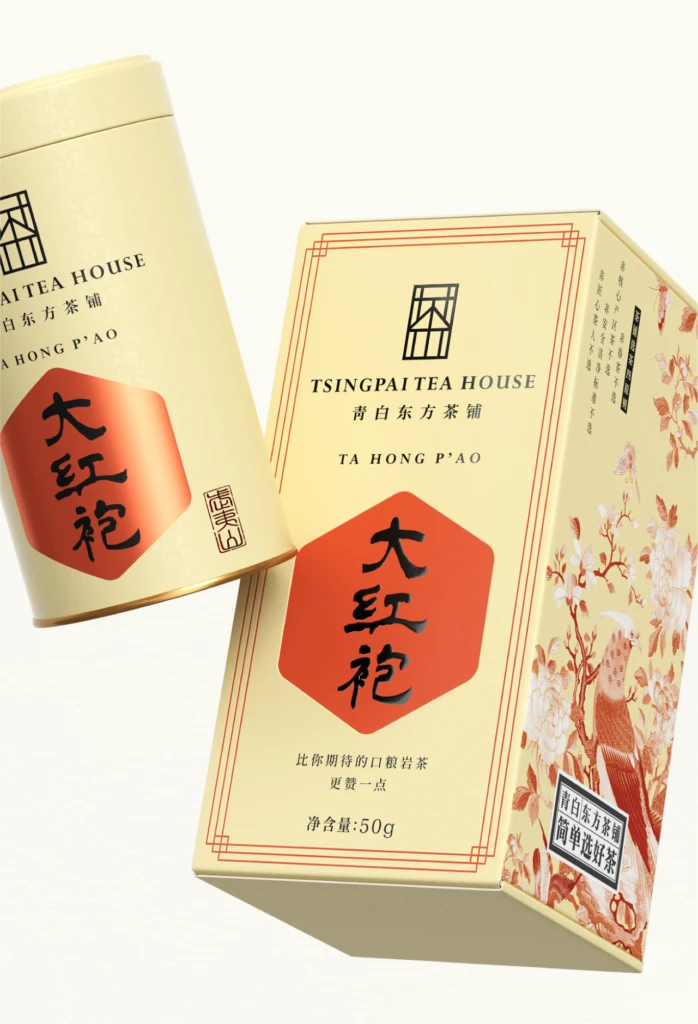
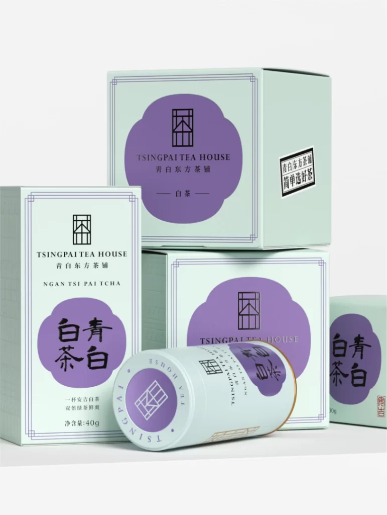
Soft mint green and muted lavender define the visual palette of this tea packaging arrangement, where rectangular cartons and a single cylindrical tin are stacked in a casual, layered composition. Each box features a distinctive cloud-shaped purple label housing a geometric window logo, alongside bilingual text identifying the brand as Tsingpai Tea House and the product as white tea. The scene is illuminated by even studio lighting that eliminates harsh shadows, presenting the matte paper textures and crisp black typography with absolute clarity against a seamless white backdrop.
Visual interest arises from the sophisticated interplay between the cool pastel background and the deep violet accents, creating a modern yet traditional aesthetic that feels both calming and premium. The typographic hierarchy skillfully balances English branding with bold Chinese characters and romanized Cantonese, while the recurring window motif adds a layer of architectural consistency across different packaging formats. Such deliberate color restraint and geometric precision distinguish this design from typical busy tea packaging, favoring an editorial minimalism that communicates quality through negative space.
Brand strategists developing luxury consumer goods will find this composition invaluable for studying how to execute cohesive identity systems across varied container shapes without losing visual impact. Packaging engineers can analyze the structural relationships between the flat cartons and the round tin to understand how to maintain brand continuity in mixed-format product lines. Additionally, color theorists examining the specific hex values of this mint-lavender combination could apply these findings to projects requiring serene, high-end palettes for wellness or lifestyle categories.